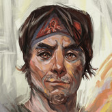
This painting didnt tured up as I expected
3yr

Miguel Nieto
I tried to give a sense of realisim on this painting, just by the color and not the perspective.
I think that maybe I should have gone for less stylized shapes and tried more texturated ones.


That sharp edge cutting through the middle that gives the illusion of being a horizon line but in the wrong place. If you painted it out it would actually improve the perspective and realism a lot. The next thing I would say is add atmospheric depth. As Dan B pointed out. Giving a soft blue/cyan fade the further away things are will give a real sense of depth. If you don't want to use perspective, it is (usually) necessary to use that technique in order to give a sense of scale to your landscapes. Alternately, you can use different colours. But those colours will change the time of day, and should also be reflected in your over-all colour temperature.

I think a key part of the painting is the perspective, so you should pay attention to that if you are going for realism. But I think not so much technical perspective, but instead atmospheric perspective. Close objects have more contrast and saturation, distant ones reduced contrast/saturation. Your painting looks somewhat 'flat' because of the lack of atmospheric perspective.
Look up some reference for the clouds. They need to reduce in size as they retreat to the horizon, or go in layers, where yours are maintaining the same size throughout, which again flattens the image. Here's a good video on the topic:
Watch from 38:00 for the clouds, but you might find the whole video useful:
https://www.youtube.com/watch?v=xWMMo1v594Y
Thanks a lot, do you have any other resource which deals about atmospheric perspective??


Honestly,the painting itself isn't bad,I quite like the composition and mood of it.I do kinda agree on texturated shapes just because on the abstract level the painting feels very repetitive.On the bottom left and right I feel this most guilty,as it doesn't have enough texture or shape design to make it interesting.(Here is an example by Jamie Jones of a paintig chalk full of texture that may give you inspiration)
On the topic of realism,I don't fully know what you meant by this?As it seemed you have succeed on making the feeling of a sunny day in your painting.I guess you can push it further by making the rocks and shadows a little more blue to simulate the ambience occlusion. (kinda like this John Singer Sargent painting)
But again not bad,so please keep going and try to make the next one better.(Also hopefully this whole thing was useful and not just a waste of time,best regards anyway if it does)
I tried to make some tougth changes with te feedback you guys gave me and I think it looks way better now
Thanks a lot. I defietly wasn t a waste of time. I appreciate it so much. I still have a lot to learn