portrait in digital medium
4yr


Athul Krishna
Hi😊😊, First time being part of a community , I just started drawing digitally .
critiques are well appreciated 😁


Hey! First off great looking peice, the hair looks good and I can see what i think you're going for with the limited value range. My main critique would be to try and define you lit and shadow area better. They can bleed into eachother and make things feel flat so its better to be able to have a hard line (in your head) of where the lit area and the shadows meet, then keep those values separate. The lightest area in the shadows should be darker than than that darkest area in the light.
Hopefully that's helpful! I'm still learning too lol


Hello there! Really nice drawing you got there! I love how you rendered the hair
What i think you can work on is to learn the skull structure as it helps to define the shape of the head! And i think you should be braver in choosing a darker value since the grays here still look pretty bright. Like the shadow around his neck could be darker and you can make your character pop out more by making the background value darker
Hope this helps!
Thanks for the reply . your right, I was a bit scared to use darker values 😊. Helped a lot
Hello!!! I think something that I learned that really helped with my portraits is that the 'white' of the eye is very rarely white. Its often quite a dark tone, and then there might be shadows over the eye from the lids, nose or brows that darken it more. Save your lightest tones for highlights - maybe a tiny dot on the eyeball, or the lids! Keep it up :)
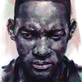

Nice work, @Athul Krishna! I am not sure what style you are going for. Your proportions look very good! My first comment would be to have more contrast. You need darker darks and lighter highlights to keep the painting from feeling flat.