Opinion and critiques on my latest (wip) painting
4yr

Marco Fornaciari
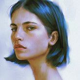
Hi guys! I'm working on a new painting and i'd like to know your opinion about it!
Please let me know!

Thank you guys for all the replies!
I've made some changes based on your different comments. Is it any better in your opinion?
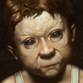
I've also made another "colored" version with slighlty diffrent values. Let me know what you think!

Love the brush textures and the flow of the hair. I'm partial to the greyscale version.

I think the colour somehow made the figure more approachable, not sure why though. Looks like a gradient map but the hue shift do bring some interesting effect to it.
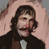

Looks amazing! Like it was said before I think the main thing that is troubling me here happens on the underside of the chin, where it connects to the neck (I think it's called the submandibular triangle in english). If the adam's apple is that low, I think we should see a bit more skin from that part of the face even on a person with low body fat. But maybe your reference has a very particular look!
Other than that the lighting is super nice, I love the flow and the shape of the neck! And your rendering of the hair is perfect, just the right amount of details and looseness to my eyes :)

Like Yiming Wu, I also think there's something to be fixed in the neck as well as in the connection with the jaw, which is a bit too sharp; it seems to me that the adam's apple is a bit too pronounced.
All the rest seems very good to me, I really like your style, it has a lot of character, while remaining somewhat delicate.
Thanks for the answer! I've made some changes and posted the new stage, let me know if you like it more this way!
Wow I love the slightly exaggerated shape.
In terms of suggestions, to me the neck doesn't seem to connect smoothly into the jaw, maybe you can use some strokes to make out the skin that connects the front of the jaw with the neck... it's a bit hard to describe but that part isn't a right angle for sure... You can feel the smooth curve if you use your own hand on that part.
Otherwise pretty much okay... I love the neck shape.
Thanks! I've changed some stuff and posted the new version, feel free to share your toughts!
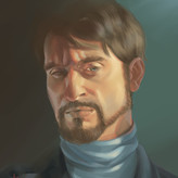

I't's wonderful in my opinion! I'm not experienced enough in portrait drawing to give you any technical advice (seeing your level)... I only would be curious to see the same drawing with a darker background on the right side: even if it probably could appear a bit unrealistic, I think it can be useful to "pop up" the portrait even more

Hey Marco, looks good to me. I suggest getting rid of the straight line tangent to the chin or move it so it isn't tangent. I usually like to avoid tangents if I can. Apart from that, try to connect the shadow from the bottom lip to the chin in a simpler way. Also maybe use a softer edge on the chin. If you want the hard edge aesthetic you can use the same brush but with like 40% opacity.
Hope all goes well


The head looks solid, but when you cover the neck with your thumb, the head looks proportional to the shoulders...and when you cover the head with your hand, the neck looks like it would support a larger head...this exercise tells me that the neck could be trimmed a bit, since you've already decided to tone down the contrast...


Hey! The ball of the neck seems to be where my eye immediately looks. It stands out because of the contrast in that area. I’d recommend lowering the contrast there,
Oh yes! now that i stopped working on it for a while and after reading your comment i noticed it!
Thanks for the input!

Looks great Marco
I would maybe try to add a little space on the left/move the guy to the right/extend the canvas. Just feels like there's some tension in that area but Idk:P Just nit picking though looks impressive!:)