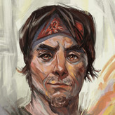
Need Feedback on this pencil portrait
2yr

Miguel Nieto
I like the shapes,, and the value is correct but I feel there is something missing


2yr
Hey Miguel,
I really like drawing old faces too, nice job. I think though that the values that you have are not describing the form of the head. The way you have it now makes it confusing to know where the light is coming from. The problem is that it flattens our drawings if we don't have a good separation between the light and shadows.
Also, remember that form shadows have soft edges, and cast shadows have hard edges. You have hard edges on almost all your shadows. This also can flatten out our drawing and cause confusion. I did a quick drawing to show you what I mean, I hope it helps :)
Miguel Nieto
2yr
Thanks likes always. About the edges, I wanted to do like Jeff Watts pencil drawings, but I still dont know how does he get that level of realisim with hard edges


2yr
I think more contrast to the background perhaps. It’s a great drawing. The contrast to the tone of the background would make it stand out more and probably more realistically as well as it will add depth.

2yr
I think in terms of "something missing", maybe you could put more emphasize on the eye areas, make it more contrasty, or use darker, sharper edges around those areas, so it attracts the viewer more and also give the whole image a center point, rather than everything having relatively the same detail level