Looking for Portrait Critiques
3yr


Solomon Asghar
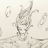
Hi! I recently finished a portrait drawing in graphite and some critique would be greatly appreciated. Thanks for looking.


A very good portrait for a very cute subject! I really like the way you designed the hair. Very natural and soft! Proportion are very good (even if I can't see the original reference I can say that the anatomy is correct).
On the other hand the contrast is too law and make your beautiful portrait too blur. I tried too push the shadow and the h-lights a little more (the second one is my version retouched with CLIP STUDIO PAINT). You can go even further if you want to! Don't be afraid to make experiments. Also I fixed the position of her L eyebrow and the h-lights on the left side of her nose (it makes look the nose in the wrong spot. Maybe in the reference it was so but when you copy a natural "mistake" it looks like YOU made the mistake in your work. So be careful. Sometimes you have to change the face or body of your subject for a better result. Be careful to the size of the irises too. They are too big and not perfectly round.
Anyway very good job Sir!!
Thanks for taking the time to have a look and give feedback, and for doing a draw over. I'll definitely aim for higher contract next time, and will post references when looking for feedback in future. Thanks again!

Hi Solomon,
Nice portrait. In addition to what you've been told regarding the values, i would add that there are some issue regarding the proportions.
The neck is way too small in comparison to the head. This is even more emphasized by the necklace she's wearing. In fact, the i think the head itself is disproportionate to the rest of the body.
Maybe you can widen the neck and the shoulders to correct this issue.
Hope this helps.
Hi TK,
I think I definitely spent a lot longer focussing on the proportions of the facial features and perhaps neglected the rest of the body. Thanks for having a look and giving some feedback!

Don’t fear the things that make a portrait really interesting: freckles, dark shadows, creases, pimples, scars, pores, oiliness, asymmetry, discolouration, etc…


The features and the rendering looks great! I think you can get make the figure more realistic and pop more if you push the values a bit more and increase the contrast.


Hey Solomon,
This is a very sweet portrait, it makes me feel like you care about this person, nicely done.
As far as the drawing goes, the proportions and structure look real good. But, I think you need to think more about the forms when you render them. What you have is so light it makes the drawing look flat. Without adding shading in the eye sockets, it makes the eyes look like flat stickers added to the face. I would also add more contrast in your focal point, which in a portrait is usually the eyes. I did a crude paint over to show you what I mean. I hope this helps, you're well on your way so keep drawing :)
Hi Steve,
The drawing is of my partner so I'm glad to hear its evident from the drawing that I care about the subject :)
Thanks for taking the time to give critique and do a draw over, I'll definitely pay closer attention to getting the forms across better in future.

I really like it. I'm not an expert on critiques or portraits.. but anyways.. I like the branches in the background and I think you did good with the expression and hair. At the bottom of the piece, was it intentional to make the chest sort of blend into the background?
The shading is soft, which is good, but I think it could look better with more defined shadows on the face?
The lost edges at the bottom were intentional, and yes I think you're definitely right about the shadows, I'll bear that in mind. Thanks for taking the time to give some feedback!