Looking for opinions/critique: character designs, style, quality
1yr


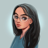
Nova Astralis
Hello everyone! I love to design characters, and I think I'm some kind of intermediate artist now. Fundamentals are still lacking, especially regarding human anatomy - but what I'd like to know is:
What exactly looks wonky about my artworks? Are they interesting or rather boring, and why? How high/low is their quality? Is my art style generic and how would you describe it? What does it feel like?
I know what I struggle to draw & to envision, I know many of my limitations very well, but these questions are just impossible for me to answer (well meaning friends & family can't either). If anyone would be willing to help me here, I'd be so happy. Thank you in advance!

•
1yr
Beautiful work here! I love the first piece of the seated figure in the water! Your inks have a very pleasing line quality, love the weight and bounce, very clean! You could begin to experiment with some more advanced rendering techniques to take these to the next level. In the last three pieces you use evenly spaced straight-line hatching to push certain elements back in the composition, but the straight lines really flatten the forms you're describing. Check out "Rendering in Pen and Ink" by Arthur Guptill, and take a look at some of your favorite illustrations to see how other artists tackle these kinds of textures using line. Specifically think of how you can accentuate underlying forms using your rendering. These feel like there's some Alphonse Mucha influence, check out some of his rendering techniques for drapery, hair, and feathers. Bernie Wrightson is a favorite reference of mine for the endless number of ways you can render something in ink. Your costuming and drapery is beautiful, believable, and well designed. However some of the drapery feels a little baggy and is obscuring the underlying figures, and looks like it could be "tailored" a bit to show off more of the gesture of the figure beneath. Your facial expressions are mostly working well for me, you've captured a lot of subtlety and nuance with each, I like the pensive tilt look in #1, the slight sneer of the Villain character #6, and the soft gaze of the two lovers #7. Overall I think most expression are slightly on the neutral side and could tell more of a story. The #4 bird woman's expression feels like the mouth doesn't match the eyes. I'm not quite sure if she's alarmed by the bird landing on her finger, or admiring it? The Roguish Pirate character drawing his sword #3 is a little placid faced for having a sword half drawn. Is he drawing his sword to engage an adversary, or sheathing his sword after ending a conflict? You can further clarify the story with the expression. These are all great pieces, I hope this helps, keep up the great work!


Character design is all about story- the colors, costume, pose, etc.
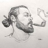
Your designs are nice, they have a romantic feel about them. It's hard to judge character design without knowing what their story is, so I wanted to talk a little about your drawings. In general, you draw really well, faces and hands look really nice.
The one thing you need to watch is your poses. Sometimes they look out of proportion and they tend to be kind of stiff. I did some quick sketches to show you how you can maybe add some gesture and attitude to your poses, I hope it helps :)