Looking for critique about shading and painting on my illustration
3yr

Tuna Bıyıklı
I drew Selena Gomez and tried to make it look like a little cartoony. I dont know is it my style or I did like that because I could. I'm open for critiques! :) It took me like 3 hours


Hey Tuna,
I think one problem is that your drawing has no gesture. From the head to the crotch is a straight line and it makes the whole thing look stiff. The reference shows her weight on her right leg causing that hip to push out, this gives the pose more gesture and flow. I did a quick sketch to show you what I mean, I hope it helps :)


For anything you're keeping cartoony like this, line confidence is critical - it's ok if there are some searching lines on your draft, but you really want to be definitive on your final linework, avoiding any scratchy ghost lines. Additionally, you want to use your line weight carefully to ensure the drawing reads well even before you put colors on. For instance - see how there's a tiny line of shadow where the hat wraps around her forehead? Using a very thin, ghosted line there gives us the impression that there is no overhang - i.e. this is a thin, flimsy cloth, or possibly even blonde hair. A bold line weight here would give the impression that there is a bit of an overhang where the hat folds over, and make it clear that the hat is something she's wearing, not part of her body. The same is true at the bottom of the shirt, the thin line gives the impression of "sticking" to her body in the drawing, where we can see there is an overhang in the photo. A bold line here would give the impression of a "drop shadow" and help create some distance there.
Thank you for all of your advices. I care them a lot and try to redesign my drawing. What do you think?

looks nice!
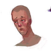
try pushing the darks even darker and making your darks more saturated.
more contrast between darks and lights shows the form better.