Hare/rabbit - hit me with your critiques 😁
4yr

Harmony Steel
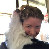
Ok guys - please hit me with your critiques. what can I do to improve this little hare (or is it a rabbit - does anyone know)? Reference included. I’m going for a whimsical illustration-y style. Thank you! ❤️
Hi everyone :) thank you again so much for your help with this little guy! For those who are interested I’ve posted the timelapse painting on YouTube - https://youtu.be/ifv8-nI_1PU

He is a hare! <3 If he looks like a crazy wizard that might beat you up because he has pollen allergies in March... then it's a hare generally. *laughs* But this is a joke. Now to the point.
I think it's very friendly!
Pay attention to where your hard and soft edges are in lighting.
What should be important should remain hard edged, even in whimsy, unless intentionally deviated. Here it seems appropriate to mention. (You have done this a tad already, so maybe this is a confirmation of your decisions in fact).
Photos will not include this aspect of "intention" unless the photographer had a similar motive. When referencing we must adapt what WE would like to say, rather than the reference providing the soul. It is an attache; Zazu to Mufasa. (unless you are the photographer. Then I would say you are a bird-lion and Napoleon Dynamite might doodle you in his notebook! ahah)
Here, his face you have painted, is so loving that we must keep it centered! I see nothing that detracts from his face, but that you may even allow the darker shapes to permeate the left side as the ref displays. I am unsure of the photographs origin but whomever took the picture may have intuitively felt the need for the light beam to slash his figure in the background. You may see that in squinting your eyes his head is lit up by a halo in the photograph. This brings our attention front and center. No confusion allowed by the photographer.
It is very well done so far! Keep tinkering! You have a great sense of "Harmony" innately! :B *punpunbunbun*
P.S. Rabbit faces are notoriously hard to draw I have found. They are often like cats in shape and yet... similar to a wooden dancing clog. ahahah There is no advice here but kudos to your choice of subject! I pray the nature of it hops you up on joy! <3
Thanks @Marshall Zazen ! Haha your comment made me laugh, love it :) "If he looks like a crazy wizard..." made me think of Radagast (sp?) from Lord of the Rings? I've taken on board your tips about the lighting and edges and it made a big difference, thank you.


So cute! Splendid drawing! I only would make the grass right in front of the hare a little bit lighter since the light source comes from the right side. And on the left side in the background I would integrate a few darker tones. Than the view will be more directed to the hare and a little more away from the background :)

I’m not skilled enough to give you an advice. I just really want to tell you that your hare looks so cute and fluffy!
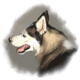

The design is very nice. As a cartoon representation it's very good, the face is really very cute and expressive.
I would only suggest you to define the structure of the shoulders and the front legs a little more: I know you can't see them in the photo but, as it is a stylised representation, you can suggest them a little, define the body shapes more, maybe give a little more softness to the chestll hair.I'll attach an example on the fly, just to make you understand what I mean (sorry for the mess, I'm about to start the weekly diagnostics of the mac, I've already deactivated the graphics tablet and I'm no longer able to use the mouse! ^^;;; )
Thanks so much @Serena Marenco ! I really value your feedback. I've done my best to hint at the shoulder and the knee, is the attached version better? I also made some lighting changes, and tried to make the fur fluffier as you suggested :)
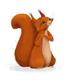

I think you nailed the hardest part, the face. The face is so cute and has so many details, the eyes shine and he vibrates happiness.
I really think the parts that are not working so well are all minor and can easily be fixed. I will mention some points so it might look like it is a lot, but it really isn't, there are so many parts, that already work: the fur, the face, the mood, the whimsical style, I really like the interpretation of the reference!
Right now I think the background is taking too much away from the rabbit. The yellow is too dominant because the background is yellow, the background lighting is yellow and a big part of the rabbit is yellowish. i would try to seperate these things. In the foto the yellow is in 'blotches' I supposed it is foliage. But in your version the yellow has lines from the top right and it feels like a really strong massive block of sunlight. Which does not really work with how the shadows on the rabbit are done because the light seems to be coming from behind him (top right to left front). The light on the rabbit is has teh original direction (more from teh top right).
I would just try a more spotted version, so it really drops back into the background.The yellow from the light is more subtle in the reference. I am not sure if it is not actually more sky bluish, on the gras it seems like this, but on the rabbit there are warm tones, too? Maybe because the foliage makes the bouncing light warm. Obviously this is practice for me, too, so please just take what makes sense to you.
The second main thing is in my eyes that in the reference the bounce light from the gras is very clear, the rabbits bottem front is almost blue/green, the yellow is on the top right of the head. Going for these colors might also help seperate the hare from the yellow background. The shadows also appear more bluish green to me, although I really like the contrasting violett you used. I can't give you a solution, but it might be worth experimenting with the some subtle green/blue shadow and bounce light. I am far from really understanding lighting so please just take this as ideas.
Small thing: Put a shadow between his front legs, , they are not appearing as legs right now to me.
I really hope there is somethign useful in my thoughts. It is already such a beautiful drawing!
Thank you @Sonja Müller !! Really grateful for such good feedback, thank you. I've done a heap more work particularly regarding the light and the focus and hopefully he looks better now, you were absolutely right that the original background was way too bright and yellow.
I forgot to add I’m thinking the background needs more depth? And I’d particularly welcome feedback on the anatomy and colors. I did try to update my original post but it seems posts more than 2 hrs old can’t be edited.