Figure Drawing Critique
4yr


Philipp Meyer
Figure drawing in black Faber-Castell Polychromos after a photo of Natalia Majewska from Kan Muftic's "Figure Drawing for Concept Artists". I will add an image of the lay in and an image of the final drawing without any digital processing. Any advice, critique or comment on the drawing would help a lot. Thanks in advance.


what you can improve is the shading, use the side of the pencil, remember to sharpen it
proko has a video on youtube that can help you "how to shade a drawing"
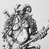

Just picked this book up so I flipped through to find the pic! Echoing others here I really like what you've done in the torso area, strong indication of form and good shading there. As others have provided more comprehensive advice I might say that the back foot could use some work in the initial shape design. The overall form of the foot should widen more as it goes from top to bottom and you could afford to exaggerate the splay of the toes a bit to enhance the impression of the force she is placing on that foot. Proko's foot videos would do a much better job than me of explaining in more detail.
The foot thing might sound nit-picky but its an important part of what makes the pose dynamic as it supports the extreme diagonal nature of the pose.
Hi Nate.
Thanks for your analysis and the effort even looking up the reference. You are right, thanks for pointing it out. That foot also seems to be quite a bit too short and stubby.


•
4yr
This is awesome Philipp. Really strong proportions, and gesture. It's definitely a study to be proud of.
What I would say is is widen your value range. The entire drawing right now is mid range with no darks. What that does is cause the eye to wonder around your entire drawing. It's correct, and well done but the lack of variety value prevents the drawing from having an visual hierarchy. With out that, it seems like the legs are as important as the feet.
In a lecture I saw by Iain Mccaig, he said "The secret to drawing and the secret to life are the same thing: Contrast. Without dark, you don't have light, and without that contrast you don't know what to look at because it's all the same. Without sadness, happiness is boring because you don't have anything to compare it to." In school, I learned that art as a skill is all about relative relationships. Dark vs light, sharp edges vs soft edges, corners vs curves ect... And getting better is all about juggling those relationships.
Also, careful of the shoulders, the angle of the breasts make it seem like her shoulder is way further down than it should be. If I were you, I'd invent an arm or something to give a better implication on where that should is.
Hope this helps, and keep up the good work
-Kristian
Hi Kristian. Thanks a lot for your feedback.
Mr. McCaig seems to be a wise man. I will write that quote into my sketchbook. :)
I see what you mean regarding the shoulder. As I look at the drawing now, even the visible shoulder looks odd. But invention of bodyparts is something I struggle with even more than value organization. Anyway I guess that is just another challenge to accept.


Very nice! I like the abs. Allthough as Gabriel Kahn said, you could exercise a bit more your core shadows making them consistent with the ambient, and the core shadow transition to shadows and reflected light, to make the values more realistic. You should check out Stephen Bauman for some tips on shadows. Keep it up the good work!
Thanks for the critique. I never really thought about the transitions of the core shadow to nearby values, but in future drawings I will absolutely try to remember to do that.


Great work mate! I really like your shapes. The biggest problem that I see right now is the inconsistency of the shadows (on her head the shadows are stronger than the ambient occlusion which is not going to happen in real life, I'm pretty sure). Other than that maybe try to strengthen the value of the core shadows and soften their edges more.
Wonderful job! Keep it up! :)
Thanks for your feedback. I tried to give more focus and therefore contrast to the head. That's why the shadow shapes in the face are so dark. But I see your point. In general the values are propably not correctly organized.


Hi, I think I've browsed this book a few times & liked it a lot! Isn't it the one where he says that what changed everything for him was when a teacher told him that he was a digital artist because he drew like he didn't had a purpose? That citation marked me!
I think your drawing looks great (I beleive the finished one is the firsty one?). A few things I noticed though I'm not sure I would have done this well:
+ I would think the cast shadow on her right tigh should be darker, considering you have other darker core shadows? not sure
+ the stool seems flat with a uniform tone (with drapery I guess?): It's hard to see her sit on it
+ the core shadow on her right tibia could use some more refining I guess
Correct. Henry Yan was the teacher who said Muftic "[...] moves his hand around mindlessly [...]". I bought that book hoping it would include a more in depth explanation of the Reilly Method, which it does not. So I was a bit disappointed, even though it is a good book in my opinion.
The first one is the finished one, but it has some digital processing (increasing contrast, whitening the background, etc.). You are right, when trying to finish drawings I have a hard time organizing the values correctly. The stool and drapery being flat is a good point. I did not really think about how she is actually sitting on it.
Thanks for your feedback.