digital drawing critique
5yr

Peter Cohen
Hi everyone,
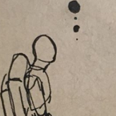
I drew this last night using Photoshop and I want to know how I could make it better. The arms and other features are exaggerated but I want the figure to look believable (as believable as a begging goblin could be). Any comments on perspective, form, design, whatever else are appreciated! Thanks!

Hi Peter, I have a couple of thoughts. I wouldn't have known from just the picture that the goblin is begging. I think placing the candle and food a little more next to or behind him (instead of in front of him) might help the composition. It would also clear more space to see his hand which is a really important part of the begging gesture.
But it depends on the story. How central are the objects to the story? Is he offering food? Are they enjoying a meal together? Or are they just for ambiance?


•
5yr
Hey, Peter, this looks like an interesting situation for a goblin, did you have a story in mind when you came up with it?
I wonder if it would be possible to give his facial expression more emphasis, perhaps enhancing the intensity of the expression, or maybe pushing the design to make his eyes and brows pop more? Maybe give him a "thought bubble" sentence (maybe not literally write it on the drawing if you don't want to, but think what it could be in your mind), this could help you make design decisions more deliberately, since it would back up for what the character is thinking or feeling. Also, since he looks so weak, perhaps you could draw the body gesture to communicate that in a more exaggerated way, such as curving the spine some more, maybe make the shoulders drop down more heavily so that he would look even more debilitated and have to make a greater effort to raise his head. Just a few ideas. :)
@Liandro Roger Thanks for the response! I added more detail to the face to indicate how tired the character is. I found the circles under the eyes really helped. I also changed some of the proportions and gesture to look more tired including your suggestion on lower shoulders. The ears and nose are also a little more droopy. I think it helped push this further really appreciate the feedback!