Critiques plzz
4yr


Jakub Lindsey
I’ve been stuck on how to how to refine my shading and make it closer to a more professional drawing. Especially the skin because it looks blah. Also i do realize the head is the wrong size plus the body shift.
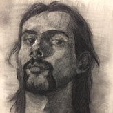

First of all, that's an awesome job you did on the coat! In my experience, if you find the biggest shapes of the figure then divide each of those shapes into smaller ones, it both gives you more accuracy in depicting the model and helps you find the planes of the surface. By finding these shapes and understanding the planes they represent, and also, having the lighting scenario in the back of your mind, I believe you will find drastic improvement in your work! the good thing about this is that it helps in every medium!
(try looking at it like using negative space, after all the negativity of a space is relative :)) )
Account deleted
Great looking drawing. I particularly like the clothes and the shadow shapes; it feels like the fabric has some real volume and weight.
Overall, I agree with @Antti Kallinen.
But, I think the overall lack of light may also be because of the photograph itself and where you took the it.
If so, then try to make sure you have good lighting when you photograph, and, if that's not possible, I believe Proko suggested to photograph in the shade outside in daylight. You can also try tweaking the brightness / contrast digitally if the photograph feels dark or too light.
Either way, good work! :)
Thank you for the tips! I just tried a little bit of tuning on the contrast levels, exposure, and what not to see what i could do. It seems the back is too overall lit to do much but I can get a little more depth. I think maybe studying light on masterworks will help me find better lighting in general.


Well i think your shadow shapes look ok, but it lacks in lighter areas. So either deepen the dark end and make a middletone for the skin, or make a lighter tone. But before that i think you should fix the shoulder area and face if you still can. Thats what i would try. Its got a nice feeling to it, worth fixing.
Thank you for the insight. That really helped me a lot because I wasn’t thinking about mid-tones too much. I usually do figure sketches with two tones by blocking out the shadow shapes and leaving the areas in light white. I do have a sloppy sketch I made that represent my two toning. In addition, on that same page, I have a botched fix on the original post (i did it awhile ago and added charcoal on graphite :|).