Critique pls :)
4yr


Dennis
Hi! Ive just made this ink/digital portrait and I feel fairly ok with it but don't think the likeness is all there. I would be super grateful for critique on how to improve the likeness and any other improvement in general!
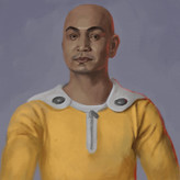

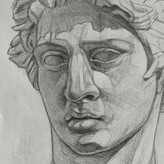

I'd argue that whenever your going for realistic likeness, if theres an issue its a propotional issue. Here, I think in your drawing the jaw is much larger and bulkier than it is in the reference. furthermore, though the details match the reference well (and btw your line work is super clean) I think if it were digital i'd recommend messing around with the liquify tool to see what proportions you could push around for better likeness. Also, consider getting a more high rez image. Its really hard to make proportional decisions with such a small image.
Thanks for the feedback, very helpful! I can see it now that the jaw looks more bulkier, but never thought of it earlier. I'll also try messing around with liquify :)


Hey Dennis,
The first thing to jump out at me is that the lower part of the face is wider in your drawing than in the reference. Because of that, it makes the neck feel to wide also. Hope that helps :)