Critique me!
3yr

Dan B
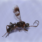
Colour scares me. I've been mostly avoiding it for too long. I also generally keep doing 'sketches' and don't commit a lot of time to my drawings... until this year!
I was doing some macro photography in the garden and took a shot I really liked of one of my favourite wasp species I finally saw for the first time. So I thought it's time to tackle colour and commitment properly.
Please critique me, particularly on my use of colour and light. I've been a bit lazy with my art and now that I'm getting back into it I want some critique to weed out bad habits before I get carried away :P
Made with infinite painter on iPad. I really like the 'Wet Marker' brush as I find it works a lot more like paint than a lot of painting brushes. Seemed to look a lot more vibrant on the iPad, looks a bit muted here :/
Oh and Happy New Year :)
Source photo is 5th one here: https://www.inaturalist.org/observations/103925475

Dang this is looking sharp! I think you actually got better gesture for the antennae and rear legs.
It's kind of an awkward pose, because it kinda want to show force but the legs are kinda like a blob... I'm not sure how much of an artistic freedom for bugs anatomy, but if I were to do this maybe I could extrude the knee on the left leg a bit more so it's gonna be like a "s" shape, which may convey the force better.
Thanks! Yep one of the unfortunate things with bugs is all that dynamic muscle and flesh isn’t there, it’s all pretty rigid. This is painted from a photo I took, it can be quite difficult to get good insect references aside cool colours because they’re so rigid.
I’d like to get into a bit of exaggeration with them eventually as they have some pretty cool anatomical characteristics within the different species.
Updated attempt incorporating feedback from Mårten and Smithies, I think I’ll call this one done now as I’m starting to lose track…. Hope this looks improved and more cohesive.

Hey. I actually like your use of color here but I am a sucker for a bit of muted colors, so I might be a bit biased, haha. I like your painting and was also drawn to specifically the wasp and the wings - they where really nicely handled! You made the wings very subtle yet destinguishable. I am not great at color myself since I've also avoided it for quite some time - so take my advice with a grain of salt; but I can also, as Smithies said sense that there are some values in the flowers that may not work with the rest as well as it could. It might be that your lights in the flowers are a bit too light (just a smidge) - especially the parts of light that are hitting the stems. I think it may make some of them look a bit unnatural
Also, I know your reference-picture has quite the more vibrant colors and the lights on the stems are quite intense, but the darks and midtones there dont go as dark as in your image - so since you have made your whole image a bit darker and subdued in terms of value - the brights on the stems really stick out. I've attached an image highlighting the shadowshapes I'm seeing on the reference along with a comparison of the values on the reference (top swatches) and your image (bottom swatches). Maybe you can pull something from there?
Seeing your adjustments - I still feel there are some troubles with the values in general around the flowers. It's as if you added a viginette to the lower part but I am not sure it helped unfortunatelly (sorry!). I'm rambling a bit.. So I tried to treat it as an exercise myself and I did a paintover to show you roughly what I'm thinking - It might look a bit muddied though. I tried to push the lights down on the stems which kind of makes them look a bit flatter in return - but since your background is very dark I think it's a bit inevitable to end up there without changing too many things. Ah yes, I added just a smidge of light to the wings aswell since I felt the tips could be a bit more accentuated (not sure if it was reallly needed though?). Again, not entirely sure if my changes were an improvement so hopefully someone with more experience can shime in and help you further :P
Thanks for the feedback! I see what you mean with the flowers, there's too much contrast in mine given the muted nature of the painting overall. I did kind of add a vignette to fade the flowers out a bit, but I'll rework it as it doesn't look like shadow like I thought it would...
I'll play around with it some more to get a happy middle ground hopefully. Appreciate the detailed response :)


Hello! I actually really like the colours you have used here! The drawing of the head is awesome and I love the way you have handled the wings. I think I find the flowers or the values a bit distracting but I can’t figure out which - like my eyes are wandering and I don’t know where to focus, but there is a lot of skill here so congrats :)
Thanks. I've made some small tweaks (just in Krita and not 'neat') with the colour intensity and making the flowers fade a bit at the edges. Does this look better?