Colour Question: Dim Indoor Portrait (+Transitional Lighting/Subsurface Scattering)
1yr

Vanessa N
Hey all, I've wrapped my brain into a bit of a knot trying to sort out the colour of light and it's effect on skin tones in dim indoor settings.
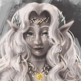
I'd love it if someone could help me sort out what colour the shadow areas would have been in my attached mini example painting (Zelda), or explain some of the reference images' colours attached.
(The post is a bit long, so no need to answer all questions, any help with this topic is appreciated!)
-
My Thought Process/More Specific Problem Points:
If the figure was in moonlight, I think the expected colour is a greenish or blue ambient hue, and if they had a lamp or a warm light on I'd expect a yellowish or orange colour cast on them. (Correct me if i'm already wrong)
In the referenced examples, characters are in indoor spaces without man-made lighting. All of them, despite the rooms and spaces not being overtly purple, have an ashy purple-ish tone to the skin. (This is where my brain gets all confused - how do I know the underlying skin's base colours!? Why purple?)
My example image was trying for a block of brighter highlights as the sun gets lower (thinking, just before golden hour) streaming in a nearby window, and I initially mapped out transitional blocks where the light might come through ("1"). I made these light spots transition with a yellow/orange from the light getting lower in the sky. Do you think, since it is falling on the skin, I should have made this transitional shade a red colour only? If the light is relatively bright, even if only in the few mapped out spots, Is the problem that the rest of the face being in shadow is unrealistic?
I also couldn't decide why the references all seemed roughly purple. If the indoor space is a white, grey, brown etc you'd think a simple brown/grey colour would be the main shadow colour, but I already knew that wouldn't look right. My current conclusion is the reference images look purpley and ashy due to a blue tinted cool lighting from remaining atmospheric colours from the sky outside (as there's no other lights to override the blue tone, even if they aren't directly exposed to the sky when indoors) and the purple is created through some subsurface scattering type effect where the redness of the skin is being enhanced?
ie. weak remaining light is blue + redness of skin is showing through more = purple
I also tend not to work in digital, so the colours i gave for examples ("2") aren't exactly the same ones I can mix on my palette, but the un-pictured middle stage gave me a very lifeless looking skin. How do you think the skin keeps some livelihood even in such ashy cool-toned settings? I tried just adding a warmer pink blush colour, but it was a bad patch for the problem which I later painted over.
-
Thank you if you read this far :) I hope to read your thoughts!


Hi, here is my interpretation of the of the lighting. I like to add a bit of mystery with colors. I only used the cloak color and background light orangey color using values and large blocks of color to create a mood.
Asked for help
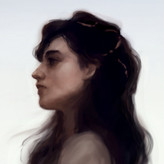
Follow Up: I saw the following image online and thought maybe I'd try with a brown shadow instead. I turned the photo black and white to check Values as Steve had mentioned them. I think the values aren't too off? Though I'm partial to soft watercolour and pastel art, and this lighting might call for a very high contrast.
The problem is I've gone from a purple shadow which was corpse-like to a brown shadow which seems monkey-like or something - it still isn't feeling like skin. (ie. darkening the brown shadows to make them higher contrast would likely look muddy - not skin-like)
I'm closer to putting this one down (will probably do some blending, glazing, and add a few details to the cloak - but don't plan to finish the glove on her hand at all), but once again, any input, critique, or insight is welcomed.
I'm thinking still that maybe the transitional colour HAS to be red/pink (not yellow/orange) due to the subsurface scattering on the skin.


I agree with Martha, try doing some thumbnails to work out your color scheme.
I also think you need to work on your drawing and creating form with your values. You are never going to make it look right if your values are not correct. I did a quick drawing and value study to show you what I mean.

•
1yr
Hi! Not sure what exact medium you are using, but if the page is starting to feel overloaded, I might suggest trying out some color thumbnails to map out the exact effect you want to achieve first. While a stronger red/pink transitional color is certainly a possibility, I might suggest for this image to use a warm bounce light in the shadows as a way to achieve that desired pop of color effect in the brown shadows. This can create a softer effect that doesn't divide or reduce the clarity of her face as much. I encourage you to experiment with small thumbnails -- and this is also a good practice to build an intuitive sense of color. I did a few quick examples based on the references you provided:
The simplest answer is: its all about value.
If the value is correct, then technically you could use any color and it would work.
In the reference you have, the colors were chosen by the artist, even the screenshot at the end was colored in post editing.
Now, I'm going to give you a generalization: warm light= cool shadows.
At golden hour, when the sun is setting, the light is very orange/red so the shadows tend to be purple. Skin is a desaturated orange, so when in shadow it starts to look purple because the shadow is cool, but the warmth of the skin takes it from a blue to a purple.
Again, this is a generalization!
My suggestion is, if you work digitally, then create the lighting and values in gray scale first- then color over it with different colors and see what happens.
Hope that helps :)
I'd somehow forgotten how much films are edited and colour toned in post production. Perhaps the blue/purple/grey cool overlay is more a conventional colour implied to be "in the dark" by films and media (when the real setting may actually be too dark to be captured by a camera or the eye if truly filmed in low light)? Stylized similar to a "night vision" shot to make things visible for audiences when it would otherwise be hard to see the values?
So maybe the difference between thinking in terms of stylization and cinematography conventions rather than trying to logically find the realistic lighting setup (which may not exist) was part of the problem.
Great recommendation, thanks! I don't work digitally too much, but I'm sure I can mess around with some colours, and do thumbnails both digitally and traditionally to help me sort out the values/colour palette of a few similar lighting scenarios.
Thanks again for taking the time to reply :)