Colour / Lighting study - I'd love to hear your critique!
3yr
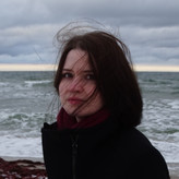

Nova Astralis
I was going for slightly stylised realism, but mainly it's a colour / lighting study. Is something looking off? What feelings does it evoke? What could I do to make it look more "professional"?

Looks great!:) feels like a summer day at the beach :D maybe just even a loosely painted scene? Looks great tho!:)


It's spot on. Feelings are hard, it may need a story/scene to help evoke. Its professional standard. How to make it better is subjective and based on the style you're looking to achieve.
Thank you. It's been a while since I posted my work, but your comment made my day then. "Professional standard" is great to hear.


I think it's a wonderful study and a great piece that goes beyond just to study. The colors and the light look very natural and nothing looks strange or wrong to me. Although, it would be nice to compare it to the original.
The more I look the more that the background is a bit less natural because it's such a blank space. The bird is casting a shadow yet it feels as if the bird and the shadows are floating. The color of the background seems a lot like sand but it's missing the texture that is found with sand and maybe a soft gradient to imply distance.
The feeling I get from this piece is calm and silence. It is a very quiet painting, very contemplative.
Regardless of these specific details overall it is quite wonderful!
Thank you! Since it was only planned as a colour study, I didn't bother painting a background. You're right, it's just blank & not appealing, although it looked even weirder without the cast shadow. I now put the reference photo in the comments!


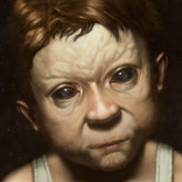
Wow that looks really good! Take my advice as a grain of salt because I am no professional but I think maybe the outline of the head is too much of the jagged line where it hits the light. It could maybe benefit from smoothing it out to be more curved.
Thank you for your comment! Yes, you're right about that part looking jagged. I wanted to make it look a little stylised, so the hard edge was on purpose, but I see how it's a bit extreme there.


It looks good to me, maybe the shadow are a bit too blue compared to the zone in light but at the same time it helps show that the scene is outside, idk. I really like the forms, the shapes are well defined and it feels 3d.
Thanks a lot! I exaggerated the colours of the reference photo (which I now put in this comment section). Perhaps I did it a bit too much :)