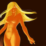
Character portrait - from reference. Shape design??
4yr


Rubén Frutos
Hey guys!! I wanted to share with you this way of practicing that I grabbed from @Ahmed Aldoori . Where he picks a ref and starts asking the question "What if?" in order to bring in the design to the portrait. (Here's the video of him explaining the method https://www.youtube.com/watch?v=Q2cS32ybTPU )
I tried to stay focused and keep always in mind shape design. Thoughts?


•
4yr
Hey, @Rubén Frutos! Very nice work, I like how it turned out to be a pretty interesting character!
As @Luca Funckner mentioned below, I also think the background is competing with the character a bit - besides simplifying its borders, I’d also suggest using a lighter value for it so that the character’s silhouette can pop out some more.
Another thing that calls my attention is that it seems you’ve been using a pattern of pointy edges and sharp angles as a visual motif - I think that’s cool, and what I’d suggest is that you pump it up even more - look for areas where you can explore this same visual pattern to reinforce an identity to the design. Overall, a slightly higher degree of exaggeration should be nice too!
About her horns, I like the idea, but since she has a skinny neck, maybe the horns’ volume has become too much of a heavy visual mass. I think exploring some negative spaces could help ease this heaviness, as well as create an even more appealing silhouette.
I went ahead and did a paint-over on top of your work applying these ideas in my own way! I made some changes in her outfit because somehow she seemed to me as some sort of royalty, or someone with high social status, so I tried to make the dress incorporate this idea some more (now I wonder, had you thought of a backstory or something for her?) I also dared to stylized the anatomy a bit in a way to apply the sharp angles motif (bony structure, lips, angle of eyebrows), so it looks a bit less realistic than in your initial version. Anyway, it’s just an idea, but see if this image helps illustrate the considerations I made! And, of course, keep in mind there might plenty other ways to apply variations of these same principles, as well as other creative solutions you might come across along the way that I didn’t consider - so please don’t face my feedback as a “correction” or a “must-do”, as it’s only one of the possible ways this could go - feel free to keep pushing it in whatever way you wish.
Hope this helps!
Let me know if you’d like to share other thoughts.
🙌🏻
This looks amazing, Liandro!! Everything that you said makes sense, and it helps to reinforce the initial idea that I had for the character. As you mentioned I thouhgt of her as high-class nobel or even a Queen.
I Love the anatomical changes you did. Sometimes it's hard for me to take distance from the reference when it comes to facial features, but it makes it more interesting for sure.
I don't think I'll touch it more than what you did tho. This feels already like an "old" sketch that I did to mess around with a reference, but I'll for sure keep in mind your tips for the next one!


Hi @Rubén Frutos. I think it come out nicely as rendered exploration. I would choose something more simpler to focus only in the design of shapes. But it works too if you can do it naturally. Also, you used your reference but as reference, not just coping. So it is is well done in that aspect for me too.
About the shape design, Im learning though. But what pops up for me is the background. You have spike-like shapes with directions that goes into several places. That's ok, but the background does, in a minor way, the same. Try to use a circle or square as background. Because of its stability it will probably be a good contrast in shape design. An mwwebe a change in hte value scale to make the character to pop up more would be better too.
Hope it helps. Keep the practice up!

Lovely design. I'm not there yet so I'm not able to critique the design. I just find it quite interesting.
Other than that, I notice the collar bone on the left is less protruding than in the ref photo.

Asked for help
Thanks!! And, as always, any comment/critique is more than welcome!! (not only about shape design)