


Albums

Activity Feed

Kris A
•
2mo
added comment inProject - Learning to Sketch from Observation
Asked for help
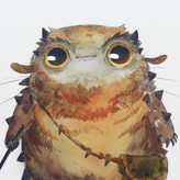
After watching the demos, I felt a lot more confident. I’m traveling so had to work on the iPad this round which definitely feels different from the pencil and paper at home. But I think the concepts are there. Tried to keep my lines lighter as I explored the major shapes and flow of this guy. Didn’t want to get too detailed and keep my mind in the open exploration mode. Feedback welcome!

•
2mo
It looks like you got the concept. Your lines are long and light and simple.
The eye got a little scratchy. I know this lesson is far from an anatomy one. But I think this little tip could help out your drawing.
Keep at it and keep drawing
Kris A
•
2mo
Asked for help
This felt really rough/tough for me. First I really misjudged the size of the robot on the page. And completely fell apart trying to draw the circle on the edge of the page. I’m still struggling a bit to get that tapered line when I’m just sketching. I feel like I did mostly lost lines (per the metaphor). Very very lost lines.
It did feel like it improved (from robot to hand to penguin) but I also need to lighten up it feels like. Otherwise, lines show through where I really just meant them as reference (the penguin’s bottom/leg). Feels like I need more daily practice with this tapered line and clean/strong lines. My lines feel really unsure and shaky.
Any advice welcome!
Kris A
•
3mo
My pears. I realize I should have gone sharper with my edges and some of my proportions are a bit off. I also realized (after watching the demo video) I could have switched pencils to make it easier to get the darker values. I’m using Procreate and used a single pencils but really had to figure out the angle and the pressure to get the different values. I think I could have switched to other pencils within the app to make that easier.
Thanks for any feedback!
•
3mo
It’s really cool that you went for some color here. The red adds an extra level of interest to your pear study. It caught my eye.
You could use a single color for all the values, but I think the darkest value should be darker. You don't want black, but somewhere around 75% dark would be good for this assignment.
This isn't a lesson about color, but i think it could be helpful to know some basics.
Theres 3 parts to color:
hue (red, blue, yellow, purple…ect)
saturation (how vivid is the color)
and value
You can play with the color wheel in Procreate. This one with the 3 sliders is a wonderful visualization of how hue, saturation and value come together to make different colors.
Using the same hue, but varying the saturation and value, I made my own red pear study. The most saturated value is the one in the middle in mine.
This give the pear more dimension. It pops off the page.
Cool stuff. Keep it colorful and keep up the studies!