How do we create the illusion of depth? How do we fake 3-dimensionality? In the next few videos I’ll try to explain all the ways that I know of.
Now this is not going to be about how our binocular eyes see two slightly different images from 2 different angles and our brain interprets those as a 3d image, none of that scientific optical jargon about how our eyes work. I'm talking about how to create depth on a flat surface like canvas, paper, a wall or a computer monitor. I’ll go over actionable things that you can use now to improve your drawings. We, 2-dimensional artists, only have the x and y axis to work with, but we need to learn how to draw 3d objects and 3d environments if we want to effectively portray our world. To do this, we need to be able to imply the z axis, that’s the one that goes towards you and away from you.
Contrast
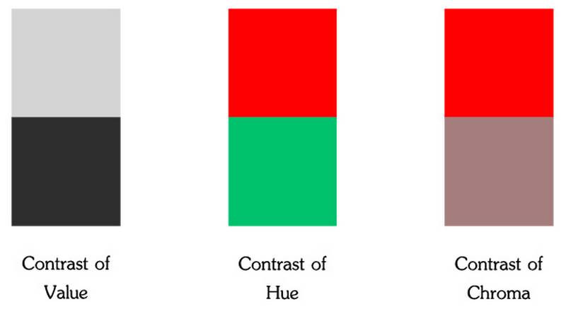
The first and one of the most important concepts to know about to create depth is contrast.
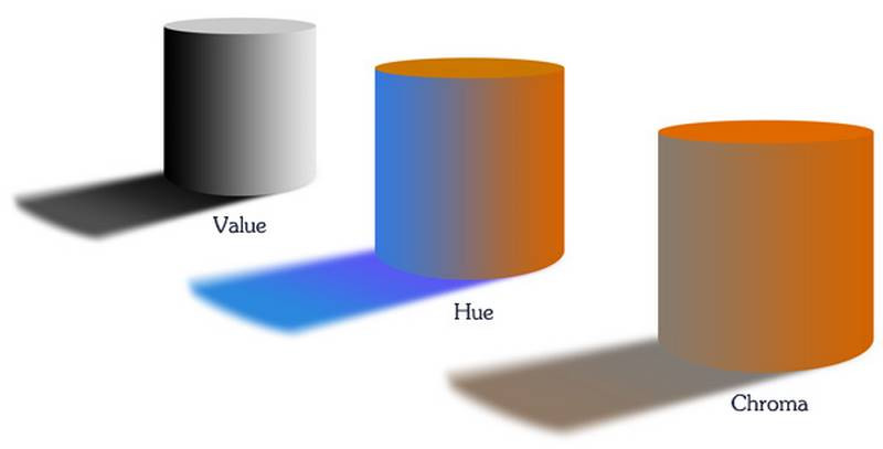
This can include contrast of value, contrast of hues, and contrast of chroma, but the most effective is contrast of value... Areas with a lot of contrast will come forward; areas with little contrast will recede.
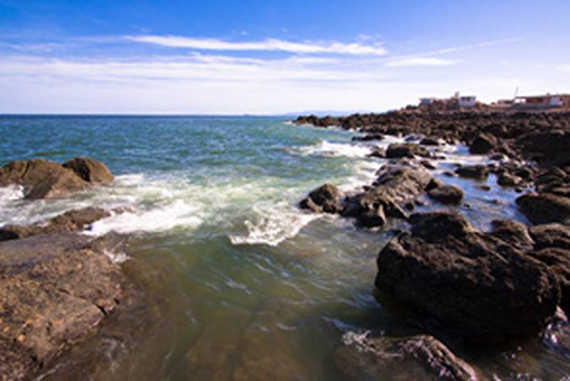
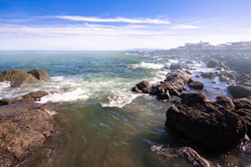
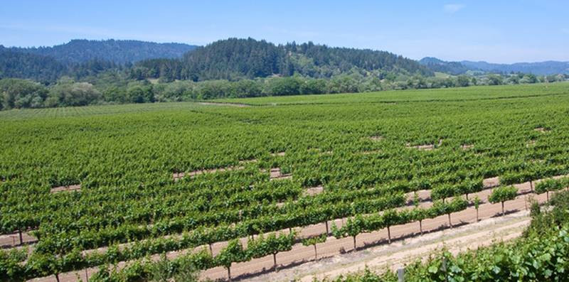
For example, in this image the foreground has a lot of contrast, which is fine. But the background also has a lot of contrast, meaning the range from the lightest light to the darkest dark is wide. it includes almost the entire value scale. If we want to push the background back and make the foreground elements pop out, we can lower the contrast in the background elements. I'm doing this digitally with a photograph, just to illustrate the concept, but I would do the same thing if I was drawing a figure or painting a landscape. We make these kinds of decisions to improve the visual impact of our pictures.
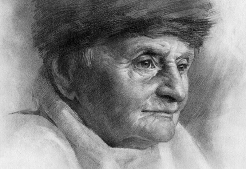
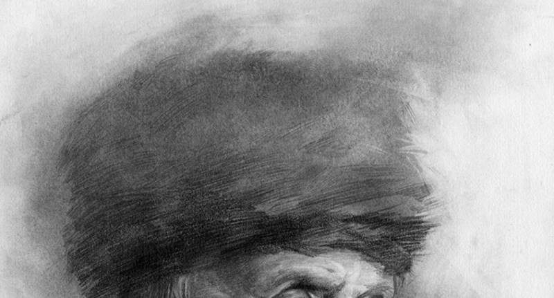
Quite often, when drawing a figure or portrait I will push an area closer to the value of the background, to make it recede. For example with this collar, as it wraps back around the head I want to push it back by lowering the contrast. I made the values almost identical and show only a thin line to suggest an edge. Higher, I darkened it a little to match the value of the hat. I was looking for ways to make the collar less visible as it recedes, instead of outlining the shape and giving it its own separate value. A common mistake is when we try to make everything important in the picture. We make everything pop forward and when everything pops forward, nothing pops forward. The image becomes busy and loses a focal point.
I tried doing the same thing at the top of the hat, by making the value lighter, closer to the background. By doing this around the perimeters of the portrait, it draws the eye to the center of the face, where there is a lot of contrast.
This not only creates depth, but also a sense of atmosphere. And it unites the person with the rest of the picture. It makes it feel like the object or the person belongs in the environment and not just a cut out shape on a page. Unless, that’s what you want.. You don't have to add depth to your artwork, but this lesson is not about not adding depth.
Aerial Perspective / Atmospheric Perspective
You'll hear landscape painters talk a lot about atmospheric perspective, or aerial perspective. This is the effect of the atmosphere on distant objects. When things are really far away from us, like miles away, this effect becomes very obvious. Mountains that are covered with green shrubbery or brown dirt, appear bluer.
That's because we're looking through a layer of particles and air molecules. This atmospheric layer scatters light from the sky and makes distant objects blue, during the day.. At sunrise or sunset, you could see warmer tones, reds oranges, and yellows. The greater the distance, the thicker the layer you’re looking through and the effect is more intense.
Things will also get lighter and colors less saturated. So, if you think about it, atmospheric perspective is really just a decrease in contrast. Contrast of value decreases as the value range shifts towards a lighter blue. Contrast of hue decreases as warm colors become cool, and contrast of chroma decreases as colors become less saturated.
This could be even more intense if there's fog, mist, smoke, or dust in the atmosphere. Sometimes the air is so dense that you can't see through it past a few feet. So, this concept isn't just for landscape painters. You can use it to add atmosphere to any situation. Steam in a kitchen, smoke at a bar, or throw in a really intense atmosphere into any picture where you want to create a better sense of air and an environment.
I've been emphasizing decreasing contrast to make things seem further away and add atmosphere. But, don't forget about the other end. Choose your focal points and increase the contrast in those areas. It's a great way to make those areas pop out at the viewer and call out for attention.
Form - change of plane, gradation
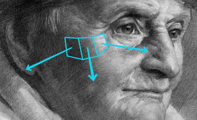
A change of plane on a 3-dimensional object indicates turning of the form.
Let’s observe the planes of her cheek. She is facing to the right towards the light source. So, this plane is facing that way. The halftone to the left of that is facing us and then the shadow plane in the side of the cheek is facing towards the left side. These 3 transitions along the forms come together to create volume. Individually, they would look like flat value, but together, as a gradation, they appear 3-dimensional.
You can show a change of plane with transitions of value, hue, or chroma. But the most effective is value. You can show a little bit of form with transitions of hue or chroma, but not nearly as much as a gradation from a bright highlight to dark shadow.
Other "rules" or guidelines that I’ve heard are, cool colors recede and warm colors come forward. Light values come forward, darks recedes. I want to point out though that these are very minor ways of adding depth and have a small role in the overall effect. A light object with little contrast might look farther away than a dark object with great contrast, depending on the value composition. So, it really depends on the whole picture and how you use all the concepts.
***
Ok, that's it for this episode. Next time I'll continue on the illusion of depth and explore ways of adding depth by using shape related concepts like, scale, detail and perspective.
Artwork used with permission:
Quang Ho - http://www.quangho.com
Zhaoming Wu - http://www.zhaomingwu.com

