
$127.20
$159
You save $31.8


Bundle discount Each additional course part in your cart adds 3% off all courses, up to 15% off.
Full course
You’ll learn the most important foundational concepts for drawing anything and soon you’ll be drawing pictures out of your imagination or from reference.
$127.20
$159
Give a gift
Give a gift card for art students to use on anything in the Proko store.
Or gift this course:


Founder of Proko, artist and teacher of drawing, painting, and anatomy. I try to make my lessons fun and ultra packed with information.


LESSON NOTES![]()
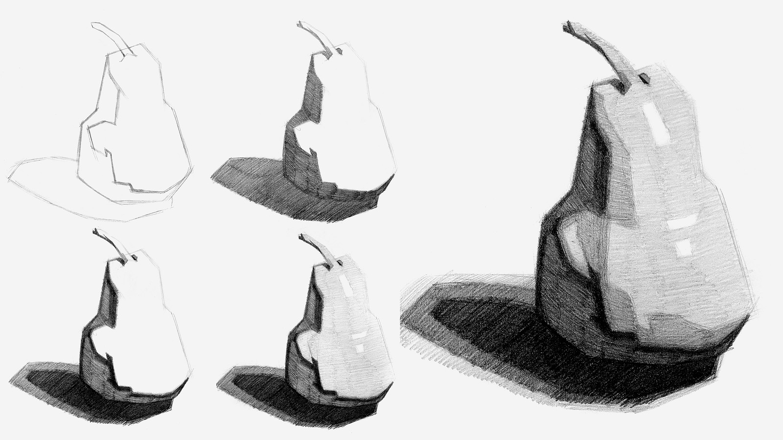
Now that you’ve all had some time to try the first project on your own, you can watch how I do it and figure out what areas you are exceeding and struggling with.
To watch this step-by-step demo on how to properly execute the first project for level 1 students, join the premium course!
DOWNLOADS
COMMENTS![]()
![Stan Prokopenko]()
![]()
![@luna411]()
![]()
![Zarkhan]()
![]()
![Zarkhan]()
![]()
![@aperson]()
![]()
![@persistencehuntert]()
![]()
![Manjo]()
![]()
![Diego Rivera]()
![]()
![Thu Trần]()
![]()
![Chronis J. Christoforakis]()
![]()
![Kamila Zamorano]()
![]()
![@heidirandallart]()
![]()
![Rithwik Bhumireddy]()
![]()
![Vicki Young]()
![]()
![@dutchcourage22]()
![]()
![Vicki Young]()


Now that you’ve all had some time to try the first project on your own, you can watch how I do it and figure out what areas you are exceeding and struggling with.
Here is my step-by-step demo on how to properly execute the first project for level 1 students.


Nice work! You've got some core values established, shaded evenly, and the construction, as a whole, is well-done.
For feedback or as a suggestion, I would recommend darkening your values more. Don't be afraid to really push those darks as they will strengthen that illusion of form and turning planes.
I'm no expert, but since your cast-shadow looks like it's at a 150° angle, I imagine the angle might've affected your read or visual analysis on the values. If that's the case, perhaps using an angle that supports bolder light-dark contrasts might be more helpful to you as a an artist working on their fundamentals.
I've been told fractiously by a painting professor that compositions with subtler lighting is useless to focus on for beginners and even intermediates... though he was a un-supporting professor, there's some truth there. Bold contrasts are easier to work with than subtler ones which require a sharper eye and surgical application of gradation shifts--both of which are, I imagine, unnecessary right now (but, of course, whatever your focus is you should work on). Whether that applies to your composition, or not, I don't know, but the advice here is relevant anyhow.
Regardless, overall I think your pair has come along nicely and you're, doubtless, on strong start for this course, seeing as this is the first assignment.
Good work!
Hello all!
Here's my attempt at simplifying the values for a pair. I actually started this assignment around five months ago (!), but kept putting it off since I was in the Spring semester for college.
I ended up doing two versions of the pair, both several months apart, with the most recent one a week or so ago--you'll see it as the one with a value scale on the page's left.
The one that looks more muddied was done on tone-paper, which I got at the behest of Stan who vivaciously recommended, from what I recall, the toned-version (or at least expressed a personal preference). Anyway, when I switched over to white, I found both the texture and weight much, much easier to deal with. I felt all the shading on the toned version wasn't taking or layering as it should've, but perhaps I'm simply not used to it. If anyone has an explanation why, feel free to educate me : )
Also, I would appreciate any advice for these pairs. I think I struggled, predominately, with correct value juxtapositions. My shading improved from the rough, muddied version, but the values simply look *too* strong adjacent to one another. (Also, I'm aware that the cast shadow is shaded inversely... oops).
I was also curious how, in Stan's shading, he was able to achieve such smooth lines where you can see transparency and markings, while the values themselves aren't blended... my guess was my tools, Winston shading pencils (HB, 2H, 2b, 4b, etc.), have a different application property than what Stan was using, but I could be wrong. I tried a lot of different techniques to mimic Stan's shading style, even going as far as to watch a Youtube lecture, but again couldn't really hone in on that transparent, scratchy, yet even look.
ANYWAY, your help or advice is welcome!!!


Hello, here is my pear drawing before the demo video and after.
I used the same pear photo that was used in the demo video as the reference photo.
Still going at it, true believers! Back to pear one, I find my last sub wanting, too much like a nude. I am trying to focus more on the lesson, Taking my time with sharp lines between values + grades of value. Also, I have an easier time with one single mechanical pencil, breaking out five grades of pencil is more challenging. NGL, Marshall Vandruff’s, “The Perspective Course” is inspiring me and between these two I’ve an embarrassment of riches


Tried it after watching the demo. Shading was more difficult than I thought. Would appreciate some feedback. Thanks!


I’d suggest making your edges and lines more bolder so therefore you can have a much cleaner outline when filling in your shading and overall giving it a more defined appearance— keep it coming!

Second try following this instruction. It’s harder than I thought🥲. I’ll need to work on this more.


Hello there. The one on the left is before I watched the video and the one on the right after I watched it .....a bit more messy I think?! Maybe,different. Thank you.

Second attempt. I tried again after watching the demo. I think I could have pushed the values a bit more but, I like this one better than the first. Open to critique on how to improve.

I did my first pear and made it too detailed! I didn’t get making sharp edges, so while yes my refined pear looks more like the pear itself, I really like the 2nd one I did with the sharp edges better because I learned a lot more! I felt like my 2nd drawing was way more loose and interesting.


He hasn’t gotten to contour lines yet, but you may want your lines to look like they wrap around the object. Good drawing!
It’s stunning. You made the same mistake as me, you didn’t leave room for the shadow.