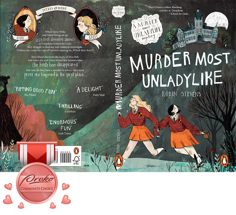
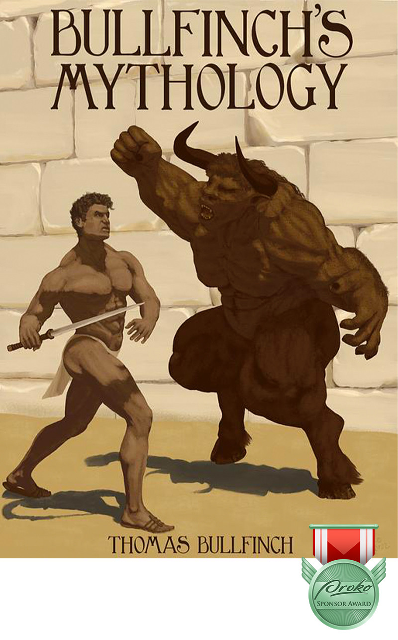
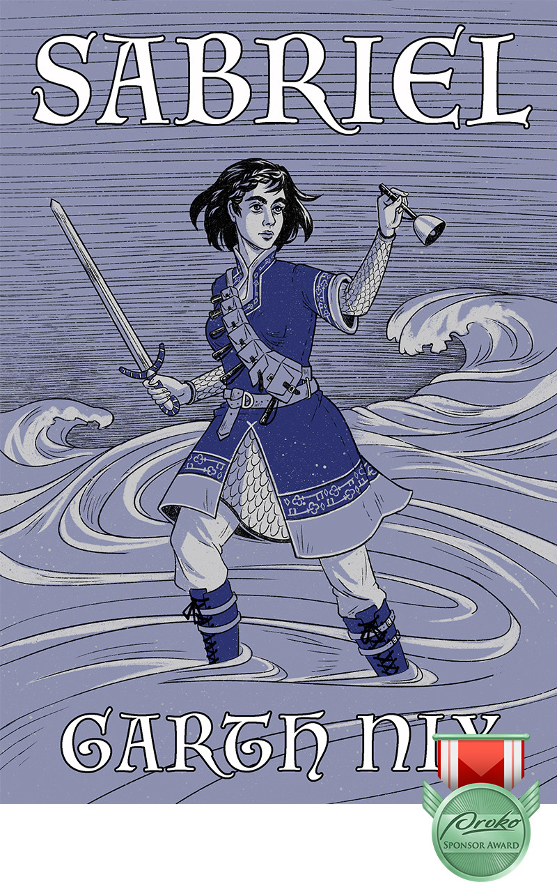
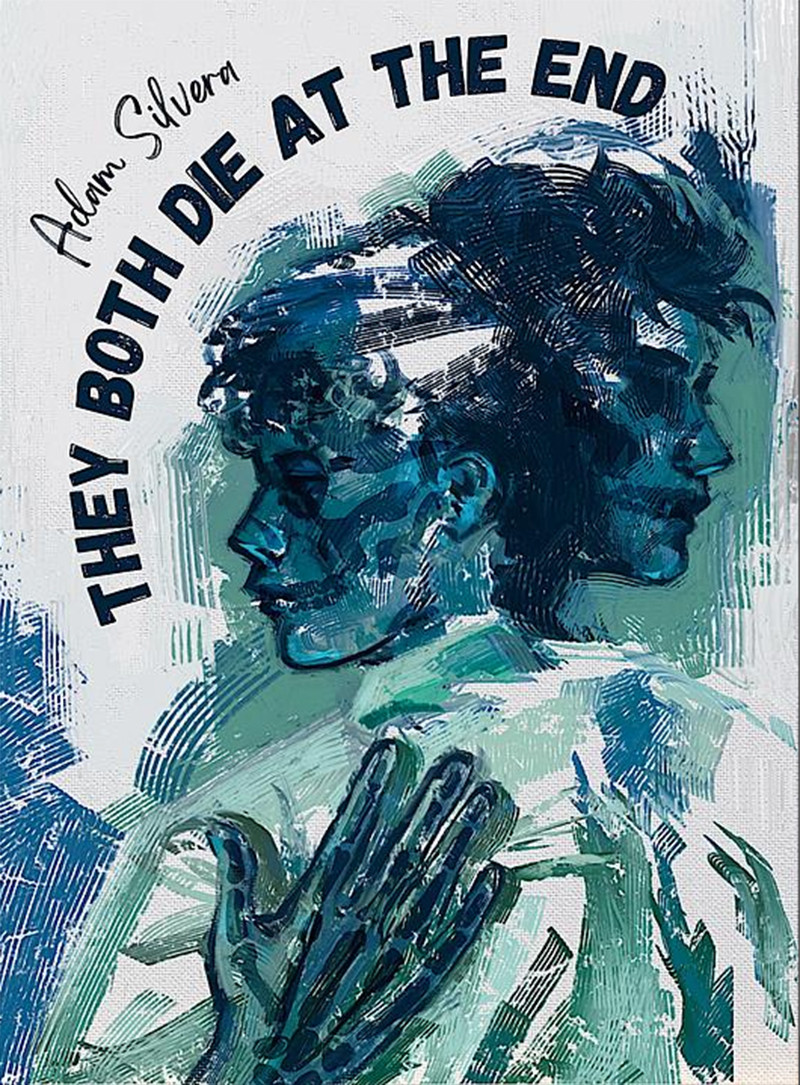
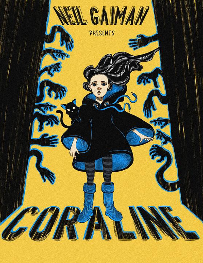
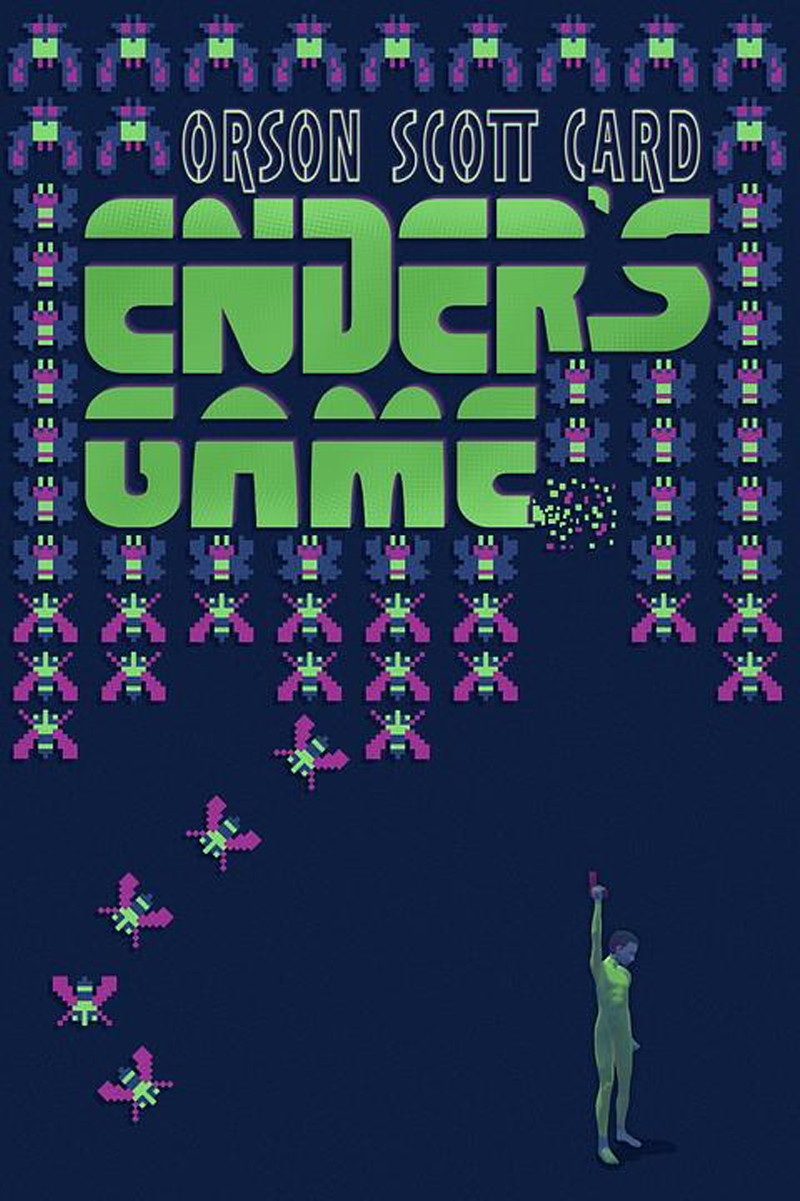
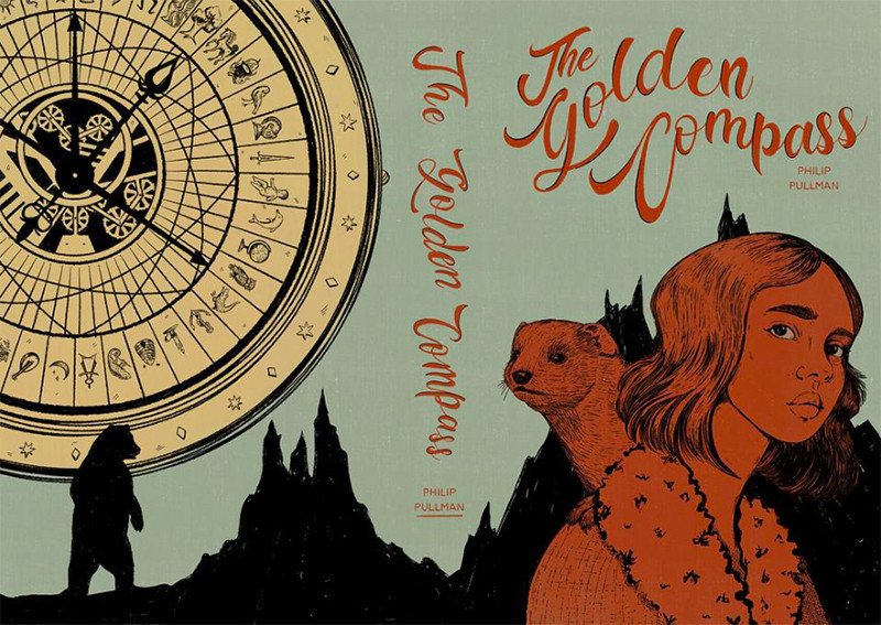
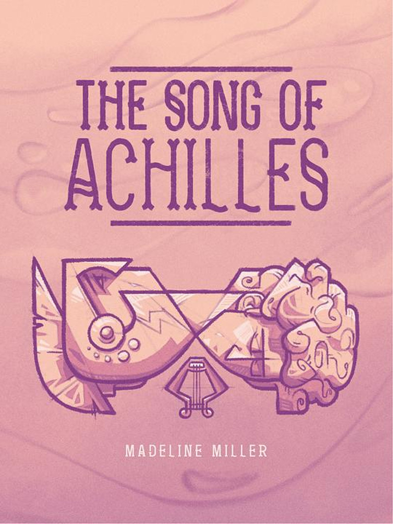
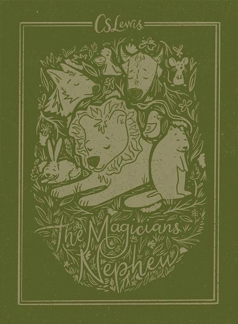
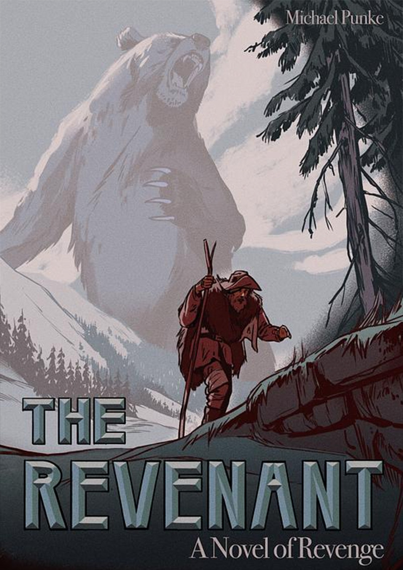
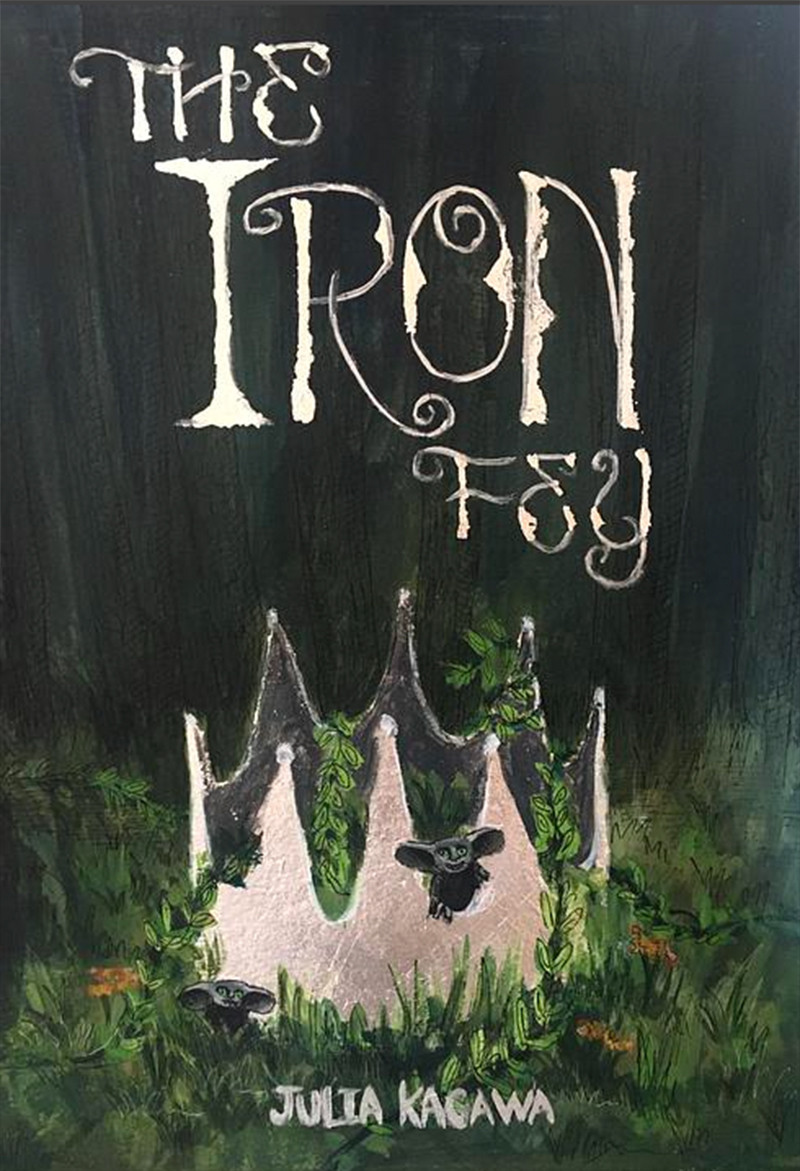
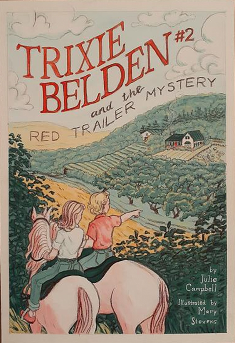
CHALLENGE: This April, illustrator Madi Harper is teaming up with Proko with a challenge fit for all who love a good story. Using your favorite book as inspiration, design a cover with a limited color palette and tangible, traditional feel. Be sure to use spoiler-free elements from the story in your illustration to make people want to pick up the book for themselves! Madi will be judging entries based on composition, traditional feel, use of a limited color palette featuring two to three colors, and use of typography for the title and author's name.
Prizes provided by: Wacom, Sentient Academy, Vision X Live Conference, Canvy and Proko.
Prizes
Winners will be contacted via the email on their Proko.com account.
1st Place
Nellie Barwick - @nelliebarwick
Prizes
Wacom One Creative Pen Display
1 year access to Sentient Academy
Vision X Replay Pass
1 year Canvy subscription
Proko Figure, Portrait, and Anatomy courses
Madi's Notes:
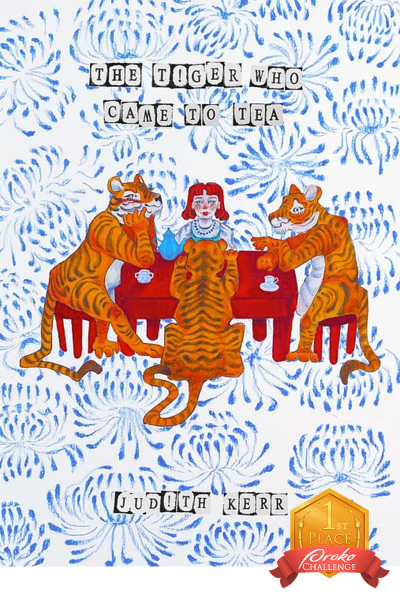
This is SO beautiful!! There are so many elements here that caught my eye and make for an extremely stunning cover! It has such a unique feel to it and makes me want to sit down and read this book to figure out why there are three adorable tigers sitting down for tea with a young girl! Just conceptual-wise you've done so well to not give the story away, but intriguing enough to make the viewer want to pick up the book and figure out why the cover looks the way it does.
The color scheme is gorgeous and simple, with the use of basically just blue and red (with the slight variation of the added orange, almost as a spot color which works so perfectly since the tigers are the main focus here). The traditional feel of the cover is consistent throughout which makes it very appealing—especially with the typography!! The use of these letters is so unique and stunning and it just works with the whole image.
My only note would be to maybe make the black around the letters red instead, just to keep the color scheme even more consistent? And any other note would be nit picking: like you could raise the name of the author slightly to sit right in the middle of that gap at the bottom. I just noticed your use of an exclamation point as the "i"— it's brilliant!! This cover is just stunning and has SO many things going for it that I had to pick it as the top winner! Great job!
2nd Place
Praskovya Kasyanenko - @prasipidgeon
Prizes
Wacom Intuos Small Bluetooth
Vision X Replay Pass
2 Proko courses of your choice
Madi's Notes:
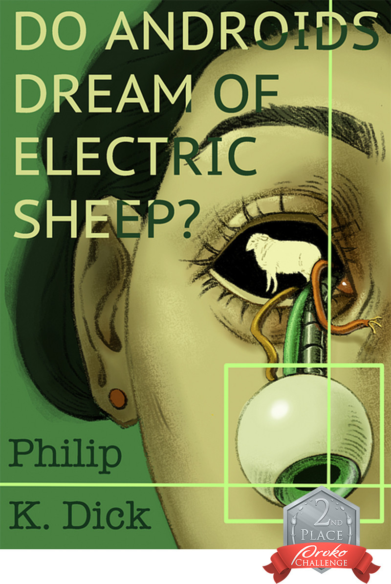
This is such a beautiful cover!! I've never read this book before but this cover makes me want to read it to find out why she has a robotic eye popping out of her head and why there's an image of a sheep in the middle of it—which is exactly what a book cover should do in my opinion, to catch my eye enough to make me want to read it!
Your color scheme is gorgeous, I love the overall green hue which gives it a mysterious feel, with just the little pops of yellow and orange. If anything, you could limit your palette even more by having those yellow and orange wires just be red, and have it match the inner corner of the eye and the earring. What this does is creates three spots of color which is a good rule of thumb compositionally. Another possible suggestion would be to hand letter the title and author's name because that just creates a very consistent-looking cover, and you don't have the gorgeous texture of the hand-drawn face up against the stark digital-looking letters. Overall though, your composition is impeccable, with the eye pulling us down in the bottom right, and the title of the book pulling out eye back up to the top.
Incredible job on this! Easily picked as top three!
3rd Place
carlosrdzart - @carlosrdzart
Prizes
One by Wacom Pen Tablet
Vision X Replay Pass
1 Proko course of your choice
Madi's Notes:
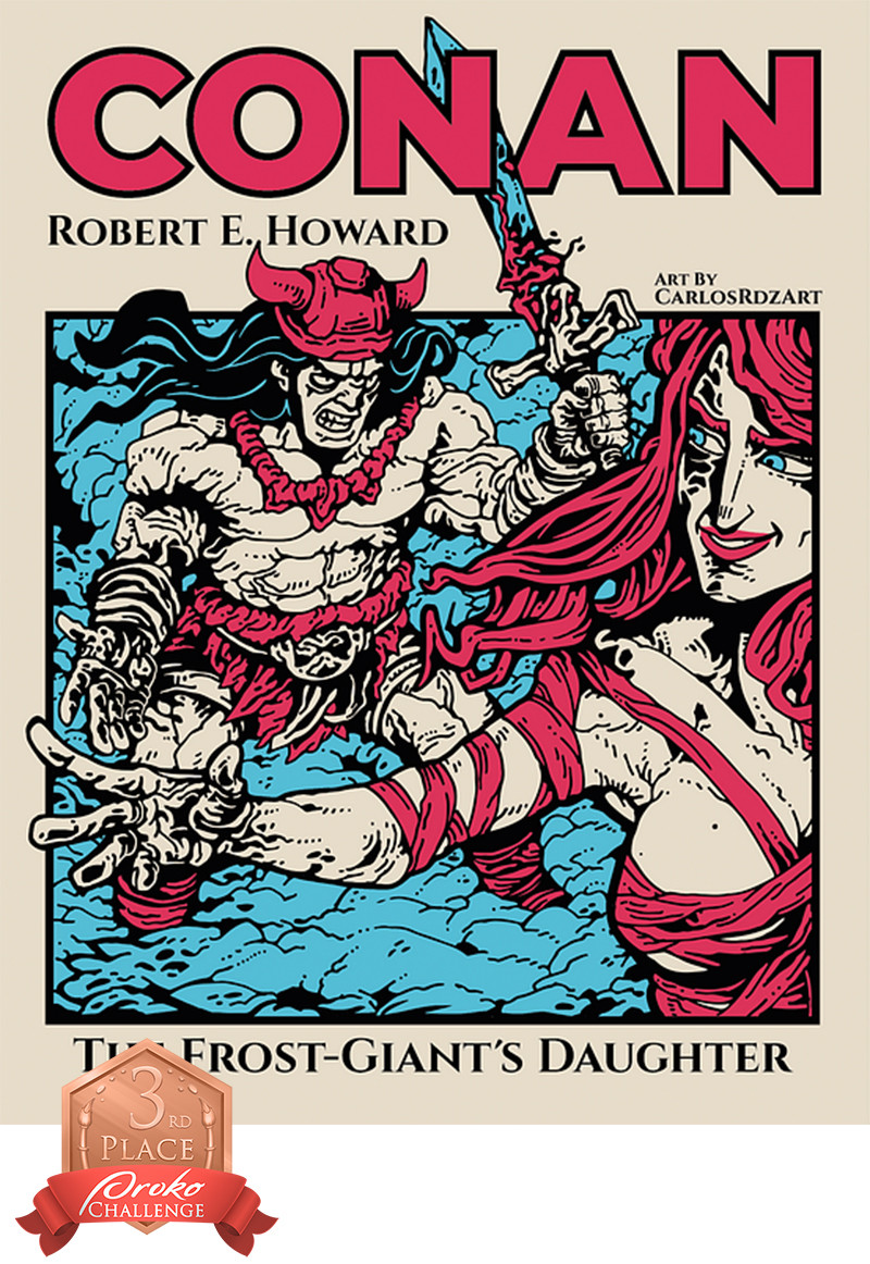
I could go on about the beauty of this cover for so long!! It's absolutely stunning for so many reasons. Firstly, your color scheme is *chefs kiss* beautiful and perfect. A great rule of thumb that I use in most illustrations is to use three colors and have those three colors be within the red, blue, and yellow family. You've got the red (slightly pink but perfect) and the blue which contrasts so incredibly well here, and that background tan-ish color could be construed as a yellow, though slightly more on the red side. But it works so well, and you've got the limited color palette down 100%.
Secondly, your linework and just the graphic style of the cover, in general, is gorgeous, and a great choice. I've never read this and I'm not sure what it's about, but it looks action-packed and intriguing already! One slight suggestion (which could be more of a personal choice on my end) is to make the linework a different color than straight black! I always find that adds an interesting element to my pieces since most people fall back on black linework and it's a way to make it stand out even more. Maybe a dark blue or brown? Another suggestion would be to outline the typography and the black square border around the illustration to have that same beautiful bumpy/rough texture that your illustration has and that'll just pull the whole thing together so nicely!
Overall I'm blown away by this one, great work!!
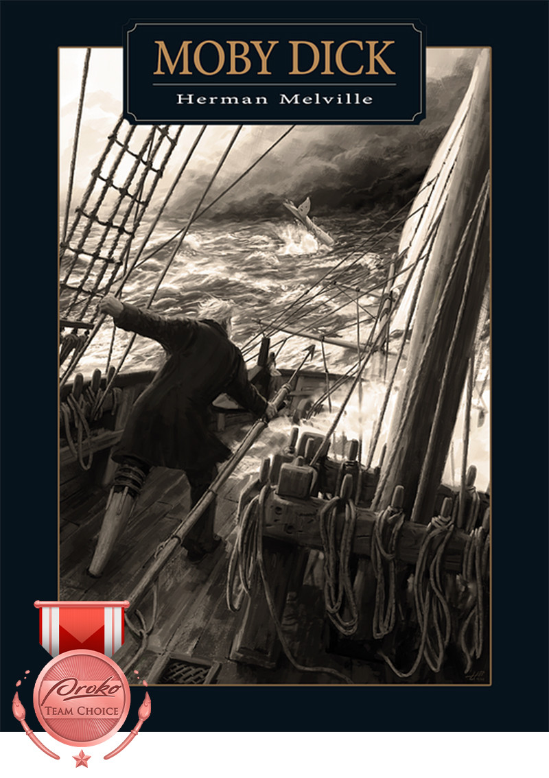
Team Choice Award
Juan Pedro Ramos Ponce - @juanpedrorp
Prize: $250 Proko Gift Card
Community Choice Award
magali franov - @magalifranov
Prize: $250 Proko Gift Card
Skelly's Choice
devica - @devica
Prize: Proko Skull
Wacom Random Winner
Matthew K - @inculcate
Prize: Wacom is awarding a random participant a Wacom Intuos small tablet.
Sentient Academy Choice
Ragnheiður Ásta Valgeirsdóttir - @rassalfur
Honorable Mentions (in no particular order)
Veronica K - @vroni
Madi's Notes: Check back soon for detailed feedback!
vinny1 - @vinny1
Madi's Notes: Check back soon for detailed feedback!
victorar - @victorar
Madi's Notes: Check back soon for detailed feedback!
Nicole Brooks - @nebrooks
Madi's Notes: Check back soon for detailed feedback!
Michelle - @michelle_i_am
Madi's Notes: Check back soon for detailed feedback!
Harshit Katiriya - @harshit_katiriya
Madi's Notes: Check back soon for detailed feedback!
Megan Day - @daygrace
Madi's Notes: Check back soon for detailed feedback!
Chris Hees - @chrishees
Madi's Notes: Check back soon for detailed feedback!
Camilla Schneeberger - @camillaschnee
Madi's Notes: Check back soon for detailed feedback!
Heidi Hall - @artbyheidijean
Madi's Notes: Check back soon for detailed feedback!
Thumbnail art by victorar

