Hi, my name is Esben Rasmussen and I work as a senior illustrator for Riot Games.


The first thing that we're going to be doing is taking different references. One thing that's very important while we're doing this is actually the planning, especially in illustration, that's where a lot of the work is actually done.

The character we will be using today is Jett, for those of you who don't know who she is, she is a high mobility character from the game Valorant. So, I know that we're gonna be playing around with the element of wind with her. It might be some wind in her hair or maybe we can make some kind of graphical shape to show wind.
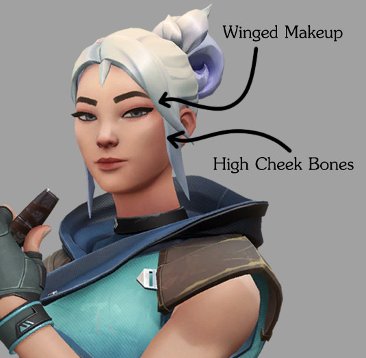
I think one thing that's going to be very important if we break this down is the winged makeup that she has. This is going to be one of our important elements. So, I know that's going to be a must as we move into the painting phase. I know too that there's some of the cheekbones that are very high that we want to play around with and also how the eyelid is working.
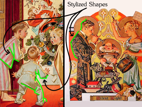
It's how some of the big shapes are contained to be a big shape instead of adding too much in illustration. We call it fidelity but that basically means that there's a lot of different details that shows the form within it. It has this sort of graphical element and we're definitely going to be trying to emulate that, so, the focus is on shapes. There's some of that also up where the back of the head is being treated. So, I’m gonna try to put those kind of angles in where I can find them.
Focal point is the term that we use of like where you want your viewer to look at the most interesting thing in the pictures. In this illustration, the focal point is over here in the faces. We're going to define her face and then we can keep some of the other elements a bit more loose and graphic.


One thing too that Leyendecker doesn't do a lot is background. There isn't really a ton of perspective and depth in his work which is all right because he's mostly focusing on the emotion and the storytelling of the figure. Whatever elements is in there, it's pretty much just there to support what is happening within that sort of context.
One thing that he does a lot is this specific treatment of the hair. There's the big shape of the hair and then within it, it's like these very planar defined three-dimensional brush strokes that are really defining where the light is coming from and then leaving things to be a bit more abstract and graphic.

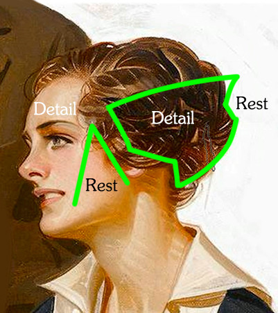
So, that leads me to one thing that we're gonna be paying attention to when we are painting which is going to be the sort of arrangement of detail. So, it's a concept called "area of detail" and "area of rest". And it's like a rhythm... I want you to think about it like music, if that makes sense. Like notes.
There needs to be silence in between two, where you have a guitar or drums, when you hit you make a noise, so I think of that as detail, something that's grabbing your attention and then you follow that up with a bit of silence. So, you have the drum, boom, break and then you can do your next beat and then you can find that sort of rhythm that's going into it.
So, like this kind of continuation of rest, detail, rest, detail. It's like a rhythm where you want to balance your detail and rest, so when you then apply the detail, it really gets the room to sing.
I know I’m going to do something more of a portrait of her, so I’m going to pick a few of these from the reference board and then put them to the side and we're gonna start drawing.
So, I’m making a small list in terms of the things and points from when we're going through these pictures and finding out what's important for us before we go into painting and drawing this.
- Looks like a traditional canvas
- Graphic shapes
- Some of those cross hatching marks we looked at earlier
- Simplified background
So, this is the part where as you go into it, you have to just be prepared to fail a lot, you have to be willing to try new things. I’m going to start with some bigger brushstrokes just to find the general feel and direction of Jett.
I feel that giving her a bit more of a standoffish attitude and maybe a little smug feels appropriate for her character. She's a badass, and I really want to sell some of that feeling of her being confident, aspirational and got this under control and can easily kick your ass if she needed to.
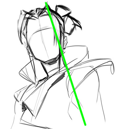
First thing I’m going to do is define a bit of a shoulder line and I’m basically thinking that my camera is looking up. So, that's going to be one of the things that I’m playing around with here. I’m going to hone in now and just draw along.
One of the things I like to do is try to get some of the bigger shapes down before I go into detail. So, before I even start thinking about her eyes and nose and all that, just focusing slowly on getting the overall shape.
Because she's looking down at us, I’m going to try to take the lips of the head a little bit off so we feel that she's kind of like looking down. Also here, we're going to try to do is find some different ways of trying out how we can make this hair feel good and graphic and have a strong shape because that was one of the things that Leyendecker always used to do.
One thing that I’m noticing from the 3D model is that there's some good shapes but it can definitely be pushed a lot more in the illustration. I like some of these side lumps of hair. We're gonna definitely play around with some of that.
I think her forehead right now it's a bit too big, so I’ll grab the lasso tool and I’ll take that part of the head and put it a bit down. I’m trying to use that angularity to define some of the ponytail. One thing that I learned over the years about being an illustrator is, especially when doing female characters, you want to be careful with the neck.
One thing that I did a lot, at least when I was starting out, I always made the necks a bit too thick. If you're trying to create somebody who feels feminine and different from masculine characters, it's easier just to slim it down, make it a bit more stylized. It will feel less masculine. It also depends on your female characters of course. If you're trying to create a female character that's very strong and her main characteristic is strength, maybe having a bigger neck is gonna sell that kind of character more. But for Jett, I think we're gonna keep it a bit more on the smaller side.
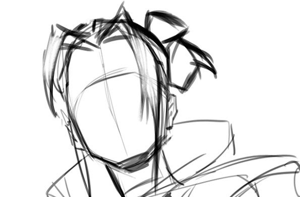
A useful tip is to flip our canvas periodically. If you use the Flip Canvas Horizontally option, then you can flip your entire canvas so it is a mirrored image. Essentially what it does is it kind of refreshes your eyes, you're seeing it again new and it'll just help you spot out some of your mistakes. Mistakes will be made always, that is part of the journey. It's human to make mistakes and we all do it. So, it's to be expected. So, I’ll embrace the mistakes that will come along the way and fix the ones that I can.

Another little tip that I’ll do a lot when I’m drawing and I’m pushing and pulling and I’m finding the picture and the angle, is I will apply the “Liquify” filter. I love going into Liquify and then pushing and pulling a bit, finding ways where we can tweak our drawing a bit more, fix some of the mistakes or make it more dynamic, and give it more flow to a curve.
Another thing that is very characteristic of her is that she does not have a very angular nose, so we're gonna try to get some of that in. If you look at our reference noses, it doesn't really have sharp edges anywhere, it's more rounded. So, we're gonna try doing something like that too.
She's a tricky one and I am definitely a bit out of my comfort zone with her just because making Jett in this sort of style is interesting. One of the things is that with Leyendecker, he often used this very Americanized feel and style to it. Also because of the historical context of it and then making somebody who's from Korea in this style, it's going to be interesting.
So, maybe if she's more of this sort of like badass, less of a smile and maybe she's kind of looking down at you, so we're going to take the pupils here and tilt them towards the viewer, see how that feels. I’m very much a hands-on kind of illustrator. I tend to try to put down the mark and then see it and explore it and see how it feels and then adjust it from there.

With the first sketch down, I think we're gonna go into exploring a different angle and then see where that leads us. I’m looking at some of the reference images right now, just trying to see if I can take something from it and find something that feels good, something that feels confident, standoffish maybe a little bit too.
There is lot more that goes into making these drawing that I am not going to be covering in this lesson. A great way to learn these skills is by drawing “croaky” or life drawing as it's also called. It's a great place to learn about gesture, flow, anatomy, and also figure drawing, like longer figure drawings, is a great place to really learn about drawing the figure.
When doing these first kind of sketches, I’m not trying to be super accurate. I’m basically just trying to find the feeling of it and then from there I’ll go in and refine more as I go along. But in the start, I want to be more loose, get the feeling in and then from there I can define if I’m capturing the feeling first and then from there, we're gonna go in and we're gonna be more analytical and break down more drawing, make sure that the perspective is right, the forms are reading, all of these sort of things.
Over time this process will become much easier. Like if it needs your character to be more confident or standoffish, you will know the directions you can go. But in the start, I definitely recommend standing in front of a mirror trying to act out the different expressions.
Another little thing that we could take from the references that we picked already in the start is how Leyendecker really simplifies things. Like the back of the head sometimes, making it into a bigger sort of shape.

Right now it can be a bit of a stronger statement. I’m contemplating if I should make her chin really sharp. Mostly just for stylization purposes, like making that sharp chin will also feel that she's more aggressive in her shape language. Her whole thing is that she has these daggers that are very pointy. If you take a look at the hair, it's very pointy... So, we're gonna try to see if we can take “pointiness” and apply it to some of her design. That might not be as realistic, but it will just help you feel more of that kind of aggressive razor sharp edges just by looking at her. So, maybe she's so edgy that you know, just looking at her will kind of cut you. I’m basically just gonna try to push my drawing again.
Often when we draw, we tend to make things feel very symmetrical or very even and the Liquify is a good way to break up some of that evenness that is naturally happening when we're drawing and it has really helped me push my art more, even if it's at 5% in my drawings, it's definitely pushing it.
Going back to our project points too, we have another kind of cool thing where we can rely on some of the graphical shapes. So, if you look at the top of the head and down her neck, we can actually make a big statement and just make this one big graphic line that doesn't really have a lot of different elements in it than just being one big statement and it's gonna add that graphicness that we were talking about in the start.
He will make the line more “flowy” than you would maybe normally do and then he would focus in on really making sure that the three dimensionality of the drawing is reading and that it has a strong shape to it. There's so much design that's happening in his drawings and in his designs. Maybe not making it as realistic as it would be, but instead, try to fuse the two where it becomes a stylistic and design choice as well as trying to retain as much of the realism or stylized realism as possible.

We have made three different sketches exploring different angles, also of expressions of like how Jett could look like. In the first one I really like what started happening over in the neck and that going into the flow of the shoulders, that feels really cool. Could look beautiful when painted up in the Leyendecker style and fits that sort of very graphic deal. I also like what's going on in the ponytail, so there's some really nice overall statements in terms of the shape.
In terms of the face and the expression, could definitely be improved upon if we are gonna go that way. So, number one I think is overall good in terms of what we're trying to achieve with some of the pushed shapes and also like that graphic sort of feel. She does feel strong, stable and also a little bit of that badass standoffish feel.
Number two, not as big of a hit but you know, that's what the exploratory phase is for, it’s just throwing things out there, don't just take the first pick, do a few sketches, see what's working, what's not working and then just find the thing that's the best before you move forward.
So, number two didn't have a lot of great things in it. It feels too casual and calm and it’s not hitting the pillars in terms of that attitude that I’m trying to hit with it. So, number two probably won’t work.
Number three feels pretty good. There's definitely some of that power that's being conveyed, there's a cool looking down shot and there's some graphic and big shapes that could be interesting to play with too. This would of course need to be improved upon if this was the direction we would go.
So, right now I’m sitting and I’m having to choose between one and three. I think for this demo, I’m probably gonna go with number three. I feel it hits the best in terms of some of that three dimensionality but also I really like where her face is at right now and there is also something about having something that's more of a front view of Jett and seeing where we can take that, where the promo art that was already made shows a really nice side profile. I want to see if I can nail this kind of front profile in the Leyendecker style.

So, that's going to be the next couple of steps. So, we're going to move forward with number three.
Now we're done with the planning, found our direction, we did a bit of exploration too. Be sure to check out the follow up lesson where I will show you how to take this drawing and turn it into a final painting. I’ll see you there!


