


Actor Peter Dinklage is someone I’ve wanted to caricature for quite a while now. He’s a great actor and has such an interesting look. I’ve gathered a few photos I found to try and figure out which angle I want to draw him facing. The best angle for capturing his likeness isn’t immediately obvious. So I’m not only practicing drawing him, I’m auditioning these photos, looking for the best candidate to help me reach my goal. The traits which I find interesting that I want to highlight in my exaggerations are his square angular jaw, his large mass of messy hair, his prominent forehead, his short upturned nose, his deep set eyes and heavy eyebrows. Those are the elements you’ll see me repeating in different ways in each of my thumbnail sketches.
Remember, [thumbnail sketching] is about taking chances and having fun. Just explore the face and try to get into a mental state where you’re just reacting to the likeness and not thinking too much about it. When you’re first learning caricature you don’t want to put limits on your exaggeration choices because you think it might be going too far. See how far you can go and still maintain a likeness. I definitely could go farther and more outrageous in my exaggeration choices, but that’s not my personal style. I focus on trying to make well-constructed, anatomically correct caricatures that get [painted in a realistic style], because those are the kinds of caricatures that I like to see myself. I also want my work to appeal to publishers and art directors. And they usually don’t want over the top outrageous exaggerations. They want an instant read on the face that’s humorous and eye catching so that readers pick up the magazine or book it’s printed on.
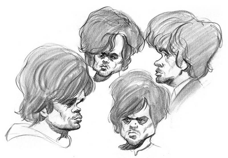
Looking at these four sketches, I think the one on the lower left captures Mr. Dinklage the best, and that’s the one I’ll take to the next level.
The Rough Sketch
Using my thumbnail sketch as my guide, I begin a rough sketch on a sheet of newsprint. I try to keep the shapes loose and organic at this early stage. I work quickly to get the big shapes laid in as soon as possible. I’m always a little afraid I’m going to let my inspiration float away and I’ll lose the likeness if I don’t act quickly to get it all down on paper. Of course it never does just float away. But the sense of urgency is always there in the first few moments of a sketch. Because it has so much potential and it’s exciting to see a face come to life. If you’re working with photos that have strong light and shadows, like this one has, that lends itself really well to quick sketching, because the shadows help reveal the forms and you can draw with shapes and values which cover more area quickly than you can with line.
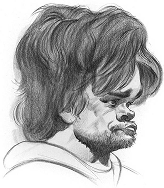
Now, with all of the shapes laid in and outlined, I start shading the darkest areas with a single even tone of value. And it’s not the final value of dark that will be in the shadows. It’s about the value that the reflected light in the shadows will end up having. I build up my darker darks gradually so that I don’t have to erase any shadow areas to get the illusion of reflected light later.
This isn’t the best reference photo. It’s a little blurry and there’s not much information in the shadows. So I do my best to interpret the dark blurry shapes I see because I want my drawing to feel more complete than the photo. Knowledge of facial anatomy and lots of experience doing studies of the individual features like the eyes is really helpful here as I do a little bit of invention where the photo is too dark.
I do my best to simplify the hair. At this stage, I definitely don’t want to get caught up in too much detail. I’ll save that for the final drawing. So I try to think of the hair as a single mass, as if it’s a hair shaped helmet with a side plane and top plane. The only texture effects I add are a few groups and locks of hair falling over his skull to give a sense of how it’s hanging and flowing. Satisfied with how it’s looking, I move on to the next step.
The Abstraction
With a sheet of tracing paper over my rough, I begin the abstraction by finding the simplified shape of the skull. I keep all my lines as clean as possible, using simple C curves and S curves. As you should know by now, the purpose of the abstraction is to correct any mistakes in anatomy or perspective in the rough sketch. Simplifying the shapes and planes of the skull into simple abstract rhythm lines allows me to more easily see those errors that might have gone unnoticed in the previous stage. When you exaggerate the skull to an extreme degree, as I’ve done here, the standard head abstraction will need to be modified to fit the new proportions. The centerline of the face, for example is no longer a straight line, but a really bent S curve. The nose and mouth in particular will be affected by the placement of the centerline, so it’s important that it follows the new altered shape of the skull.
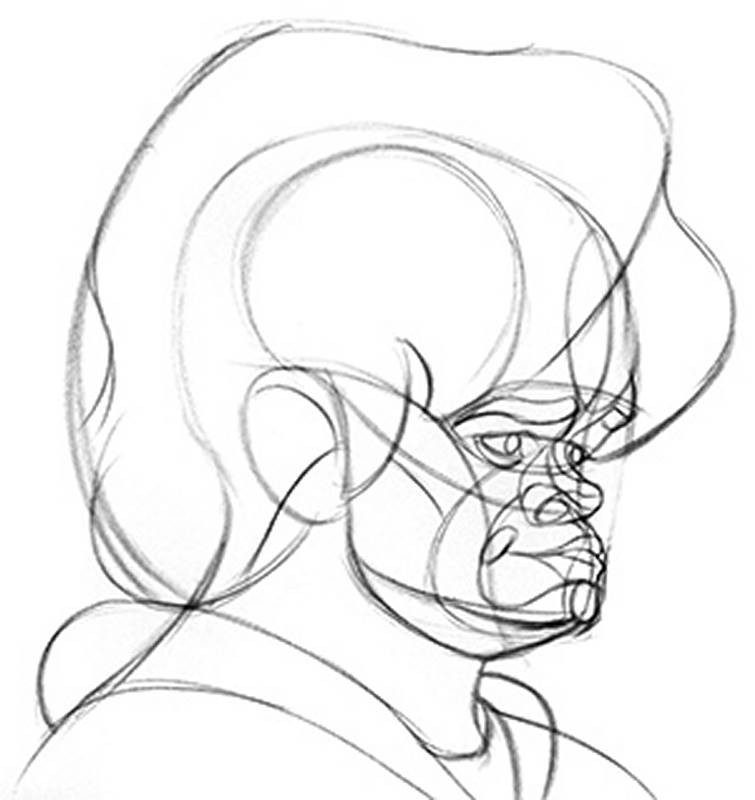
A profile view is usually a bit easier to draw than a front view, because you don’t need to worry about matching features up from one side of the head to the other. Also, I’m including a little bit of the eye on the far side of the head in this drawing. So it’s not an exact side profile view. More like a very extreme three-quarter view.
Everybody’s hair is a little bit different. So there’s no one right way to abstract that. Just simplify the shapes that are there, and always account for the shape of the skull underneath.
With the addition of a couple other minor rhythms that highlight a bit more structure of the face I’m ready to move on to the final step.
The Final Drawing
For the final drawing of Peter Dinklage, I’m using Blackwing soft pencils on a high quality smooth transparent vellum. It’s a nicer and more archival surface than tracing paper. So I can do finished drawings on it, but still use it to trace.
My first goal is to simply trace the outlines using the abstraction for placement and the original photo reference for the actual contours of the anatomy. I also have my rough sketch in view so I can refer to that when needed. Although there are no shadow edges mapped out in the abstraction, I use this time to outline the edges of all the major shadow areas on the head. I think it’s best to outline the shadow areas first so that I know exactly where to shade in my values. In a drawing like this, where I may end up displaying it or just using it to create a color painting, every shape needs to be consciously designed either with a hard edge or a soft edge. If there are areas of the photo that are unclear where a shadow shape ends or moves into the light, that’s where the artist comes in and makes an executive decision. I assign shapes to either the shadows or to the halftones. Halftones, if you recall, are any forms not in full shadow. The hair isn’t all in shadow. But its local value is almost as dark as the cast shadows. So I will shade it to about the same value as the shadows.
I like to think of this part of the sketch as sculpting the forms. The paper is a two dimensional surface obviously, but I’m trying to create the illusion of three dimensions. So my pencil strokes carve out the shapes with directional strokes that follow the suggested curves of the forms. Sculpting the forms of the hair is a lot more daunting of a task, especially with a pencil. The narrow point of a pencil is not necessarily the best tool for shading in large areas like the hair. I much prefer charcoal for that task. But this is a pencil drawing – not charcoal, like the rough sketch. So I do my best to shade the large single volume of the hair first before adding too much individual locks or strands of hair. If you focus on all the details of the hair before shading the big forms, you’re much more likely to get spotty values of light and dark everywhere that don’t serve the big picture AND you’ll probably spend a lot more time on the hair because you’re attacking it bit by bit, rather than all at once.
Now is the final clean up phase. I’m smoothing out any hot spots of dark value, cleaning up smudges and adding highlights where I can with the eraser. I also carve out some hard edges in the hair so that it has more variety in its texture. A good drawing will have a good balance of hard and soft edges.

More Overview Examples
Court made additional demos from start to finish for the premium caricature course. It includes fully narrated caricatures of Jennifer Lawrence, Donald Trump, Jackie Chan, and more…. You can get those examples and all the extended premium lessons in the Premium Course.