Check out the premium course for additional lessons, demos, assignments and critiques!
Why We Need Color Temperature
I often run into the problem of having way too many colors to name or categorize by hue alone. For example, if I have several variations of red, I still call them red. Even adding “saturation” or “value” to the discussion is not always enough. That’s why I use color temperature. The two big families here are warm and cool, and they sit on opposite sides of the color wheel. When I gradually shift the hue around the wheel, I’m also shifting color temperature, even if the hue identity (like “red”) remains the same. It’s helpful to think of this as a relationship among multiple colors rather than labeling one color in isolation.
Movement From Warm to Cool
A great way to think about it is like traveling between two train stops: one is warm, and the other is cool. Most of the time, you’re painting somewhere in transit between these two stops. In other words, you’re not always at the warmest or coolest color.
Chart 1: Using Only Hue
I start with a warm hue on one side and a cool hue on the other. Then I create a series of swatches by gradually shifting the hue. Each swatch is a small hop around the wheel from the last. I try to keep the transitions smooth so the colors blend as though they’re moving around that wheel. This shows how one color can shift from warm to cool by hue alone.
Chart 2: Using Saturation (Grays)
If I limit myself to hue only, I’ll end up with a candy-colored painting because all the swatches have the same saturation. To broaden my transitions, I make a chart that goes from warm to cool through gray. I place a perfect gray in the middle. From the warm side, each step moves a bit more toward gray. I do the same on the cool side until I meet in the middle. This chart illustrates how I can shift between warm and cool by mixing in more or less saturation.
Combining Hue and Saturation
I can also shift both hue and saturation to create a more sophisticated movement from warm to cool. This combines the straightforward hue shift of the first chart with the grays of the second chart. In actual paintings, I rarely stay on a single plane of hue or saturation. Moving somewhat in both directions is more realistic.
The Chameleon Effect and Grays
One of my favorite properties of color is that context changes how we see it. When I place the same gray swatch next to a saturated yellow, the gray can appear cooler. When I place that same gray next to something else, it might appear warmer. Neutrals like grays are also common in nature, so we read them as transitional colors that move us along the path from warm to cool.
Using Color Charts in a Painting
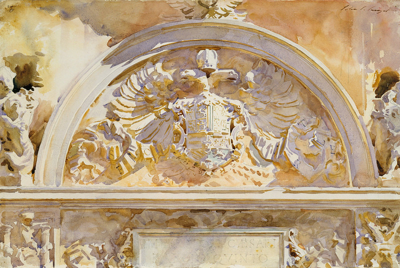
Looking at a painting by John Singer Sargent we can see these ideas in action. If I sample areas of color from one of his paintings, I notice he’s often working with just a few basic hues, like red, yellow, and maybe some blue, and blending them in different levels of saturation. A single archway might show a gradual transition from warm to cool,
- Starting on the warm side with reddish or orangey hues.
- Moving toward neutrals (grays) through slight desaturation.
- Ending on the cool side with hints of blues or purples.
When I take one swatch out of that sequence and consider it alone, it can look gray or dull. But when Sargent places it in a constant state of movement between warm and cool, each color becomes lively.
Not every part of a painting has to include the entire range from warm to cool. Sometimes the fullest cool color is somewhere else in the image. The point is to show a complete path from warm to cool across the artwork. Even if the path is spread out across different objects or areas, viewers perceive the overall temperature shift.
To visualize these color temperature relationships, I make small color charts without leaving gaps. Each step flows naturally into the next. These charts aren’t necessarily my final palette, they’re just a way to train my eye and give me a roadmap of how to travel between one color family and the other.
I find it helpful to remind myself that color never exists on its own. I’m always thinking of color in relation to its neighbors: Is it warmer than that color to the left? Is it cooler than the color to the right? By practicing these ideas and making charts, I get better at capturing the movement of color in my paintings.
Check out the premium course for additional lessons, demos, assignments and critiques!


