Would Love a Critique
3yr

Alex P
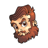
I've been working on a project with an fairy and elf fighting each other for teeth. I was able to get some better lighting structure on this from its previous iteration. But I do feel like this piece feels stale and off colored. Angle wise it might be a bit too on the nose, and I'm struggling to combine color and value together properly. Any thoughts are appreciated. The darker one was my first attempt going for a more dramatic noir look but I felt like it just didn't read well.

First off, the second version is a huge improvement!
Not sure if you were only looking for feedback on the colors, but I also wanted to mention something about the composition (though it's also related to color!). If your main idea from this is a fairy and elf fighting over teeth, you need to make sure that's *super* clear. Otherwise the viewer will form their own idea of what's going on, which can make the picture confusing.
A good way to check if a composition is clear is to shrink it way down and "read" what it looks like is going on. If it still reads when it's small like what you meant it to, the composition is working well.
I can tell you that my first read was that they were playing some kind of board game. Here's what I could tell as a viewer:
- Their gestures and expressions make it clear they're really competing.
- I can make out a piece in the elf's hand, though I can't tell it's a tooth.
- I can make out that there's a table.
Here's what I had trouble with:
- I can't really read what's on the table (the jaws). Even zoomed in it's hard to understand.
- The wings don't read clearly as wings.
But there's enough pieces there to put together to form a story: a human and and elf are playing a board game together and they're really competitive (their expressions are really great, btw!). This overall read influenced my whole experience of this piece. I was like "Oh, they're clearly playing a game. But what's the game? That's an odd board—kinda 3D. Are they putting pieces onto the weird board somehow? Or is the elf making a move of some sort? Ohhhhhhh, they're *jaws*! Wait, what's going on?". It wasn't until I went back and read the text of your post that I understood they were supposed to be fighting over teeth.
What's happening is that the jaws aren't really recognizable objects, plus they're close to the same color as the mat under them. You can put anything down there you want, and make it any color / value you want. Some questions you can ask yourself:
- Do you need two jaws? Is it important to what you're trying to get across that there's more than one?
- Does it have to be jaws? Is there something else that would make sense and possible be easier to read?
- Whether you keep the jaws or not, is there a way you can give the object a clear, readable silhouette? Are there different angles or colors for the object or what's around it that would help things read better?
Hope this helps!
Honestly really does. So it is meant to be a kind of game competition apologies on the lack of info. But I think all of these are great points to look into and try and read it out as a story as written. Thankyou for the feed back.


Hey Alex,
I like your painting, the drawing seems pretty solid and everything looks pretty dimensional. One thing I noticed is that you are missing some color variation.
For example, light is hitting the fairies blue shirt, but, there isn't any blue bounced light in the shadows under his chin. Light is hitting the warm table, and yet non of that is being bounced into the green elf. What happens when we lack these bounced colors, is that our characters look like stickers placed on the background. Color harmony goes out the window, and nothing looks like it really is sitting in the space.
I hope this is helpful to you and makes sense :)