Snow critique
4yr


@pollypopcorn
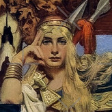
Here's a drawing I did of Snow from Once Upon a Time. This is one of my first times trying to do a face with color. Does anybody have any critiques or suggestions for improvement?

Hi Pollypopcorn - apologies for "ghosting" your thread but I wanted to point out some of the good aspects of your drawing. I think the proportions of your drawing is not far off and I feel that you captured a likeness (which in my limited experience is two thirds of the battle, right!) I agree with the others: pencil is not ideal BUT there is some gorgeous work being done in pencil. For example if you look at Raymond Briggs' work, especially the animation based upon his books, you can get a good idea of what you can do with pencils. However, if you want to learn a tried and tested way of colour theory I reckon you shouldn't fight it you have to take the plunge and use paint (if it is too much of a jump just yet then may be start with some water soluble pencils). Yet you can still learn the fundamentals using pencil, ie, tonal values and form.
BUT for me the main aspect of your drawing is you seem to have a developing sense drawing edges and thus a growing sense of the planes of the face. Do you know about these already? Were you thinking of these whilst drawing the image? I believe with a bit more experience you can exploit that. For example, along the bridge of the nose and around the arch of the eyebrows and sockets needed the same kind of attention as you used on the cheek and chin. My advise is to think about how light "flows" over the surface of an object and how it creates form as it flows across the different planes of an object/face. You don't have to do this only when drawing. Next time when it is a really sunny day or when you are in a single lit room look at how the light behaves and ask yourself how would draw the phenomena you are perceiving. I reckon you will start a habit of looking for clues that will help your drawing. Any way enough of me preaching good hunting and draw!

I will say the proportions can be better. Though, it has nothing with color, but I see that the proportion of your drawing seems a little off; like the nose seems to be a little smaller than it should be,
Colored pencils are not the best of tools when it comes to learning colors. It may be convenient since they were the first coloring tools we had been introduced with when we were kids, but in the long run, they're actually hard to use. Some artists even have come to hate them, arguing that colored pencils lack almost everything an artist needs to color their drawing or painting: 1) they're hard to blend, 2) the colors are rather too bright to use by itself, and 3) the wax used to make colored pencils give the drawing that ugly sheen finish. The other problem with colored pencils is flexibility: you'd need a lot of them to cover a wide range of colors.
If you'd like to learn colors, get the actual paints, like watercolor, acrylic, or even oil paints. They're much more practical and reliable. You can just buy 4 or 5 paints, and with them you can make all colors you will actually use. Colored pencils look nice since if you bought them in a set, they'd give you this rainbow-like colors. But soon you'd notice that most of them are useless, because you can't really blend them and you can't fit a bright pink or emerald green in any drawing.
Thank you. I haven't used paint a lot, but I've noticed that a huge chunk of what I've learn about color has still come from painting.

Hello pollypopcorn! Thanks for sharing one of your drawings. Currently the biggest suggestion is just keep drawing and putting in the time. Something to improve on would be to further study the three dimensional shapes of the face and to understand a photograph/film still is giving an already flattened representation. For example, the shadow going across the cheek and the neck in the drawing is laid down evenly and it is flattening the drawing. I see that the image drawn from does not provide much visual information so it leaves a lot to be interpreted.
Another concern I had is the materials being used. It looks as if the paper is scrap copy paper. The color pencils do not seem to be providing a lot of pigment. I do not know what is being used but you may be able to make some improvements in materials used. The paper might be able to hold more pigment if it was a thicker paper made more for drawing and a variety of materials. The color pencils may provide more pigment if they were something like prismacolor or a comparable product.
Great job on your first face with color and I hope some of these comments are helpful :)