Self portrait
4yr
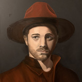

Alec Moff
Feel free to leave an honest critique!
Account deleted
Great portrait painting and I can't imagine how tough it was to paint. Jedidiah pointed some good feedback. I have some minor critique too. The first point is, your left eye (the eye in your shadow) looks not correct. It looks not 3dimensional. More like a simplify 2d eye. The second point is, your jaw in the shadow side have to move outside (but if your jaw look like that your had painted, then forget my point). The third point. The distance between your left eye and your ear is to large. You look a little bit to the left. My last minor point is your mouth. The perspective looked off. You need to turn your right side down.
Thank you and especially thank you for taking time to draw over it. Helps a lot to understand


Ooo! Excellent piece. The rendering on the face and hat is very well done. The atmosphere is good, the colours are very clean! The only problems I see are very minor things. For example, in this piece is how undefined the clothing looks at the bottom compared to the whole piece. It only slightly detracts from it though and it's not anything to worry about.
The other thing I noticed is that the hat above is quite bright in the shadow area compared to the rest of the elements in the shadow. Unless that was done intentionally, or you were painting from a reference image, pushing the shadows a bit further would give the piece a bit more cohesion and the focal point (the face will pop out more).
Some things I'd like to see (this is not a critique, just my recommendations) would be a bit more variety in the edges. You can try to lose the edge around the right shadow area of the hat to give it more interest. Maybe even in the areas of the face in the shadow
As you can see only a few things changed nothing much!
I see the difference in the hat, that looks really nice, I be sure to keep that in mind next portrait. My mentor always gets on me to soften my edges. Besides the top of the hat, did you edit anything else in the photo? Thank you so much for the critiques
oh btw, I'll include a side-by-side comparison because the changes are hard to see immediately

This is looking pretty clean and humble! Maybe the position of the jaw line or its scale is making it seem a bit weird... I'm not sure why but overall I think the shape looks fine.