Questions and critique on composition
4yr

Sandy L
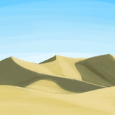
Hello. I did two iterations of this idea I have, first one from above, which turned out not great and then I checked how other people have done forest-scapes and did the second one where you're looking on the standing stones standing on the forest floor.
I'd love critique on both these, but I also specifically wonder if it's inadvisable to do the bird view one? I could only find art in ground level view, but maybe didn't look hard enough...
What should I focus on to get the bird view one to work composition wise as well as with values and such?
I feel like the front view one is a lot better, but that's not the scene I want to portray, of that makes sense?
Anyway, thanks in advance for all types and advice
@Josh Sunga, @Peter Anton, @Serena Marenco, @squeen, @mac hewitt
Thank you so much all of you for the help and suggestions. I've watched Dorian Itens stream, grabbed a bunch of references and will try to apply everything into value study thumbnails to see which perspective will best portray the scene I want to make as well as trying to design the values and shapes into grabbing visual interest. Then I'll try to color it, Edgar Payne have some interesting color shapes and will be fun to look into what colors he uses more closely. I will drop the result here whenever it gets completed, thank you all again!

•
4yr
Awesome! I look forward to it :)
•
4yr
Hey Sandy, do the scene you want to portray and just try your best to make it work! There's more perspective challenges but the payoff is that it's not your typical shot and it's good practice either way.
(That said, I think all the prior advice here is correct in that the bird eye view is diminishing the subject. And working purely in values will help you focus on composition.) I gave your standing stones a try:
The first thing I considered is the design of the henge. Even before composition, the subject matter has to have enough inherent interest to capture our attention. I tried to build interest by varying the size of each stone. If you wanted each an even height then perhaps you could create an interesting shape for the stones instead.
Next I wanted to place the henge off center by virtue of rule of thirds. There's nothing wrong with placing the subject dead center but I think there are better camera angles for that. Offsetting the weight in our image gives us more room to play with movement.
I'm trying to design the value structure to put my subject matter in a clear and interesting context.
I make value contrasts to distinguish the different elements of the composition for visual clarity.
I also design the shapes of light and dark to contrast in pure graphic shape as well for visual interest.
But mostly, creating a strong value structure is simply making our subject more visible and our image more clear.
As for color, I'd suggest looking at some plein air artists. Edgar Payne is a must! If you look at some of his paintings and color pick the actual color, what appears to be green might surprise you. Just as we put values in context to make them appear more bright than they actually are we do in a similar way with colors.
Anyway, nice work and thank you for sharing! Hope some of this will help!


It really depends on what you want to communicate. Why are you drawing these rocks? What is their significance? The overhead view is more detached and neutral, whereas the ground view lets us feel like we're in the scene. What story are you trying to tell? My main critique is just that it feels totally made up out of your head, with no observation of what a real forest looks like. Even if you're going for a stylized feel, the shapes are just too generic and uninteresting. I would definitely find or shoot some reference images if you're planning to take this further

So, which view to use depends on the need you have to show something: in the Renaissance era the bird's eye view was often used to represent cities or battles, i.e. very large scenes that needed an overall view. It would have made no sense, for example, to use it to show a scene from the lives of saints. (I'm just giving examples, it's a bit more complex than that, but I'm simplifying as much as I can).
In this specific case I don't think a bird's eye view is necessary and makes your subject much less interesting.
The point of interest is this megalithic complex, which I imagine you want to portray as imposing: if you show it from above, it becomes a simple element in the landscape without you having provided any additional information, since its location within a forest is intuitable even in the first image.

Sorry if this posts multiple times I'm having trouble with the spam-protection.
I agree with the other commenters, the bird's eye view make the monolithic stones look small (they could also use more surface texture/detail). You might want to look up "3-point perspective" to get the lines right and add a vertical vanishing point (see sketch below).
I would add to that you might also want to push your contrast much harder. Black shadows, sunset lighting, darkness in the deep forest shade, something...because our eye is drawn to contrast. The edges where the stones meet the ground should be darker too because of ambient occlusion (i.e. the sky-light is partially blocked). That's the old "shadows harden on contact" notion.
If you prefer light and airy, then good with abstract/watercolors? Not to sound too harsh, but to me your pallet right now is falling into the "finger paint" regime (mainly in the second image, not so much the first).
Light and darkness seem like such meager tools, but it's really all we have. That said---I'm a total noob to art, so feel free to ignore me.
:P

Hey Sandy, good job with these compositions.
First off I would suggest doing the eye level one due to it being easier in terms of perspective.
Next I would suggest working with black and white only. Doren iten has a new video explaining how you can communicate a scene with 4-5 values. Which would be good to start out with.
At the moment you can darken the frame and have the light illuminate the stone hedge like objects, making them a very clear point of focus.
Hope this helps and I look forward to seeing the results
Thank you, have not has time to watch Dorien Itens stream yet but that is definitely something I will try out.