Portrait Study 04
4yr
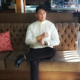

Patrick Velena
Been trying to do more portraits and keeping in mind the basic form/anatomy of the face.been also trying to learn to blend more


There's a lot of really good stuff in this one. Looking at your gallery this one shows a lot of progress. Nice work!
I did a quick paintover. Here are some of the things I focused on:
- Turning the form, particularly along the profile. Look for overlaps and changes in value. They're there, but happening really quickly since it's aalllmost in profile, but not quite. If you don't put them in, it'll feel flat. You may have felt this in the mouth—there are lots of little opportunities for overlap and value change. Also, the darkness of the hair is probably playing some tricks on you and making things along the edge of the face look lighter than they actually are.
- Working on edges. As Luigi and Gabriel mentioned, hair is soft, so giving it some softer edges can help. But it's also about varying edges on all the forms—soft, hard, firm, lost, broken, etc. In general, a given shape on a 3D form rarely has the same edge all the way around.
- Organizing the highlights. Which is the strongest? Vary the edges on highlights as well. Keep in mind that highlights are reflections layered *over* the matte shading (see this WIP video I've been working on about highlights: https://youtu.be/xC69A5tMr74)
- The neck! Don't forget it's generally a cylinder. There are a few interesting lines from the musculature, but don't forget the larger form underneath all that. Look for the value changes to indicate it's a cylinder.
- Putting in some occlusion shadows from the hair as it blocks light from reaching the forms behind/underneath.
- Turning concave forms into a series of overlapping convex forms. Generally when drawing the figure, convex forms work best unless deliberately stylizing.
- Toning down the texture of the hair. Leaving it in spots, but softening in others.
- Knocking down the value of the jacket. Compositionally it's competing with the face—the light of the jacket next to the dark of the hair is the strongest contrast in the picture (it's also a very sharp edge). Our visual system is strongly drawn to faces and to high contrast, so they're fighting a bit.
- I decided to put the silhouette of the hair back in, rather than the background strokes you put in. I liked the graphic nature of the hair against the flat background, but that's more personal taste. I think you could make the brushstrokes work, but right now they're introducing a new, unprecedented texture into the picture and thus draw more attention than they should. This is exacerbated by the contrast between the strokes and the background.
Here's a video of the paintover, in case that's interesting: https://youtu.be/bdlmIgVfeH4
Hope this helps! Please let me know if you have any questions.
Oh wow this is super helpful! thank you for the wonderful overpaint and great insight. Now that you've mentioned it using white on the jacket is very distracting. And thank you for showing me how to do the hair as i've always struggled on how to simplify it! This is super helpful and I've learned abit from your application of occlusion shadow and fixing the highlights and structure of it! I still have this feeling of flatness after i've finished this piece since I can tell there's something wrong around the cheek areas. I'll definitely keep going back to your video whenever I have a hard time!

Hi @Patrick Velena, this is a beautiful study. I especially appreciate how you exaggerated some of the facial features of the face to get a nice design going. The original model definitely has a 'sharpness' to her, and I like how you incorporated that design language to her eyebrows, nose, lips, and chin.
As mentioned by Gabriel, I do think that you could simplify the material rendering of the hair into big shapes with soft edges. Additionally, you can differentiate the silhouette of the hair by giving it a soft edge as well. This will communicate a material difference between the hair and the face.
Overall great work, hope this helps!
Thank you! Im still trying my best in incorporating what kind of edges I should do but I always end up doing more hard edges as I still feel a bit uncomfortable using softer edges which im still trying to overcome. But im glad you liked it!


Hey there! I love your values, you pretty much nailed them :)
I'd drop that brushwork on her hair, while it's "artistic" it messes up the silhouette and it forces the viewer to focus on that area, which might not be your intention.
Other than that, try to simplify the hair a bit. Instead of drawing every piece of hair individually, try to clump them up into bigger shapes. Simpler shapes are just easier on the eye.
Keep up the good work mate! :)
Thank you very much Gabriel! I've always struggled in doing hair and I always end up dong this sratchy-feeling brushstrokes whenever i do hair since im still wrapping my head around it to do it. But glad you liked it!