My introduction to Proko 2.0 (SO EXCITEEEEDD!!!)
4yr


Rubén Frutos
Hey guys!!! I’m super pumped about this new website that the Proko team has put out for us. I guess this is both an appreciation post and an introduction to my art.
So here you you have a couple of cowboy designs I did just for fun. Let me know what you think and let’s interact!

•
4yr
Hey again Ruben!
I know you said this was just for fun but I couldn't resist seeing what these guys might look like on a simpler background! Nothing wrong with a midtone or any graphics- but usually you want to avoid high contrast that would take attention away from your art. I also think these two are great foils to each other so I put them together. (I made each slightly wider and taller respectively to emphasize).
Either way, it's great to see you sharing a lot!
Hey Josh!
Even tho I said it was just for fun I'm always looking for new ways of improving in any sense so any tip/critique is more than welcome!! You're definitely right, I usually work these b&w characters with a midtone Bg, but they for sure look better on a brighter canvas.
I also worked these two in the same canvas -Then I split them for Instagram posting xD- but I should have pushed the proportions much more, just like you did. Thank you very much!!
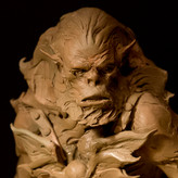
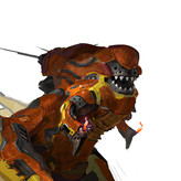
As an extra I'll post here the initial sketches that inspired these designs (I did these back in October for a shape design assingment and I feel like I've improved a lot since then). I'll most likely do the full series of characters so I have a cool package of designs for my portfolio!


I love how well these shapes show character! I'm super excited for this website to! Nice work Ruben!