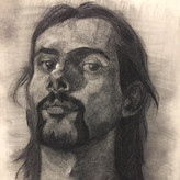
Head Digital Painting
4yr

Nailsen Ivanderlie
It's my first ever finished digital painting, so im hoping you guys can give my a very critical critique, and maybe some workflow suggestion because i only use 1 layer and an opacity round brush and eraser to erase extended paints. Any kind of critique is welcome thank you proko community!!


Hey Nailsen,
Great job on your first digital painting, way better than my first. The one thing that is most noticeable to me is that the face feels very flat. This is because the shadows on the face are not consistent with the other shadows. I did a draw over to show you what I mean. The drawing is pretty rough, but I hope it is helpful :)


•
4yr
Hey Nailsen! Great job on this, it's a really solid first digital painting.
What I'd say is pretty much what everyone always says. Focus more on the fundamental drawing stuff. Their right eye in your painting is too high, and it feels like their left is out of the socket. @Hooman Hn's advice of flipping the canvas is something I'd recommend too.
It feels like a very correct painting, but doesn't have much personality in it yet. The background is an easy spot to do that, but I wouldn't stop there. Maybe spend some time really trying to nail down the nose and mouth to make them look really cool, not just correct.
Anyways, good job! This is a really nice study
Good luck!
thanks a lot kristian!! when u said the eyes is not alligned thats when i start seeing the mistakes im making, and i tried flipping the canvas just now and the eyes looked incredibly odd. I will try to nail down the nose and mouth more on my next painting THANKS A LOTT!!

Given the way you did this, it's AWESOME! And it's your first time! really well done.
First things first, I suggest that you always flip your line art or shapes at the beginning of your process so that your figure or portrait is balanced.
I love the texture of the face you did, but in my eyes, seeing it side by side with the hat and the coat, I can't feel them being of the same universe (weird way of putting it maybe :) ) but the level of texture and detail doesn't match between them.
Of course, you can have unfinished parts in your art it actually makes it so exciting! but it should happen gradually in my opinion.
If you used reference for your colors and lighting, good for you! (however, the highlight values on the hat, neck, and clothes kinda throw me off; you might want to check them again) , but if you didn't use any references for your lighting, WELL DONE! However, I learned the hard way that there is nothing wrong with using references. In fact, it's the opposite! References are the most important part, whether if you want a source of inspiration, or you just want to make things right.
The most appealing shapes for us are already there in nature, so why not use them?
Also, Some rim light and a change of value in the background could make the character pop out better.
Good Luck!
wowww thank you very much for your consideration and time!!! because i feel something is off but i dont really know what that is. im using refference for this painting but i think im using it too much until i cant really see the mistakes im making thanks a lotttt !!!