Feedback on colors
2yr


Hey, everyone! :) I'm red-green colorblind and I've been messing around with colors in this drawing, attempting to follow some of @Marco Bucci's lessons from his course The Color Survival Guide plus a bit of color theory and painting stuff I'd learned in the past.
I'd love to hear some feedbacks and suggestions from you all about this piece, specifically regarding colors.
Thanks in advance!


I like this idea, it's very cute.
As far as color, the only thing I would do is warm up the skin on the soldier. Doing this will make my eye travel from the little girl, which is very warm compared to the background, to the soldier who is also surrounded by the cool green background.
Other than that, nice one :)
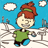

I like your drawing a lot, although I would add some more white highlight areas maybe on the tank. The sky should be lighter than the ground I think too.
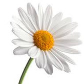

Hi Liandro! I love the picture and the moment it captures. "I don't care where you drive that tank of yours, but it wont be across this flower, I won't permit it!" :D It's so sweet, and so relevant. The theme touches me.
So it's the greens and reds that are challenging for you? If so, very corageous to make this piece with just those colours. And well done. I'm definitely no professional, but with my eyes... I might emphasize the root of the flower with a darker value, or, alternatively, give some highlight to it, just to have the focus of a viewer on what's going on in this scene, why is she stopping a tank? Same with the sky / clouds, some variation with values or some shading could give the picture a more striking atmosphere. I like it that you've chosen to use green on the soldier and red for the girl, since red reads more powerful or, in this picture, authorative, so it's an awesome contrast: a common girl with a stop sign has more power than a soldier sitting in a tank :D. Overall, I think you have here a great colour scheme, wouldn't change a thing if not emphasize with darker values or highlight what you most want to show.
•
2yr
I'm glad you like it, @Tuija Kuismin, and thanks! Yeah, mainly reds and greens - but one weird thing about colorblindness is that it can shift my perception of any other colors with touches of red or green (pinks, purples, browns, oranges, cyan...). So, in a way, it kind of messes my perception of almost all colors... To me, the biggest challenge is to identify/name the colors I see, and it becomes even more challenging with grayed-down colors. Over time, I've learned to "see" colors by thinking of their visual properties based on I'm able to perceive (warm X cool, high or low saturation, etc.) instead of just thinking of colors by their names. Still, of course, what I see is inevitably different from people with normal color vision, so I can never tell exactly how my color choices will be seen by non-colorblinds.
Thank you for your thoughtful suggestions! :)