Critique
4yr

Jo Edgehill
I'm back with another piece I'd like feedback on...I'm slightly embarrassed by this one,but would like to hear any changes I could make anyway. Thank you! :)


Hey Jo,
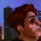
First of all, the head shot is really nice, and has good expression. The figure has a nice gesture and also a good expression, well done. I did do a draw over to show you a few things you can think about with your designs. One concept that you should learn is the idea of simple vs complex. Try to keep one side of a shape simple and the other side complex, or one side stretched, the other side bunched up or pinched. This is something that will keep your designs from looking too busy for the eye. Also, try not to bury hand gestures inside the silhouette, it makes it hard to read. I hope this helps :)
I really appreciate it,Mr Lenze. Honestly , your help is so valuable to me as a growing artist. I always try to take your advice and do better ,and I feel as though I have improved a lot. Thank you as always! :)

Hi Jo. Check the twist on the character's chest: it's looking left, while the base of the neck is almost on top of the opposite shoulder and looking right. The base of the neck should line up with the torso, independently of where the head is turning. It seems the character's left shoulder has two things going on: that shoulder, if you follow the arm, ends at the base of where the neck is right now, but at the same time the cape is covering a shoulder that doesn't line up with the arm. Hope this is helpful.
Ah,I definitely see what you mean. I'll try to fix my mistakes in my next drawing.. thank you! :)


HI Jo. I really like your character's expressions. I noticed the proportions are a bit off; one forearm is significantly bigger than the other, and the last three fingers on his left hand are small and bent at a weird angle (they almost look broken). I think it's a nice overall design, but I would also mess around with the colors a bit. The black of the leggings is a very stark contrast to the overall desaturation of the other colors (maybe town the black down to a cark gray or brighten up some of the other grays for something closer to a midtone).
Aaron Blaise has a great tutorial on drawing hands on his youtube channel, and you might consider googling different color schemes with the colors you chose to get an idea of what levels of shade and saturation go well together. Overall though, I think it's a great start.
Wow that's a lot more than I had expected haha. However,I appreciate it so much and will try my best to fix it! Thank you for your advice! :)