Any critiques?
4yr


Lea
I made this fanart to practice digital art what lacking parts should i work on to improve my digital art skills or any part of this illustration? Thankyou so much!!^^


Hey there! Amazing work, I love the aesthetic :)
First of all, I think you should clean up your textures a little especially on the skin, and maybe blur out areas where you don't want much attention. Right now it's very hard to find an area where the eye can rest and it's hard to find the focus point (which is probably the face).
Try to incorporate the background color into your shadows. It's a very saturated color, there wouldn't be an instance where it doesn't tint your shades.
Lastly, your colors are a bit muddy, which happens because you might be using too many gray tones to shade. In reality, they are usually much more saturated and tend to lean towards blue (the sky tints them). Also, the light often reflects from the body making the shadows a bit more reddish.
I attached an overpainting, maybe it can be helpful.
Keep up the good work mate! :)

Nice work. First I would ask where you feel you struggled? I think the picture looks a little stuck between realism and cartoon, so sort of looks flat as mentioned by Dylan.
If you want it to be more cartoon/Manga style, I would add more sharpness and line variation and outlines. If more towards realism, I would focus on enhancing lights and shadows to bring the contrast up and accentuate forms more.
I hope this is useful!
i was kind of struggling with her arm and i feel like the illustration is lacking but im not sure why, and yeah i was trying out a semi realistic anime style thankyou so much on your tips ill try them out!
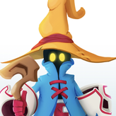

This looks really cool overall. I think the lighting in the hair is flattening it out more that defining it. The cuffs on the sleeves and the bones on the staff could use some harder edges and more defined shapes. Also, her right arm would look less like a tube with a little more of a deltoid. You can zoom out and look at the image as a small thumbnail to see what's popping out and what looks flat. Nice work though!
thankyou!! didn't realize the hair shading was holding back the illustration. and ill work on the edges haha XD i was struggling with her right arm a lot turns out she's missing a bit of deltoid thankyou so much for that! ill take notes on your tips