

Activity Feed

Rohit M
added comment inProject - Blob to Box
2mo
Asked for help
Doing a Level 1 and Level 2 with a focus on line weight as well. On level 2, after few boxes it becomes difficult to keep track of where the horizon line is (even intuition wise), especially if the boxes are in tilted positions. Now, when I am looking at Cambiaso's boxes in 'Fighting Figures' with light and dark washes along with line weight, I truly understand how masterful that is!
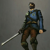
Rohit M
2mo
Pasting Cambiaso's Group of Figures/Fighting Figures just for ready reference - mind = blown
Show all replies (1)
Show 1 more replies
3mo
Asked for help
Made this an assignment on perspective, pencil and inking - level1 and level 2. The car is looking a bit squishy - made the vertical perspective a bit more aggressive than I could handle
8mo
Asked for help
Great Assignment! Did all in overhand grip - stilll not used to it. What is the problem with regular people grip? :|
I am also currently studying Glenn Vilppu's dynamic gesture drawing and had taken beginner's force gesture drawing from Mike earlier. So, including Stan's method, tried to compare all three methods and then tried to use them in my own way but mostly focussing on Stan's method - started with Glenn's flowy lines for gesture, then did the shapes with Stan's method and aimed (unsuccessfully) to put line weights based on Mike's force gesture (I blame overhand grip and my inability to think before I put weight on the line). It was fun!
9mo
Great lesson! More of this please!!
Two questions I had was on concave vs convex shapes: (1) Mike, in his lessons on shapes, relates convex to positive and concave to negative shapes which I did not fully understand. How does convex and concave shape usually work or are used in rythm and shape design? (2) I noticed that Stan was sometimes putting two almost parallel curves to denote hands or even legs below the knee, but there was enough variation that it looked good. But when I try, arms start to look like a flat ribbon curving: Eg - ( ( not sure what the secret sauce is here?
Also, on a side note (not to the topic) - I think the video editors on Proko team love Stan tearing away the paper :P - they showed every shot of Stan removing the paper when he moved to the next drawing...haha
9mo
Sorry, should have shared the examples. Here it is - elaborating on the two questions:
Q1) How to reconcile/design negative and positive shapes when a more dynamic positive shape (i.e torso shape in fig 1) leads to a confusing negative shape (shape A)?
On cancave vs convex negative shapes: Negative shape A is a mix of concave and convex edges vs Negative shape B is almost all concave edges. I prefer B personally as it is a clearer shape than A that has confusing edges. But A has more asymmtery which is more dynamic.
On cancave vs convex positive shapes: Fig 1 torso is closer to what I see in the reference i.e. convex/straight and concave lines with one side being more complex than the other which is good (however, this leads to negative shape A which does not look as good to me as negative shape B). In Fig 2, while the rythm and energy of torso is clearer to me, however, it has both sides looking similar (but this leads to clearer negative shape B)
Q2) I have marked all the ribbons in fig 2 - I tend to make them a lot. Also in fig 1, in the lower part of the stretched leg, a mix of concave + convex lines give a better shape than two concave lines (drawn in red). However, I see Stan using two concave lines for legs sometimes, so not sure here
Show 2 more replies
10mo
This was much more fun than measuring - draw along with Stand - mine looks buffier than the reference but may be it is 'Bane' Murphy haha
11mo
Asked for help
Spent way more than 1 hour on this one - went through multiple corrections:
Show all replies (1)
1yr
Asked for help
Did level 1 and then variations on the shapes
1yr
Couple of sketches to practice line weights after the demos/master studies
Show all replies (1)
1yr
Asked for help
Great assignment! Did master copies of 3 artists - proportions are off in some despite repeated efforts :( : Two old masters - Durer and Callot (discovered him recently in a book); the 3rd one is Steve Huston - in awe of his line weight and line value organisation - plus it seems like he draws the full figure in a single stroke!!
1yr
Thank you Stan for this video and the course! I just want to say that the beauty about this course is that it makes me want to draw after every lesson. It has the technical nuances but the way it is presented with projects that give freedom to draw what you want while focussing on the specific skills, that is brilliant and so much fun! I am taking other beginner drawing courses outside Proko that are very technical with assignments on values, perspective, forms etc - which I think is absolutely necessary to do but not fun to be honest. However, I think Stan has found the magical mix of fun and learning! Also, kudos to the production team - video, sound, fx - blends right in! Looking forward to future lessons!!
Show all replies (1)