

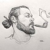

added comment inFirst stages of new piece
4d
Hey @matt barton! Nice start here! A few things to consider, the gesture is looking pretty stiff, the proportions could use some tweaking. First, gesture- Your character is stacked upright (almost right against your vertical head measurements) which makes him feel like he's standing up straight, balancing on a tight rope, or he's been caught and is surrendering. You can really push the centerline of the body into a fluid S curve for a more graceful flow to the body which sells an upward flying momentum. Same with the limbs, they're pretty straight and stiff, you can push more curve into the overall flow of the arms, and consider leaning on more asymmetric poses to add some more dynamics to your character. Proportionally the head is a little large for the chest/frame, and the legs and arms feel a little squat for "Heroic" proportions. Especially with the low angle you're viewing this character from you could lengthen the legs a bit to sell the idea that the figure is flying above the viewer. Take a look at "Heroic" proportions from Loomis and you can see the head stays relatively the same size, but the chest, hands, arms and legs are much bigger adding to the imposing presence. Another thing to consider is the overall storytelling of your pose/costume. The cape is a bit inactive, and the hands could tell more of a story. The open hands suggest a peaceful, welcoming character, but if this is a threatening or commanding character, you could use those hands to convey a sense of power and control over their surroundings. The cape is a dramatic element to include for a character and you can use that to also sell the idea of flight, power, and movement. I hope this helps! Keep up the good work! Looking forward to seeing this one cross the finish line!

matt barton
4d
Hey @Patrick Bosworth Thanks for the tips man I really appreciate you going out of your way to help me. So when I looked at the image again I was not happy at all with it so I tried again. I think this image is an improvement but after seeing your recommendations I will implement a couple of things. The legs definitely need some more flow in the gesture so I will tweak that. At this stage I would like to keep the arms as they were pose wise as that will feed into the story I'm trying to tell later on. Again thank you for your tips (the cape looks excellent btw, will be using that)
added a new topic
First stages of new piece5d
Hey guys
Just started this piece and would appreciate any feedback you have so far


8mo
Hey Matt,
It's easier to just show you than to explain it. I did a quick diagram that I hope will help, let me know if you have any questions :)
8mo
Hey Steve As always thank you for feedback (you are fast becoming a mentor of mine lol) ive posted an image of how i think the perspective works on the character. Im looking for the torso to be twisting towards the viewer and would like the front leg to be pushed forward
Show all replies (1)
added a new topic
character illustration help8mo
Hey guys
Is this piece looking alright ? drawing it in perspective has been tough

9mo
Cool work :) A tip I would like to add is to watch out for the "snowman effect", which is basically symmetry on parallel sides. It seems to be most prevalent around the arms and legs, with a bit for the center of the midriff too. To fix it, keep an eye out for the natural rhythms of the human body, as often times they will fall more on an alternating rhythm or curve-against-straight pattern. I think you could also benefit from creating more straight lines/edges overall to make the drawing more dynamic rather than all round shapes.
As for anatomy, I would recommend slimming down the neck as usually it's not wider than the head, especially not for women or unless the model is a bodybuilder. The pec area also seems a bit unaligned. I see you have a curve for the torso bending backwards, but the breasts seem more 2D facing the towards center rather than following the structure of the torso and sitting on top of the pecs, which would make them face more towards the left of the page and overlapping.
Hope this helps :)
Show all replies (2)
added a new topic
feedback would be appreciated9mo
hey guys
Currently sketching out this piece and would appreciate any tips you have
10mo
Asked for help
justb trying out some bodies in perspective and would appreciate any feedback
anyone know what brush is being used in this demo ? id like to try it out
added a new topic
Just dont enjoy art anymore1yr
So this is something I have had in my head for a fair while now and I'm kinda at a crossroads. Basically I just dont really enjoy art anymore. I do still enjoy doodling and sketching but sitting down and concentrating on a piece is becoming a real chore. I had aspirations of becoming a pro artist but to become one you must put together a pro portfolio, learn to market yourself, take rejection upon rejection on the chin and keep going,develop a style that helps you stand out from the crowd, land a contract and work for less than what i make in my current job.
Plus on top of this I am experiencing something of an existential crisis in terms of art itself
What does art do for the wider world ? how is it meaningful ? yeah cool its good for the individual in terms of expressing themselves but honestly.. when has art ( drawing and painting ) really changed the world ????
Now, maybe I am being overly negative but I cant find an answer for myself or have dedicated so much of myn life towards art that Im now thinking I want to move on before I waste my whole life.
I would be very interested to hear from you guys on this one. Have you had a similar experience and how did you over come it ?
added a new topic
Looking for Crtiques before continuing2yr
Hey guys
So I think I'm making good progress on this piece but something feels off. I would appreciate any feedback you have before I commit


2yr
Hey Matt! Good job on these, you're right to stay away from detailing at this stage.
A couple things, though the gesture is getting there you're losing a lot of the energy of the poses. What I suspect is happening is that you're not drawing as much with your arm as you should be.
With these sorts of drawings, feel free to draw past where you think the shapes should end. These ones that you've done have very abrupt ends which do stop the figures displaying their action.
See the example below for what I'm talking about:
2yr
Hey Kristian
Thanks for the feedback i shall keep this in mind on the next go around
added a new topic
First steps in gesture drawing2yr
Hey guys
Would really appreciate it if I could get some feedback on these. I think I've managed to stay away from detailing and tried to get the energy of the poses but if you can see something I would love to know
Thanks in advance
2yr
Asked for help
Hey guys
Would appreciate your help with this one before i progress. Is the perspective and anatomy correct ?
Thanks in advance
2yr
Asked for help
Hey guys
Early doors on my latest study piece and would love any feedback you may have
2yr
Asked for help
Hey guys
Trying anew way of getting the reps in here and would love your feedback
Calling this one finished. Really enjoyed making this one. Thanks to everyone for the helpful hints
Show all replies (1)
Asked for help
hey guys
So Ive put in some more time. Hopefully the advice you gave has been implemented well. Would appreciate any further advice
Show all replies (3)

My initial reaction to the saturation was that it's much too saturated. But @Steve Lenze pointed out that it's a stylistic thing, and I agree. Every situation calls for different lighting. If you were going for a very natural light, such as indirect light through a window it would be way off, but if you envision your character bathed in fire light or a sunset then your much closer.
Great drawing though. I love the line work.
2yr
Hey Chris thank you for the feedback and kind words. My aim is to go for a sunset style look, I'm going to play around with the saturation though and see what results I get
Show all replies (1)
Hey Matt,
This drawing is pretty good, especially the face. There is a problem with proportion though, the head is too big for the body.
As far as the painting, color saturation is a personal style thing. I think though you could desaturate the skin a little to build contrast with the rest of the image, but, that's just my opinion. I think the bigger issue is the lighting. It doesn't look like there is a convincing light direction because of a lack of shadows. I did a sketch to show you what I mean. I hope it helps :)
Show 1 more replies
added a new topic
First attempt at colour work in a while2yr
Hey guys
I think im progressing quite well with this image but would like to get some of your feedback before going further. Is the lighting ok ? is the colour too saturated ? appreciate any comments