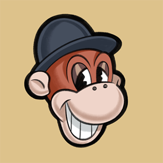
Ron Kempke
added comment inCritique - Simplify Pear from Observation
11h
Stan, you've clearly explained how we can use only 5 values (3 in the lights and 2 in the shadows) to indicate the form of a single object but, when we are faced with multiple objects that have different local values, how do we use those same 5 values to describe their forms if we want to show their local value differences?
Show all replies (1)
Very informative. Think "paint by number".
Can't wait to start the long run and improve a lot. Here is where I am from now, looking forward to get better at value, line quality and everything. I'm really happy sharing the journey with you guys, let's work together !

Ron Kempke
13d
I think you misunderstood the assignment because your drawing lacks value shapes.
Show all replies (1)
Show 8 more replies
28d
Stan, I purchased this course mainly for the exercises, especially those that will help improve my seeing and recording accurate proportions. I imagine they will be closely tied to seeing and recording accurate shapes.
Asked for help
Week 18: The last week of this unit. I've continued the 250 cylinder challenge, and i'm 200 cylinders in. i could use some feedback on these. obvious they are not correct. But i'm wondering how you would get a better result. Drawabox states that you should eyeball the boxes and make an educated guess for the converging lines.
Also continued lesson 4 and created a bunch of studies of insects.
To reward myself for the work of the last weeks, i've bought myself some nice colored pencils. I've drawn attached frog with them ;)
1mo
All box and cylinder verticals should converge to the same vanishing point and the near corner angle of the box bottoms should not be acute (smaller than a right angle) as you show.
Show all replies (1)
Show 3 more replies
Sounds like it's an out-of-control virus that has very little to do with art.
Show all replies (1)
Why is Bob Ross in the womb?
Show all replies (2)
3mo
Comet,
Nice attempt but, before you concern yourself with modeling (shading), you need more practice seeing correct proportions. I noticed a few things in your drawing that detract from a true likeness, if that was your intention. Her left eye sets back a little too far in your drawing and eye, eyebrow and jaw are slightly stretched horizontally from the model's. If you extend a line from the model's jaw, it lines up with the front of her ear canal. Also, the model's straps aren't spread apart as far as you show and your sternocleidomastoid muscle should be directed to the pit of her neck instead of straight down. Try drawing this head by eye, then lay your drawing over the reference and hold them together up to a bright window to see how closely you've duplicated the proportions. Comparing your drawing to the reference in a mirror also helps to exaggerate any differences in your drawing.
Show all replies (1)
Asked for help
2022//8/31. Good morning everybody. Here’s my today’s 30 mins warming up exercise. Thanks for any comment or advice. Have a good day.
Show all replies (1)
5mo
Asked for help
2022/9/1. Good morning everybody. Here’s my today’s warming up exercise exercise. Thanks for any comment or advice. Have a good day.
5mo
Compared to the model, lines through the eyes and the mouth corners are not parallel in your drawing and they diverge slightly as they recede. Try adding the features over a simplified construction drawing to assure correct alignment.
Show all replies (1)
2yr
When is your drawing basic course coming out?
Hello, is someone working with an anatomy book to place the mucles at the right place ? Like an anatomy book for bodybuilding for example.
Show 1 more replies
1yr
I thought you should do a gesture drawing first and then go over it with structure but Proko went straight into the structure it seems
1yr
I, too, was disappointed that Stan didn't start with a gesture. I don't know if it was intentional but his drawing differs from the model's pose. The model is erect but she leans forward in Stan's drawing. If it wasn't intentional, a gesture drawing would have prevented it from happening.
Show all replies (1)
1yr
Asked for help
Having some odd things happen. I had edited my last post to add more imagery and when I checked it later, the edit was gone. So here is my master drawing from Milt Kahl’s beautiful work.
1yr
I'm always interested to know why people copy. What does copying do for you? What skill do you hope to improve by copying another's work line for line?
Show all replies (2)
1yr
Asked for help
Hi,
I am currently learning the Loomis Head based on the 3D model. Next, on the Lay In, I want to draw the skull in its bone structure. Unfortunately this part is not shown as an example by Stan or I overlooked it. Do you have a suggestion or a video on how I can best proceed?
I had read that the Loomis Head is well suited to draw a skull. As a reference I bought the 3d skull from Proko.
KR
1yr
The method you want is masterfully illustrated by Andrew Loomis in his books, "Fun With a Pencil" and "Drawing the Head and Hands." These titles may be currently out of print but used copies for sale regularly post on Bookfinder.com and eBay. Good luck with your search!
1yr
Hi everyone, I really appreciated this lesson as well. Here is my first attempt from a picture. I think the shape is not really accurate. Any feedback is welcome.
1yr
Nicely rendered but your proportions differ from the model's. Your drawing appears to have been stretched horizontally. If portraiture is your ultimate goal, learning to see and reproduce correct proportions is essential.
Show 1 more replies
1yr
Asked for help
Page layout and design is new to me, got some questions around things like:
- where the horizon line falls in each panel on a single page
- the mix of shots used in panels for a single page
- when and when not to repeat information within multiple panels
Am very confident with writing but translating writing skills to the types of skills that are unique to comic stories is proving challenging.
Are there some common faux pas or things that good comic artists should typically try to avoid when it comes to page layout? More specifically, in my early storyboards I find myself worrying about things like:
- Is it OK to have ~2 panels on a page (especially consecutively) where the horizon line is the same height, or the height of the horizon line hasn't differed significantly between the two panels?
- What to avoid when using the same types of shots for ~2+ panels on a page? i.e. Establishing/long shot > med > med > med > closeup? My initial thought is that this is fine so long as the angle of each shot differs in a meaningful way, but in practice I'm skeptical that there are lots of pitfalls here that can make the end result boring or off.
- What to avoid when using panels to establish setting, i.e. after the initial establishing shot, tips and tricks for revealing more of the setting and environment in a way that's interesting and meaningful prior to introducing characters.
- Using the same perspective multiple panels in a row , i.e 2pt perspective several times in a row on the same page, and so on.
Possibly overthinking a lot of this, but any general advice or things to avoid in terms of page layout would be appreciated.
1yr
This may answer some of your questions or at least get you thinking:
https://www.youtube.com/watch?v=UdWsNp5KWdE&t=3148s
Show 1 more replies
I operate in a different realm, a lonely realm but I very definitely consider it a realm within the 'art' world in general, I illustrate for aviation publications and provide freehand portraits of the flying machines for private clients - a very mechanical and technical realm but through it I get to inject my personal expression and ultimately have my say and it's because of that recognized style that I am established and am able to price my work, it's always a balancing act though between being affordable enough to keep busy and being priced right to be respected. Unlike more abstract or 'natural' artists I could never 'name my price' as it were because in the art world the technical realm is looked down on as more design or illustration but I strive to be recognized as an artist and am definitely working my way to that high price.
2yr
It's pricey now, but a helpful out-of-print book for learning solid drawing is "Draw the Looney Tunes" by Dan Romanelli.