Professional artist from the animation industry.
traditional 2D animation.
storyboard.
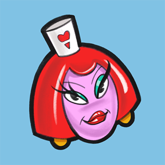
character design.
Follow on social
Albums
29character design
22comic stuff
18drawings and oil paintings
16digital painting
Activity Feed
Help!
Browse the FAQs or our more detailed Documentation. If you still need help or to contact us for any reason, drop us a line and we’ll get back to you as soon as possible!