


Carl Emil Zeidler
added comment inwhat are my weaknesses?
3yr
I like them. Be careful that your drawings don't bocome flat when you draw foreshortened hatches, like you did in the roof in #2. In nature, there is a lower probabillity that a line will be foreshortened.
Show all replies (1)
Cool and different concept! I am not the most experienced painter (I still neet to learn to control gradients), but i took it also as an exersice for myself, and i am sure that you would have figured out some of my improvements yourself if you had worked on it a bit more. Here is what i would do. Overall the colors work well. I can see that you seem to be using dodge and burn a lot (is this true?). I would personally hesitate to use it too much, until the end phase of the painting, especially for realistic painting. For comics in lineart it works fine though. The palette you have chosen is quite difficult, since the spring green and the rose red are strong complimentary colors (a praying mantise is actually more chartreuse green, and i find that this spring green is pretty rare in nature, if it is not in a shadow, but this looks cool too,). I decided that a yellow background would be the best for tying them together. I moved her anatomy arround. The most problematic thing for me was that it was hard to see wich leg was in the front. I think it is very unlikely that her flower dress would drape this way arround with her right leg in front, so i actually tried flipping the dress. Her right hip is also raised, so i made her lean on her right foot. Dont forget her clavicle. Her armpit was quite low and her legs were quite long. i also moved her head forwards and added a shade under the lip. It could help to include a bit more mantis anatomy. Nobody sais she has to be realistic though. Sawteeth makes it read more as an insect. Perhaps you could include the fact that mantises tend to appear to look to the side?
3yr
It looks great! I definatly do feel the tension, as if they are in a short break during the fight. If you bend the cat's front legs even further, it could look more ready to jump (be carefull not to stretch back legs or it would then look like a playfull dog). Maybe you can pose it so that not only the head is reaching, but also the body is bend. A bit bolder camera angle could also improve, but dont overdo it, or it would look like an action scene. Then it is better to keep it like this as a contrast for the next scene, as this angle conveys a moment of clarity. A last thing i could see is to move them a bit further appart in the frame. It would show that they keep within safe distance from each others. Just take what you can use from my comment.
3yr
To me you nailed it! A bit more value range and storytelling could perhaps improve it.
I feel like grays and other neutral paints should be cheaper to buy, but usually they are the same price as the stronger colors.
What is a term for the property that a pigment can have, that you need more of that color than the other stronger colos? For example, to mix a neutral grey, you need more yellow paint than purple.
Show all replies (1)
3yr
Quickly you say? I always have to wait ages for the paint to dry, and still it bleeds together when i think it has dried when it actually hasn't... i must be doing something wrong... they certainly dont look like yours... :)
3yr
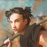
Hello. I think the circle is a bit too tangent with the silhouette, it makes it a little bit harder to read. it could look like a hat or something. Dont remove it, it adds a lot to the painting as well. You could also choose to charicature the european look even more by shading more under the eyebrows, but then you might have to raise the eyebrows as well, or she would look masculine. There are many round shapes, that is also a legitimate choice if you want a certain style, but be aware that you then have to be careful that it is still defining the landmarks in the anatomy. You can try and work more with corners and lines, it will look a bit more confident. Also the hair is a great opportunity to be expressive. Otherwise great piece, the colors work well in my oppinion.
3yr
Looks great! Reminds me of Leyendecker and Rockwell. But why are they all doing the duckface? shouldnt say my profile picture has the same lol
Show all replies (1)
3yr
None of the traditional 2d animators that i am aware of use the overhand grip. I guess it is just not needed when all you draw is lineart. So they tend to use the "tripod grip"
Show all replies (1)