Two Best Buds from Halloween
4yr
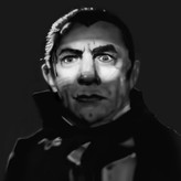

Tony
I just made these in the last two days and was just hoping for some general feedback. Both done in Procreate with the vine charcoal brush. I tried using the smudge tool for the first time with these and I really like how some of the transitions look, but I’m still having difficulties with better edge variety because my photo references are typically low quality, so I’m left with figuring out where to put hard edges on my own, which I’m not very comfortable with yet.
In the livestream today with Lane Brown, he mentioned making cast shadows have harder edges, so I’m going to look for that in the next portrait I make, but for now I have little Michael Myers and Dr. Loomis 🎃🔪 and just wanted to see what you all think. Thanks! 🤓

These are really rad! I really like what you did with dragging the edges of the head and ear back on the Dr. Loomis portrait. It gives the piece as sense of "memory" if that makes sense. To help get comfortable pushing those hard edges you could always add a layer on top of the drawing and experiment with pushing hard edges in certain places, that way you can see where you'd like to push them without fully having to commit. Generally with cast shadows they start off hardest in edge the closer they are to the object casting it and as they move away from that object their edge becomes gradually softer.
Thank you! 😁 Now that you mention it, I feel kinda dumb for not thinking of that already. 😅 When I started trying to learn to make portraits I decided I wouldn’t let myself trace, use a grid, measure, or use multiple layers, because I wanted to push myself to develop observational skills. I think I got so used to it that I forgot using more layers was an option. I guess I know how to start experimenting with edges in the next one! Thanks again! 😄

both are awesome and I think you have a great art style'

Hi Tony, I would try to accentuate the contrast between the light and shadow parts, otherwise they are good portraits. Well done!
Thank you, Serena! Yeah, I can see in the thumbnails that it’s hard to read because of the lack of contrast. It’s just another example of me sticking with how the reference looks, even though artistically it’s not the best way to design it. I’m working on another portrait right now, so I’m going to make sure I address the contrast before I finish. Thanks again! 🤓