


Activity Feed

James Paris
•
2yr
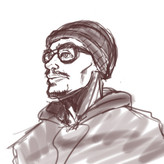
added comment inDigital Painting in Grayscale
Asked for help
Took me around 2h I think, it's a bit too dark, I realise now that my drawing tablet and my monitor have way different brightness !

Isidro Alvizo
•
3yr
Asked for help
How did I do? I drew 100 of the Loomis heads and here are some from varying angles.


Asked for help
I don’t think the Overhand grip works for me since I draw on a flat surface, I can’t also figure out how to hold the pencil in the form.
Asked for help
This is how I usually grip my pencil, I feel it works better for me than the overhand grip. Maybe I’m just giving up too easily but I never hand a problem with using it and it work for the most part. However I would like some criticism on what I can do to improve it.


Once you start painting, the overhand grip will make more sense. It also forces you to use your wrist, arm, and shoulder vs the manuscript grip that lets you cheat. Mind you, I use the manuscript grip when I am working on details. It is the best grip for that. The overhand grip should be used for large, long, flowing strokes.


Why not have multiple options at your disposal? I learn different things from different mark-making mediums and grip styles, but mark-making is a skill that takes time and dedication to improve. As a westerner, I defaulted to a tight hand-writing grip when starting out and then learned to try different grips. But I think the idea of "guidelines not rules" applies here. For example I've seen figure drawing done with overhand grip using a large Sharpie marker. I'd gently suggest that if you're learning from a teacher, at least try their medium and grip suggestions.


like others have mentioned the main thing is to stay loose regardless of how you hold your pencil. The value of the overhand grip with charcoal is it allows you to stay loose, and gives you better control over your linework. You can go from broad lines to fine ones more easily than a normal grips.
For certain drawing tools (pens, digital) it may not even be possible to use overhand, and those methods normally have different means of line design. Just remember to stay loose and gestural

If you’re are doing really rendered drawing I suggest holding it more loosely and further back on the pencil when shading that will make sure that you don’t hurt the paper by making an indent in it.


The overhand grip works best for Charcoal, sharpened the way he describes in this Video: https://youtu.be/D_W9sZ8S7RM . Like you I have mostly drawn with the tripod grip. Once I started his courses I decided to try charcoal since that is what he shows in the video and I did come out with smoother lines. My drawing has always been very rough. I has gotten easier the more i have used it in the lessons. Really, I think it is a preference. I prefer lead holders with 2mm lead. Here is Proko's video about drawing grips if you have not watched it: https://youtu.be/pMC0Cx3Uk84 . Here is his video about other drawing supplies, such as the lead holders: https://youtu.be/FoyaGaFajSU .


Top 5 things you want from a color theory course?


Hi Stephen, in no particular order
-Many exercises and examples
-Analysis of the work of past artists and how they have used their color palette.
-The value of color as an element in a composition.
Best regards.


Marco Sordi
•
3yr
Asked for help
2022/7/3. Hi everybody. Here's my latest illustration. It's a concept for a videogame. The subject is a fairy who can manipulate time. I'd like to have some feedback or critique. Thanks and good night.


Wow! I can tell you are improving very quickly! it's a beautiful illustration. One thing that I would suggest is decreasing the contrast of the small planet on the right as it is taking away attention from the focal point. The next step would be practicing more gesture drawing and using references for the pose and the lighting in your next illustration. One amazing resource I would suggest u use in your next illustration is Magic poser web. https://webapp.magicposer.com/ it's an amazing resource to figure out the lighting and pose. I hope it helps!


Hi! I really like this idea and some of the rendering. It looks like you put a lot of work into this illustration, you did some great design with the hair, and details on the boots! What I think could be better overall is lighting. There are many things fighting for attention and I understand that they are important but they could be emphasized with a different approach. I would suggest darkening everything accept the character, and a lot, and than putting just some smaller glows on the clocks. Making them much more subtle but still important.

This looks great, the proportions and structure are very good. I would say this falls more under the splash art category than concept art. Character concept art leans more towards multiple designs of the character. Showcasing different color schemes, outfits, and poses of the character.
I will link a few from Riots League of Legends Zoe for examples:
That’s a really cool concept you have made. I don’t have a lot of feedback but it might look cool if you gave the character a tattoo that relates to their idea as a time manipulater.


Sandra Süsser
•
3yr
Hi guys. Trying to do structure the Proko way. Had a hard time with the chest area of this feline. Any suggestions?


Because I love cats so much I actually have some experience here. What your seeing is a connection of skin and fur from the right arm to the chest. It' becomes very confusing when the fur fluffs out and to the left making it look convex when it's actually a concave shape. You have the the structure of the cats chest just right I would just connect the elbow on its right arm to the center of the chest with a concave line. Hope that helps! Keep up the awesome work!