


Marcus Bäckström
added a new topic3yr
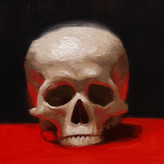
Painted this portrait the other day. Any advice on how I could have dealt with the hair better?

3yr
So... I had another go... and I think this is going in the right direction - thanks so much to you all for your great advice and help here - I tried not to overwork this, and have now I think got a better range of colours - as to whether they are actually in the right places or not on my figure is another question entirely :) I have included my pallet so you can see how this ended up - so much better than my original muddy mess - although I think I have a lot to learn about keeping it tidy and trying to group my warms/cools/lights/darks... The other learning point I have uncovered as well is the skill of taking a photograph of an Oil Painting - seeing as I paint in my shed where I have lots of big windows this is a nightmare for taking a photograph without reflections and shine on the surface - I do have a DSLR camera, but its so long since I have used the manual exposure settings that there was a lot of guess work going on here...
Marcus Bäckström
3yr
i would highly advice to pay just as much attention to the background as the figure. It might not seem as important but color is all about relations to each other. Changing one color (in this case the background) is gonna affect how you see all the other colours, same with value. In the reference the background is clearly light blue but you painted if dark red, the complete opposite. Look how much lighter the background in the ref is compared to the cast shadow btw. Value over color every time.
Show 1 more replies
3yr
Looks like you're still painting in grayscale, don't be afraid use more of the yellow and red when mixing. Something that might help you get more comfortable with the colors is to do a colorwheel using the palette, sure helped me when i first started painting with color
Show all replies (1)
added a new topic
Fruit study in oil3yr
Going back to the basics and painting fruit to try and learn more about how color works. I feel like i have a basic understanding of color theory but there's still so much more to learn. I realise a lot of colors gets lost in photos so it's not gonna be 100% accurate to the irl painting but any thoughts on the pear are welcomed

3yr
Looks great! It looks a little dark, is this the photo? What medium is this? Okay, you didn't ask for critique, but the only thing that bugs me is that the trapezius muscle is a little prominent...
3yr
Thank you, It is a bit brighter in real life yeah, it's really hard to take good photos of oil paintings due to the glare. I'm guessing you're talking about the upper part of the trapezius at the neck, i might have exaggerated the contrast of the shadow on the back of the neck. Maybe softening that up slightly would help?
Show all replies (1)
3yr
Really special - its awesome - how many hours approx??
Show 1 more replies


3yr
Wow...is this is oil painting? Anyways it looks great.
added a new topic
Finished my figure!3yr
Well there is it, it's finished and i couldn't be more happy with the result!
Could you talk a bit about the materials you'll be using?
Any plans on more oil painting courses? Loved Aaron Westerberg's painting course
I think what people mean, when they tell you not to worry about the quality of the art, is that you don't want to obsess about everything you draw being perfect. It's important not to rush things when drawing and painting but also realise that most of the stuff you draw as a beginner won't be masterpieces.
So my advice to you would be to take your time and do it correctly, eventually you'll build up enough muscle memory, intuition and skill that things naturally speeds up.
Show all replies (1)

3yr
Marcus! You’re making such good progress in school, it’s a shame I am no longer there but I’m fortunate to see all you guys getting so good. Being aware that the time limit for the portraits after class are typically less I can say with confidence this is/was headed in a really nice direction. I know mine never looked so well when I was there! I felt the portraits were for sure my weak point, which is why now I often take time to practice them (albeit from photos mostly)
Anyways, the angles are all looking lined up and proportions look well together, I don’t sense anything that stands out. The only thing I could pick at is the forehead on the right edge, it’s a bit too ‘smooth’ (if that’s the right word) as it transitions into the hair. Maybe just a bit more structure in the brow area, or pushing the mass of the hair slightly to the right so that it looks more like it sits on the skull. However, something like that can be easily shifted as you lay in more values if you had the additional time. Could be that’s just what it looked like and you can brush aside my remarks as well!
I just want to reiterate that this is really nice. I like how subtle everything is and there there isn’t a lot of chaotic lines, you’ve simplified it well enough, it’s a really strong start. I think if there was additional time I’d push the values more and start that big look stage.
3yr
Thank you so much for your kind words Amanda. I can totally see what you mean about the hair needing more volume, i should push the shape design a bit more to avoid the tangent it's currently creating.
Hope you're doing good, loving the pet portraits!


3yr
Snyggt jobbat Marcus! are you going to do a second version where you expand on the study? or is it practice for practices sake?
3yr
Tackar tackar. It was gonna be a study for an oil painting but sadly the model had to cancel so nothing ever came of it
added a new topic
Figure on the easel3yr
Started painting on this one last week and i'm super excited to keep developing it. Started sketching it in using transparent iron red oxide and then went in at put down general colours and values in a thin wash. Currently adjusting the values and temperatures of the painting while refining the drawing.