

Activity Feed

Nellie Barwick
added comment inProko Challenge Favorite Book Cover - FINAL SUBMISSIONS HERE
2yr
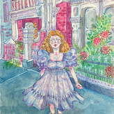
Hi there! The book I chose to illustrate a cover for is “The tiger who came to tea” written by the lovely Judith Kerr in 1968. This book holds a great sense of nostalgia and significance as this was one of my favourite books to read in my childhood. The whimsical tale of a small girl and a large friendly tiger dining together and making mischief seems to excite and inspire all children alike. I loved the aesthetics of this book; the type of vintage and grandma feel that the story gives you is like a warm hug to your younger self. I wanted to capture all these feelings in my adaption of this cover. I decided for the font, I wanted to make it feel like an old newspaper or typewriter. Almost like a child’s collage that they would place on the kitchen table. I wanted to keep my colour palette minimal and simplistic, so I used the base colours of orange and blue, but I created tonal value through blending and overlaying these colours to make darker and lighter shades for dimension in my piece. I decided to make the background a floral pattern to imitate an old English home in the 1960-1970s, like a wallpaper in a children’s bedroom of a 1970s house. Also, the colour pallet of orange and blue is reminiscent of the 1970s with groovy and bright, fun colours. I didn’t want to over complicate the piece so I kept the composition clear and easy to comprehend so If you saw this book in a bookstore you could identify it from further away but still have enough detail. I thoroughly enjoyed making this piece and wish the best to everyone who has entered the competition!

Mizallarmé
2yr
The background pattern and the colour palette are wonderful. Really liking the typography, the letters look like they were pieces of a Scrabble game. Nice work!
Show all replies (1)
Show 2 more replies

I just found out about this whole community and it is really amazing.
This is my first entry for the April Proko Challenge.
La Mécanique du Cœur (The Mechanics of the Heart) is a book that I am very dear to my heart because my first love was the one who showed it to me.
In university a professor showed me a very cool Graphite and Watercolor technique and since the challenge was a traditional feel what better way to adapt this technique now in digital.
With red and brown color accents I think this is the best way to represent this book.
2yr
Like the composition and line work. The colour palette is soft and the nuances are very good. Good job!
Show 1 more replies


My submission for the Book Cover challenge. The hated and loved Moby Dick (I love it). Trying something old school.
2yr
This illustration is breath-taking. The shadowing, the composition & the perspective are so professional.
Show all replies (1)
Show 7 more replies

Hi! Here's my submission for the challenge. Book is A Gathering of Shadows by V.E.Schwab, the second in a trilogy and one of my favorites! It's full of pirates and magic tournaments and different Londons, and darkness that's gaining strength and waiting for the right time to strike back and conquer the kingdom.
Show all replies (1)
Show 5 more replies

Hi :) going for Lovecraft - The Call of Cthulhu. Done traditionally, pen, ink and markers. Enjoy
Show 2 more replies


Hi, this is my final submission for "Walden" by Henry David Thoreau.
Probably not my favorite book, but I read it once and I found it very cozy.
I tried to keep it on a traditional feel but also with a modern touch.
Show 4 more replies


Hi everyone! I have a lot of favorite books, but keeping in mind the constraints of this challenge, I chose One Hundred Years of Solitude by Gabriel García Márquez. I have read the book at least 3 times. Not just because there are tons of characters in the book with the same name (not coincidently):) and honestly, sometimes it’s hard to follow because of that, but the story gives me a huge range of feelings. The story is sometimes graceful, sometimes magical, and sometimes brutal. It’s not the easiest book to read, but it is worth reading for the experience it gives.:)
2yr
I have to say that your work is astonishing. The composition is very solid, the details on the skirt are wonderful and the color scheme is warm. Never expected to find a book from my country on this challenge (I'm from Colombia), and this surprised me greatly. So, thank you very much for making this.
Show all replies (1)
Show 3 more replies


Hi everyone! For my submission I chose “Something Wicked This Way Comes” by Ray Bradbury. I remember reading this book every autumn when I was younger and it always made me feel excited for the season. The strange and sinister imagery conveyed throughout the story has always stayed with me.
I’m pretty new to drawing digitally so I tried to keep it simple and focus more on colour, and contrast between light and dark since this is one of the main themes in the book. This was so much fun to try! Thanks! :)
2yr
I find your color scheme quite fitting, I like the way you modified the title's type, very funky. Amazing work!
Show 2 more replies


The Buried Giant - Kazuo Ishiguro
2yr
The color scheme is cool and the line work has a lot of character and cleanliness. The composition is awesome too. The typography is nice, although it's a bit hard to read the line below the title and the author's name, maybe having more contrast between colors would help with that. But I like this work. Great job!
Show 2 more replies


The Left Hand of Darkness by Ursula K. Le Guin is one of my all-time faves, but a risky pick because it has so many good covers out there already! (and it turned out half of my thumbnails were just half-remembered covers lol)
Tbh, I have never really designed a book cover before (only a couple for fun) and I'm afraid this came out too much like a comic book cover! But I had a lot of fun nevertheless.
Typography is also very much a weakness of mine so please let me know what I can do better!
2yr
The color scheme and the illustration are nice and clean.
About the typography, I personally think its colors are nice, but the title is too little in comparison with the author's name, I think it would better the other way around. As a handlettering/illustration artist, an advice I can give is, instead of using plain typography, play around with the disposition and size of the letterforms to give them the vibe you're looking for, whether they're are hand-drawn letters or fonts. This can give a lot of character and personality to your work. Hope you find this info useful. If you have questions about it, you can ask me, no worries.
Show all replies (1)
Show 1 more replies