


@jaffacakes
added comment indo you use references when creating a concept? if so how?
13h
Short answer: Yes! absolutely use references, lots and lots of them.
Long answer:
Okay so Ill try and give you a step by step on what your process should be for creating a design, its a VERY broad question you're asking so its hard to compress like 5 years of concept art study down into one post, its a complicated subject but hopefully this makes sense.
Step 1:
Write down what you are trying to make, this is important so you have a clear idea in mind of what you're goal actually is, otherwise you'll never know when you've reached the finish line and you'll be designing forever.
Be specific too, if you're making a robot design, its not enough to simply say 'a cool robot' instead, you should think about what the function of the robot is and how it's supposed to make the audience feel (i.e is it fast? scary? old or new? etc) . After all, art is about conveying an emotion and that's what will make people like and remember your design.
Step 2:
Gather lots of references. If you don't have 'pure ref' already, you should get it, its free and I have no idea how people create art without it. Initially, just try and gather things that look cool and stand out to you, things that match the idea you have in your head and then ask yourself why you like the things you gathered. What makes them 'cool' in your eyes and how can you add that into your own work? Then you can start to get more and more specific with which references you pick as the idea becomes clearer. Also Pinterest is faaaaar better than google images for finding inspiration in my experience.
Also remember that you can gather references for different aspects of your design. What I mean by that is, if you're designing a creature, and its supposed to come across as 'scary', then you should try to think of things YOU personally find scary and use parts from those things in your own design to convey that 'scary' emotion. A good example of this sort of thing would be 'The Night King' from 'Game of Thrones', he has horns on his head that make the shape of a crown, it lets the audience know he's a king/ leader character without him ever speaking. We see the shape resembling a crown, subconsciously understand the symbolism and get a feel for who the character is, without ever having the need for dialogue.
Also keep in mind that there isn't really such thing as a fully original idea, weather you realise you're doing it or not, when you start drawing from imagination, your brain is gonna start pulling from things you've seen throughout your life. Stuff from games you remember... or films you've seen...or just nature. Don't fight it, Lean into it! As long as you aren't completely 1 to 1 ripping off someone else's design, its okay to be inspired. You don't have to start from scratch and make something crazy complicated to make something cool either, there are lots of things that are already cool out there so start there and add a twist to it. Look at the terminator for example, its literally just a human skeleton but metal. Skeletons already look kinda cool, throw some metal on there and... boom, cool robot design! Most designs like this are made by using a technique called 'conceptual contrast', think of the lightsaber from star wars, they just combined two completely opposite things to make something original. A sabre (very old weapon) and futuristic energy (very modern/sci fi thing)' and for the terminator its the same, they combined organic (human skeleton) with inorganic (metal) to get something new.
Step 3:
Thumbnails and Silhouettes. At the very Start draw lots of little designs with barely any detail in them and just explore as many ideas as you can. Don't get attached to any one idea and don't become attached to the first one you make either. These aren't supposed to be pretty drawings , you're just trying to throw out lots of ideas. Sometimes its good to wait a day or two and look at them again with fresh eyes before you decide which one you really like the best. Once you've decided then you can carry that one forward and keep working on it.
Another good way of generating lots of ideas is doing silhouettes, just use pure black and make some shapes and you'll start to see things in them and give yourself new ideas. Its kinda like when you look up at clouds and see images in those. The silhouette is also the most important part of the design anyway, so its good to cover that part early on, its the first part our brains process when we look at something and when the design is far away its the only part we can see. So its important that the audience be able to understand what the design is based on its silhouette alone. Take any pop culture character and reduce them to just pure black and you'll still be able to tell who they are without any of the detail.
Step 4: FORM FOLLOWS FUNCTION... There are no accidents when you're designing something, every detail you add will have a logical reason for being there. Asking yourself: Who? What? When? Where? and Why? questions about what you're trying to make will make your life so much easier when you're thinking of details to fill out your design. Lets say I want to design a character... so I ask myself ''...Who are they? They're a hunter. Okay, So what do they hunt with? A bow. Okay, so if they have a bow then they need arrows...and if they have arrows then they'd need a quiver to store those arrows and then maybe they need a strap across their chest to hold the quiver....see what I mean? everything just kinda falls into place once you start asking these sorta logic questions.
Function will make up 90% of your decisions about WHAT details to put into your design but WHERE to place those and what they should look like comes down to what I originally said in step 1, about how you want the audience to perceive your design. (is it scary, fast, evil, good? etc.) Shapes convey certain meanings. Spikey shapes will communicate to the audience that a character is dangerous, where as round shapes come across as friendly and square shapes communicate that something is 'stable' and 'strong' (look at every Disney character ever made and you can immediately tell who the Villain/Hero is based purely on the shapes alone)
Step 5 :
There are some other basic 'Visual Design' things you should be aware of too, these aren't things that necessarily communicate anything to the audience but are more so just to make things overall allot more visually appealing. Every piece of art you make could be boiled down into essentially just placing 'shapes' in a specific order and there are ways to place your shapes that are better than others. Visual design is a MASSIVE topic so if you have any more questions feel free to ask but...
I'll list the 2 most important ones that are gonna solve most of your problems, in my experience.
1. The Golden Ratio (Sometimes called: 'The Rule of Thirds' or 'Big, Medium, Small' or the 70/30 rule. Its all basically the exact same idea, just with different names)
Basically, the whole idea is that if you had to slice one shape up and make it into two smaller shapes, the absolute worst thing you could do, aesthetically speaking, is cut it perfectly 50/50 down the middle so that both halves become perfectly symmetrical, symmetry is often boring...its repetitive and just looks bad to the human eye. If you've seen one half of the shape then you've already seen the other too, because they're identical... its basically telling your brain the same thing twice. You typically want to have more of one thing than the other. So a better way to cut the shape would be to make one half slightly bigger than the other. That's why its called the golden ratio, if you look it up on google images you'll notice that the diagram shows you a bunch of rectangles and each one is 1.618 times smaller than the last. You don't need to be that accurate with it and start measuring or anything like that, as long as you understand the basic principle of having one thing more than the other. This applies to EVERYTHING, not just the shapes. Have a red and black color scheme? then do 60% black and 40% red etc.
2. Gesture (sometimes called 'Flow' or 'Leading Lines' or 'Rhythm' and there's something called 'tangents' which is sort of related too) Bare with me because this one sounds really dumb at first but I promise it makes things look so much better. So... Every shape you place, ideally, should have a clear sense of directionality to it. It should point your eye one direction or another. Think of your shapes as if they were little arrows, just like an arrow, the end that's the most tapered/ smallest is the direction its pointing in. If you have a square that's perfectly symmetrical, then that's a bad shape, because both sides are the same size so it has no direction to it.
So lets say you start placing your shapes and each 'arrow' points you in a different direction. When you follow all these arrows and average them all out, What kind of line does it make overall? What path does it lead you on? Ideally, you want this overall line to flow through the longest length of your object. If it were a car you'd want the line to run from the rear end, over the roof or through the body and then point out of the front bumper, because that's where the action is and that's the direction the car is going to go. If it were an arm, you'd want the flow of shapes to start from the shoulder and flow down all the way through to the fingers. The type of 'path' you make with all these shapes/arrows communicates allot about your design, if you were designing a race car you'd want your 'path' to be quite straight and simple to imply that the car is aerodynamic and quick. There's a balance to it though, if all your shapes point in exactly the same direction then it will create a fast line but it can become boring to look at. As you study visual design more you'll find this common theme of balance pop up everywhere, too much order in your design becomes boring and too much chaos becomes confusing to look at. Its about striking a balance between the two.
Hope that helps you :)
Show all replies (1)
2yr
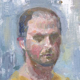
I have a few notes for things that you could work on but first I'll say that you chose a pretty difficult reference picture and that could be the cause of some of the issues I'm about to mention. I'd usually recommend choosing a subject that isn't wearing make up because make up is designed to trick the eye and alter how the face is perceived so it can become difficult to tell what the actual form of the face is and what's just make up.
Also the resolution of the image is kind of low so that might make life hard when you're trying to render little details like in the hair. Also I'd try to find something with more dynamic lighting for the next one, this ones lighting is a little flat so it doesn't show a whole lot of form.
As for the actual drawing I think you could maybe bring up the high tones and highlights a touch more to give more of a separation between the lights and darks and build more contrast and depth in the image.
Secondly I think there's some proportions going a little off on her right eye (our left), that eye doesn't seem to be quite the same shape as in the reference. I think it might be a little too low and small. Sometimes getting a ruler and lining up the features can help, it also helps with just figuring out the general perspective of the face too, seeing as most of the features are going to align parallel to one another (eye to eye, nostril to nostril etc) if the face is in a symmetrical expression
Final Thing is the hair. Overall I feel like its far too busy and could be simplified down a lot more. As I mentioned earlier the resolution of the reference doesn't help, I can barely make out the strands myself. But just for future reference its best to try and simplify the hair down into 'ribbons' rather than trying to depict every individual hair and don't be afraid of allowing some parts to get lost in shadow like on the right side of the her face in the reference, that way there isn't so much detail detracting from your main focal point (the face)
Been studying Hair allot recently and I found this video that really helped me a ton https://youtu.be/w0Qh4Cu5ecM
Hope that helps in some way
Show all replies (1)

2yr
Generally what you're looking for in skin color is a low-chroma orange. Depending on the person, it will swing a little towards red or yellow and up or down slightly in chroma, but will generally be low-chroma orange. This is true even for darker skin colors.
One of the first things to watch for is distinguishing highlights from form lights. Things can be really confusing when you can't tell if a light area is a highlight or a form light. This is one of the main challenges when working from photos—it can be hard to tell what's a highlight. From life it's easy—you just move a bit, and if the light moves with you, it's a highlight. In highlights, the chroma will drop even lower (assuming a white or whiteish light). Highlights usually have a core area that's lighter than the other parts and closer to the color of the light, and a darker transition area that's closer to the value and hue of the object. The chroma of this transition highlight will be higher than the core highlight, but lower than the chroma of the object.
The next thing to look for is higher chroma in the lights—but *only with form lights*. Highlights lose chroma as they get lighter. For form lights, more light = more chroma. So, as the form turns away from the light, it will lose chroma slightly as it also loses value. The shadow areas will be even lower chroma. So, the light-most-facing plane (LMFP) will be the highest chroma, and the form shadow will be the lowest chroma (starting at the terminator). Capturing the diminishing of chroma along with the diminishing of light can make things look real and full of light.
A good trick is that the area of the form light that is most facing to the light (the light-most-facing plane or LMFP) will usually be right near the highlight. It'll be on the side furthest from the viewer. This will be the highest chroma, but darker in value than the highlight.
You ultimately end up with a hierarchy that looks like this:
- Light-most-facing plane = highest chroma, third-highest value
- Core highlight = lowest chroma, highest value
- Transition highlight = second-lowest chroma, second highest value
- Form shadow = third-lowest chroma, lowest value
I attached some diagrams and a paintover to hopefully help illustrate
@jaffacakes
2yr
I was under the impression that colours were most saturated/ Highest chroma in the mid-tones? because the light washes out the color?
Show all replies (3)
Show 1 more replies
2yr
When it comes to colour I would worry less about trying to copy the exact colours you see in your reference and instead focus on the colours in the context of your canvas. Let me explain:
Colours are relative, meaning they will always look different depending on what other colours surround them, for example just plain grey, sat next to blue will appear red/orange-ish, because blue is a 'cool' colour so it makes the grey look 'warm' by comparison. This can make it extremely hard to guess the actual colours that are in you're reference because your eyes will always perceive a different colour to the one that's actually there (unless you managed to isolate that colour and view it somewhere away from all the others).
A good solution to this I found was to use 'Gamut Masking' or a 'Limited Pallet', this is a technique in which you select only a handful of colours and use only those colours throughout your whole painting, at first this sounds counter intuitive, but it actually makes the whole process allot easier, because now you've narrowed down your options as to what the colour could be and rather than having to choose from the entire hue chart you only have to pick from a select few...
So the question you should be asking yourself when picking a colour shouldn't be 'What is this EXACT colour' and then pain-stakingly trying to get it as accurate as the eyedropper/ Colour picker tool. Instead you should be asking yourself 'how this colour related to the rest of the image'? Is this Warmer or Cooler, Less or more saturated, Darker/Brighter than the colours that are around it. Like I mentioned before, only the colours on your canvas are the ones that matter, if an area in your reference is 50% warmer, more saturated, cooler etc than the area around it, then your painting should show that too, it doesn't matter if its the exact same colour or not, what matters is that its 50% warmer, more saturated, cooler etc in relation to the rest. If there's a spot on your reference that is the warmest part of the whole image then in your painting that should be the warmest part too, the colour can be red, green, blue... it doesn't matter, as long as its the warmest part, it will look correct in the context of the whole painting.
Hope that Helps :) I struggled with picking colours for a long time so I've done a ton of research into the subject, here's a couple of the videos that helped me the most, the James gurney video shows an example of the colour relativity thing too.
https://www.youtube.com/watch?v=qfE4E5goEIc James Gurney - Gamut Masking
https://www.youtube.com/watch?v=4LhcNbFMkTw Marco Bucci - Colour Harmony
Show all replies (1)