


Flynn
added comment inCastle. How can I make the image more interesting?
3yr
Hmmm so i get what you mean, i think it just lacks some main interesting feature. So something that immediatly catches your eye or something. For instance the sky looks very cloudy so maybe you get add in some thunderstorm or some lightning bolds.
What maybe also contributes to the "uninteresting look" is that it has overall a very low contrast and just a lot of really dark grey values. Doing stuff in greyscale doesnt automatically makes thing boring thats not what im trying to say but i think you can just use a bigger value range, this would probably make it more intersting because you could hightlight certain parts and you would just have more contrast.
I dont know how finished this is supposed to be so i would assume that if you would completly finnish it that you would get some harder edge work at some of the towers because the edges are sometimes washed here, even if they shouldnt be.
At this stage you could probably also add some more detail, so it would look more natural. Overdoing detail is obviously unnecessary but you could for instance carve out some single stones at the sides of the towers, because right now they look like some perfectly geometric cylinder shapes, which would probably not be the case in real castles, because they built stone after stone and some may be worn out already over the ages.
Oh and also the background looks a little boring because its such a flat land. Maybe you could add some mountains or forests there.
added a new topic
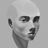
Illustration for critique3yr
Hey sorry if this is the wrong category but i thought this is kind of a painting because i used edgework and no lines and so on, but correct me if im wrong.
So this is my "personal" art so it does not have too much context. However I would like to get critique on literally everything so i get a kick in the butt again and i can move foward. So whatever you have in mind about values, the folds on her shirt, the overall colors, the composition, the portrait or the hair just say it :)
Thanks in advance


3yr
Hey there! Great work! Lovely folds :)
Adding to what @Kristian Nee has already said it's very hard to see what material the clothes are made out of, in fact, they blend in with the skin. You should probably do some material studies. To start, I recommend using differently textured brushes for different materials it helps me a lot as well :)
It also doesn't help the readability that your value range is so small. Don't be afraid to deviate from the reference in order to get a better punch :)
Flynn
3yr
Thanks a lot, I will dive into material from now on. I understand everything you said, very helpful


3yr
Hey Flynn! Great job, I really like the proportions and the gesture of the study.
The first thing that stands out to me (not drapery) is it feels like she's floating on that chair. Right now, it feels a bit like she's floating. I feel like it placing her in that chair a bit more would ground her in the scene and in turn give you a better idea of how the drapery might be flowing.
For the drapery to me right now, it feels more like a good study of what you were seeing, rather than an interpretation of what you were drawing. What I would say is try and think of the fabric as something wrapping around the form. @David Finch has a great video on his Youtube channel about drawing clothes I'd highly recommend.
Show 1 more replies
added a new topic
Critique on Drapery study3yr
Hey, i would like to get some critique on this drapery study