


Ritik Gajbhiye
added comment inPractice makes better
3yr
Hi brett nice gesture! Keep practicing!
If you like to learn more about gesture drawing. I encourage you to check 'force drawing by Michael mattesi'(if you don't know about it yet) he has great books also you can check his YouTube he is doing livestreams on there recently. :)

I've taken two character design courses through Brainstorm School, which I think is currently run exclusively online, one course with Abe Taraky and one course with Gue Yaj. I think when I took my class with Gue, it was his second time teaching, and now he's had another year and a half of experience teaching. I learned a lot from Gue, and he's incredibly nice and patient so I highly recommend his class at Brainstorm!
Ritik Gajbhiye
3yr
I never heard of that! Thanks for letting me know! :)


Hands down Characters for Animated Film with Daniel Arriaga on Schoolism! :)
3yr
Oh, i know that one! I have taken wouter tulp's expressive characters and i kinda thinking about taking that one! Thanks, i maybe try that one too:)
added a new topic
What is best online art course you have taken?3yr
What are the character design or for concept art or any art course you like. I just asking generally for fun. It might be helpful for someone!
3yr
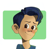
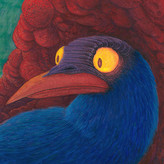
Hi @Ritik, love the stylization. If I had to give some feedback regarding color, I would say that we can make some adjustments to the colors you've chosen for some areas of the face. Skin is semi translucent, which means that for certain areas, we can see the blood affecting the color of the surface of the skin. These include the area around the eyes, the cheeks, nose, and ears. I like that you've applied that knowledge to flush the cheeks and the nose, so we can bring in that knowledge to brighten up the eyes and ears as well.
I've attached a painting by John Singer Sargent. For the eyelids, he's chosen to use a bit more of a saturated red, and it brings a bit more liveliness to the skin tones in those areas. Same thing goes for the ears. You could slightly exaggerate colors in these areas of your painting to add more variety to the skin tone.
Additionally, you could play up the saturation of the colors for your shadows on the face (I'm mostly looking at the shadows cast by the nose, as well as the shadows on the left side of the face). The color seems a bit dull, but you can punch the shadows up a bit by making the color a bit more red instead of dark brown.
Hope this helps!
3yr
Thank you very much this is really helpful! I'm loving this platform, it's a great to get critique on work it really help! Thanks once again! :D

3yr
Hey Ritik! Feel free to post any design/painting work here then- I'd be happy to help!
3yr
Oh shit! I think i forgot to add photo on the top post. Here's if you like do critique :)
Show all replies (3)

3yr
hello Ritik! i think the colors are working well. but if it was me doing this i probably would make the shadows a bit more consistent and present in some areas. (make the shadow appears more in areas like the nose, and in the left ear). is it. good job.

3yr
i think you loose a lot of shapes with the way you placed the red on the nose and the cheeks.
in the suggestion you see how i reduced that a bit and brought in the other local colors you established to get more shape on the form of the nose. on top of that i used your orange on the forehead and introduced it to other parts of your coloring so that it doesnt stand out just on that aread.
i added some light in the shadow for the same purpose to bring the shapes more out. in the suggestion+ i added some orange from the background circle on the figure. its something you can do to merge both elements a bit more together but thats totally subjective and up to you.
i hope thats helpfull for you.
3yr
Yes you're so right! Colour do look more unified in later ones! Thank you very much this was really helpful! :)


3yr
Hi Ritik! I think the colours work quite well together, but feel like it would benefit from some texture or smaller details :)
3yr
I do think so, I'm not much detail loving guy but do think it need little more polish! Thanks for the advise :)
added a new topic
Character design3yr
Hey everyone, hope you are having a good day! I need critique on design or painting! Thanks :)


3yr
Hi Ritik :) I would suggest changing that orange circle to blue or even a bluey purple because the skin there is primarily orange and blue is the compliment to orange. It should make the portrait pop more. You could also try adding some painterly white outlines around the circle and giving the piece a background colour, maybe a faint purple? I’d love to see the result ! Hope that helps :) 🎨😊🌸
3yr
That's very nice suggestion! I have done this one about a month ago so not gonna change it now(also i have already posted it on social media). I have been doing some value studies lately and thinking about doing some color work. That's why i needed some suggestions! Anyways thank you so much! That was really helpful! :D
Show all replies (1)

3yr
Hey! Your character silhouette is well defined however I think the shading could be more polished ( accentuate the sharp edges and loosen up soft edges). One more thing, the background circle is tangent with the head.
3yr
Hey, thanks for suggestions! Yes, i do think this is little underpolished and i do need to work on edges! Thank you and have a great day :)
added a new topic
Need critique!3yr
Hello everyone, i just need some critique on color or anything related to that. Have a great day! Thanks ;)