


Janice Albert
added comment inStan, We Need That Video NOW
5mo
Hi, Do you have pastel or watercolor classes? Thanks.

D S
5mo
https://www.proko.com/s/qThb
Hi Stan, have you ever tried to challenge AI to draw something in your patented kangaroo style? :)
Show all replies (1)
2yr
Hello, Patrick, I posted a question related to your post you made 10 month ago "I'm brainstorming at the moment to produce courses, movies, and books on drawing and painting..." (can't paste the link) a while ago, not sure that you saw it. Could you please take a look when you have time? I have a couple of questions/thoughts. Thank you!
2yr
actually, here's the question itself "Dear Patrick, big fan, thank you for showing the figure drawing process in such a detailed and full of thoughts process. This is very helpful for drawing natural real alive human beings. I have two questions here: 1. The courses of "Fantasy Female" here on Proko, is it a combination of your original movies? - I have almost the full collection of your original movies, and was wondering if this course is different or has more information? 2. The course on character design (I personally find it very unique and so much different from many other character design courses), - will this course have an evolution with the series of how to show interaction of the characters. - You have it partially covered in your figure drawing courses when you describe the thought process of composition and reference models placement. Do you think you will in some time in the future cover how imaginary characters can interact, how to make a composition, how to use life reference models for the designed characters get together in an illustration or a painting? Sorry for the long message, and thank you in advance for your response.".
Show all replies (1)


3yr
I'm brainstorming at the moment to produce courses, movies, and books on drawing and painting the figure, particularly fantasy figures. Please feel free to suggest what you would like to see from me here, maybe a Q&A for instance.
2yr
Dear Patrick, big fan, thank you for showing the figure drawing process in such a detailed and full of thoughts process. This is very helpful for drawing natural real alive human beings. I have two questions here: 1. The courses of "Fantasy Female" here on Proko, is it a combination of your original movies? - I have almost the full collection of your original movies, and was wondering if this course is different or has more information? 2. The course on character design (I personally find it very unique and so much different from many other character design courses), - will this course have an evolution with the series of how to show interaction of the characters. - You have it partially covered in your figure drawing courses when you describe the thought process of composition and reference models placement. Do you think you will in some time in the future cover how imaginary characters can interact, how to make a composition, how to use life reference models for the designed characters get together in an illustration or a painting? Sorry for the long message, and thank you in advance for your response.
Show 2 more replies
2yr
Pumpkin patch makes me think about eye patch, pirates, dead pirates with seaweed and octopus spiderweb…

Marshall is not old, He's vintage!


3yr
Asked for help
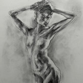
Here are some of my assignment drawings. Struggling a bit with the proportions on these. Any feedback is greatly appreciated
3yr
Nice work on depicting muscles! I can see you have some drawings with proportions almost accurate, and some drawings are off. I believe the outcome depends on your approach. When you think about muscles first, you lose proportions. I would always start with the gesture lines and big shapes. Think which way the body bends, if for shortening is happening. And keep in mind, majority of the reference photos make image look flatter than the real object, so bend lines more if it makes sense. Than some landmarks, head marks that look close to the reference in size. After that I would think how robobeans are twisted and go from there. I think Stan and Marshal in one of the gesture drawings review talk about why proportions may be not as on the reference.
Show all replies (3)
Show 2 more replies
3yr
As many comments below suggest, check proportions and correlated lines. Check the shape of the negative space. Make a smaller sketch just to feel the shape and relationship between different planes and shapes… if you don’t mind, here’s my draw over. One of the things is that the lower jaw is relaxed and lowers, so it will change some angles, position of the lower leap, wrinkles. Look at the triangle of eyes and the nose saddle. I usually draw something like that, than analyze where I need corrections and go from there. Good job!
3yr
Depends on the model, but I don’t see any ‘short’ and ‘wide’. That must be coming from the people who are used to manga style illustrations:))) The only part that looks a bit off to me is the model’s right hand. I guess shoulder to elbow is foreshortened, and elbow to fingers part is standing right up, but even if proportions are correct, probably light shadow balance is off and makes it look like elbow is not in the right place. I think if there was more differentiation in planes of inclined shoulder part, forearm, and the wrist part, it would look more balanced. Otherwise, looks completely natural.
Here is my character design… not exactly what I envisioned first, but that’s the limit so far…
Show all replies (1)
3yr
Mark, art is not about pretty pictures (they make a huge deal, but that's not the point). I see good responses below, and let me add some to it:
1. You are drawing for the sake of drawing, that's how you get enjoyment.
2. Sketching, and quick concepts are valuable skills, but keep in mind, those have a vast room for improvement in technicality, speed, technique, and media.
3. Any good piece of artwork should have a 'story', - I believe you can draw more just a pretty face, - that's not that hard to learn to do. 80% of cute portrait digital painting is just not that hard. You set proportions, you know your color pallet, you know where skin is pink-warm, and where it's cooler. The remaining 20% is just the way you finish it, a set of little tweaks (tricks) you do to make it stand out.
4. But, if you want to be a Concept artist, just quick sketching maybe not enough. I would recommend invest some time in understanding speed painting (Marco Bucci, just watch a ton of speedpainting), thumbnailing, and maybe doodling for story telling.
5. Skills should be continuously developed. If you notice something is becoming easy, find to try something else. Have fun with it. If it works for you, do more, if not, leave it for now, - most definitely not the right time.
6. If you want to do comic books, drawing skills level may be not the (only) issue. Story telling skills are important. If you draw character concepts and all of them are just standing, maybe you can start practicing from there contour lines, dynamic shapes, some action, emotions... I always wanted to see a comic book in a concept art style :))) tried, but realized I have so much more to learn.
Good luck, try things until something new clicks
3yr
So I’ve been drawing for the past two months with all the advice in consideration. Do you think there’s any improvement? Thank you!
Show all replies (1)


Well done and good efforts. The arm closest to the viewer looks a bit unclear. Because it is closest to the viewer, make the lines thicker and the volumes stronger. The arm furthest away should be a little lighter. For me the sketchiness doesn't matter. Your lines suggest some hesitancy, but that can be charming as well. If all figure drawings looked like curvy, confident animators drawings it would be a boring world. There is a bit of angst in this line quality that I like. But... It's good to show you understand atmospheric perspective even if you don't use it all the time. But definitely practice it and show you can use it. Also, Try grounding the figure more to suggest solidity by using a stronger floor shadow. Keep up the good work!
3yr
Thank you, graphiter, - I just started to add more shading and line difference, and I completely not thinking about the purpose of the lines, and forget about volume and perspective implied in the drawing. Some more things to focus on. Thank you!
Yay! Is it going to be digital painting or oils? Thank you!
Show all replies (1)


Your work is already great! But the problem is not your lines though. The problem is that you combine the sketchiness of a pencil with the straightforwardness of a pen.
Pens are great, it's like painting with watercolor. The stake is high, because if you make the wrong stroke, the mistake's probably irreversible. But when you do make the right strokes, that feeling is unbeatable.
In your work, you're still halfway through. The lines are in pen, but the shadow are in pencil sketch. It's like you paint with watercolor and dab them with oil paint at the same time.
From my experience, the reason of sketchiness is that you haven't build up your knowledge of the subject really well (in this case figure/anatomy). This makes you less confident in putting bold strokes on paper. It's like in your head you keep saying, 'is this the right stroke?' 'maybe I should leave it blurry, so if it turns out not to be the right stroke, the mistake isn't that obvious'.
So I will encourage you to keep using pen, but be bold with it. That's the reason we use pens at the first place. And don't blend them with pencils. I've painted over your work to show you what pen boldness looks like (it's digitally made, but as you can see the lines resembles that is of conventional drawing pen's).
3yr
Thank you, Vinecntius for your reply! I was thinking about what you said, and I think you're right about direct corelation between anatomy knowledge and line quality. I, for some reason, never though about it. It makes sence now why I can make a clean sketch of a toy car, but figure drawing is a mess. Also, ambout mixing pen and pencil, - my intension of usnig pen was to go bold and think less, make figure cleaner, but than I got carried away and made a mistake trying to paint over mistakes, rather than fixing them at the beginning of the sketch (or in case of short sketches, planning it). Thank you very much for clearing this up for me!
3yr
hi, if i am a beginner-ish (i honestly don't know where i am at my drawing path), how can i start working towards my IP without being distracted from improving drawing skills? https://www.instagram.com/polar_tux/
3yr
I just wanted to say that I really appreciate all your time you put in your answers and advises


I know you were looking for non-line related feedback but practicing "line confidence" would be your biggest level up right now. Your proportions and gestures are really good, I especially like the pen piece.
To build up line confidence, sketch your quick gesture lines in much lighter, and then only really use pencil pressure when you put down the final line. Practice making only one "final line" and committing to it. It might be frustrating when you're not happy with the first dark line, but committing to it is important to avoid overly sketchy drawings. Practice makes perfect :)
3yr
Thank you for the feedback, Kesley! I see there is no way for not talking about my lines (lol), I think pen sketches are a bit 'better' because I had to put more confidence into something i cant erase. I can't find an 'exercise' that will teach placing one final line (Watts level). Maybe I am doing something wrong? - I do gesture lines, I place head, torso and pelvic area as lightly market boxes that are turned the right direction, positioned against each other, and foreshortened. And after that all the mess begins. Part of the mess is shadowing, part of it is not using eraser, but the biggest problem (i don't know what it is) i don't know how to make it cleaner. Should I erase between drawing construction stages?
Show all replies (1)


Hey D S,
Nice five minute sketches. Quick sketch is pretty hard, so these are getting there. I did a draw over of your first sketch to show you how you can improve. I don't really know what the pose actually is, so I took my best guess. I hope this is helpful, and you find some value in it :)
3yr
Thank you, Steve! Showing more perspective through the structure is what I don’t do very well, thank you for showing how it works for this pose! You made it look so much clear now. Thank you for your help!
Show all replies (1)