

Giulio D'Amico
San Benedetto del Tronto
Hi! I'm an Italian digital and traditional art student. Always trying to improve and learn something new in drawing and painting.

Giulio D'Amico
added comment inProko Challenge Sketching Light and Color - FINAL SUBMISSIONS HERE
2yr
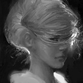
Here is my final submission for this challenge. I decided to go with a portrait study from a photo reference with a hard light. Hope you like it!
Show all replies (2)
Hi everyone! This is my final submission for the challenge. I chose Arabian Nights, with a focus on the tale of Aladdin. I included also the initial pencil sketch.
Show all replies (3)

2yr
This is amazing work! I just got into this pose and found that I kind of wanted to roll my shoulders back and stack my head over my pelvis just to be able to balance. If she's cutting through something and applying pressure on the sword then it makes sense for her shoulders to be rolled over but if not maybe try them less hunched and lowered/back?
Giulio D'Amico
2yr
Thanks for the feedback and your comment! I'll think about your advice. The pose should represent the moment after a slicing action. But since it is finished and she's not applying force on the sword anymore, you're probably right.


2yr
Hey Giulio,
I like your redesign, and the drawing is nice.
My biggest feedback is that she looks like she is sleeping. The pose is very up and down and straight which makes it kind of stiff. I did a quick sketch to show you how you could add some dynamic elements to the pose. I hope this helps :)
2yr
Hi Steve. Thanks for the feedback! I think this really helps! I see now that my pose lacks dynamism. And your silhouette is clearer too.
added a new topic
Character redesign2yr
This is a character redesign of Karai from the TMNT verse. I realised it for the February CDChallenge.
I feel that the pose is not readable enough.
Do you have any suggestions or feedback about it?

They both look really good! I would say the way you used thick dark lines in the first image sould be more focused around certain areas you want to draw attention to. Those heavy lines remind me of how product designers manage to instandly draw the eye to details. Overall i guess my attention is just "jumping" between details instead of "searching" for new ones. I dont know if that explains what i mean... AS of the second painting id have to see your reference to critique anatomy.
3yr
Thanks for taking the time! And also thank you for the advice on the line weight. The reference I used for the second painting is this one. Is a photo from A. Belovodchenko.
Show 1 more replies
added a new topic
Critique request on anatomy studies3yr
Hi! I just completed this two anatomy studies. Any comment/critique is very much appreciated.
These are both digital studies. The first one should be more focused on drawing.
3yr
Hi! They are both great studies! About the first one. I think you can push more the shadow mass on the right. The eye socket should be darker than the cheek. Also, I think you accentuated too much the angles of the face on the right (see attached) and on the nose.
Show all replies (1)
3yr
Hi! Thanks a lot for this amazing opportunity!
I'm Giulio D'Amico. I'm a digital and traditional art student based in Italy.
My focus is on 2D illustrations and I'd like to work in the game industry (Wizards of the Coast for example) or in the editorial illustration industry.
My main interests are fantasy scenes and portraits. My goal is to create immersive and realistic illustrations which evoke a story and paint compelling characters which inhabit them.
Thanks again for the opportunity!
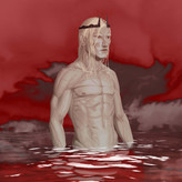
Hi! This is my first submission on this community! I tried to imagine a little sky-warrior and his trusted winged friend. I'm including the full comp and a close up. The rendering it's pretty rough... :|
Hope you like it!


Hi! Here is my final submission o/
I included a few wip screenshots to show the overall progression, now that I look at it there are a few things here and there that I still would like to work on, but running out of time here on my side
Nevertheless it was super fun to work on this, never would have thought to combine these pictures together, thanks a bunch to the Proko team for setting this up o/
3yr
Really fun idea and comp! In my opinion you could improve the composition just by suggesting more depth, making the closest characters darker.
Show all replies (1)
Show 6 more replies

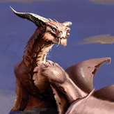
Here's a very curious fellow, and my entry for this challenge. I'm including a pic of initial sketches.