


Nova Astralis
added a new topic1mo
Hello everyone! I love to design characters, and I think I'm some kind of intermediate artist now. Fundamentals are still lacking, especially regarding human anatomy - but what I'd like to know is:
What exactly looks wonky about my artworks? Are they interesting or rather boring, and why? How high/low is their quality? Is my art style generic and how would you describe it? What does it feel like?
I know what I struggle to draw & to envision, I know many of my limitations very well, but these questions are just impossible for me to answer (well meaning friends & family can't either). If anyone would be willing to help me here, I'd be so happy. Thank you in advance!
From my favourite books, "Frankenstein" was the easiest to choose for this challenge.
There's a scene in which Victor lays in a boat just floating on lake, ruminating about his misdeeds, his creature and the misery he brought upon his family. This scene always striked me as heavy, terrifying in its quietness and foreboding (the next day the creature seeks Victor out to speak to him and to blackmail him). Lakes and mountains are important motives in the story, being part of nature, contrasting Victor's "unnatural" endeavours. He finds solace in them, and at the same time is a stranger in them. In creating life himself he turns nature upside down, so I liked to show the mountains upside down in the water's reflection.
I chose blue for his clothes, since that's "the" romantic colour, and as the complimentary colour yellow for the reflection of the sun and the title. Since the tagline of "Frankenstein" is "The Modern Prometheus", the yellow sun/light can also be interpreted as the fire Prometheus steals from the gods.
Show all replies (1)


It looks good to me, maybe the shadow are a bit too blue compared to the zone in light but at the same time it helps show that the scene is outside, idk. I really like the forms, the shapes are well defined and it feels 3d.
Nova Astralis
2yr
Thanks a lot! I exaggerated the colours of the reference photo (which I now put in this comment section). Perhaps I did it a bit too much :)


Wow that looks really good! Take my advice as a grain of salt because I am no professional but I think maybe the outline of the head is too much of the jagged line where it hits the light. It could maybe benefit from smoothing it out to be more curved.
2yr
Thank you for your comment! Yes, you're right about that part looking jagged. I wanted to make it look a little stylised, so the hard edge was on purpose, but I see how it's a bit extreme there.


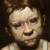
I think it's a wonderful study and a great piece that goes beyond just to study. The colors and the light look very natural and nothing looks strange or wrong to me. Although, it would be nice to compare it to the original.
The more I look the more that the background is a bit less natural because it's such a blank space. The bird is casting a shadow yet it feels as if the bird and the shadows are floating. The color of the background seems a lot like sand but it's missing the texture that is found with sand and maybe a soft gradient to imply distance.
The feeling I get from this piece is calm and silence. It is a very quiet painting, very contemplative.
Regardless of these specific details overall it is quite wonderful!
2yr
Thank you! Since it was only planned as a colour study, I didn't bother painting a background. You're right, it's just blank & not appealing, although it looked even weirder without the cast shadow. I now put the reference photo in the comments!
Show all replies (1)

It's spot on. Feelings are hard, it may need a story/scene to help evoke. Its professional standard. How to make it better is subjective and based on the style you're looking to achieve.
2yr
Thank you. It's been a while since I posted my work, but your comment made my day then. "Professional standard" is great to hear.

Looks great!:) feels like a summer day at the beach :D maybe just even a loosely painted scene? Looks great tho!:)
Reference
added a new topic
Colour / Lighting study - I'd love to hear your critique!2yr
I was going for slightly stylised realism, but mainly it's a colour / lighting study. Is something looking off? What feelings does it evoke? What could I do to make it look more "professional"?
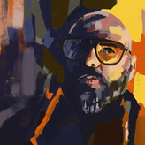
Dead: Albrecht Dürer. Living: Karl Kopinski.
I only did landscape thumbnailing a few times before. I feel it's getting easier, but it's still quite the challenge for me. The biggest problems I have are with textures like leaves, grass, trees etc. I really struggled with No. 3 & 4 here. I think in the future I should reduce the amount of details even more, but I'm not sure how to do that without losing too much information. Anyway, I like my results - it was pretty fun although definitely out of my comfort zone. Makes me a bit proud even ;)
Show all replies (1)
[Reposting because I found some mistakes - I hope this is ok. The original post was in time and is still up]
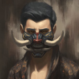
Illustration for a novella I wrote last month. The references fit it surprisingly well, so I just had to participate in this challenge :) It's a fantasy/scifi/romance story about natural & artificial beauty and whether one is better than the other. Of course both are valid, and there's a happy end, too.
Show all replies (3)
Illustration for a novella I wrote last month. The references fit it surprisingly well, so I just had to participate in this challenge :)
It's a fantasy/scifi/romance story about natural & artificial beauty and whether one is better than the other. Of course both are valid, and there's a happy end, too.
Show all replies (1)

Hi @Nova Astralis, I love how this character's personality shines through in your drawings. I especially love the one with his back turned away from the viewer. It says a lot about how he's feeling, and when you compiled your drawings onto one page this specific pose had great contrast against the mood set by your other drawings.
I think @Josh Sunga made good points about line confidence, simplification, and design. The last 2 are definitely some of the most ethereal concepts to grasp about illustration, but can be used to great effect. With character drawings, you definitely want to be apply concepts like playing straights vs curves, complex vs simple, etc. to bring more design into your images. Please let me know if I sound a bit confusing haha, I can do a draw over to clarify some of these concepts.
Lastly, I wanted to ask if you use direct reference for the poses, lighting, fabric, material, etc. for these images? I know it's a tedious process to try to get really solid reference for every little thing, but it doing this definitely helped out my illustrations immensely. If you happened to have some direct reference for one of the images, I could also show how we can use reference to punch up your images.
Great work! Let me know if any bit of my feedback was confusing so that I can clear up some of these concepts
3yr
Thank you! Yes, Josh Sunga and you make excellent points that help me a lot. But I'm also glad to hear that the "feeling" is right. It's the most important thing for me when I'm creating something.
I did use references, mainly for the poses. The clothes, except the trousers & boots in picture 1 and the cape in picture 4 are drawn from imagination. The reference for the cape in 4 is pretty bad, I just used it for the forms only, not shading, so it wouldn't be helpful to post (and on that photo one can see too much of my apartment). I'll attach the pose/trousers/boots reference for picture 1 to this reply.
You're feedback isn't confusing (or maybe I just believe that I understand it :D). Thanks a lot!
Show all replies (3)

Hey Nova- great to meet a writer/illustrator on here!
Nice work! I especially like the first and fourth image because in both he seems lost in thought but in different ways! Very cool.
A quick way to improve these would be to make your line work sure and more confident. At the same time, subtle/softer indications for interior details would also be effective. Try to use a range of line quality to describe different characteristics of the drawing. Loose or even messy lines could be used for the fabric- whereas contrasting this with harder, structured lines for the armor could go a long way to indicate material!
I did a quick paintover- Mostly just simplifying what you have already. Paying attention to value structure to clarify the various elements and make sure the viewer gets the image on the first read!
But again, good work! I'd love to see more of his story in the future!
3yr
Wow, you even made a paintover - thank you so much! This is the first constructive criticism I got in years. When I look at my drawing I can now see its mistakes and possibilities more clearly.
I couldn't resist and made a paintover myself and tried to apply your critique. It's not perfect, but much better now. How did I not think of that negative space between right leg/arm and torso? I probably was to absorbed with the question where that cape should go.
You're advise is very useful! Thank you for taking the time.
Show all replies (1)
3yr
Hello there! I'm Nova, an aspiring writer & illustrator. I'm self taught and hope to learn from professionals, so I'm excited I found Proko 2.0 yesterday! Most of my works are illustrating a series of fantasy novels I write.
This right here is my first character sheet. Feel free to tell me what you think!
I'm looking forward to be part of this community.
Best wishes, Nova