


Steve Lenze
added comment incharacter illustration help
7mo
Hey Matt,
It's easier to just show you than to explain it. I did a quick diagram that I hope will help, let me know if you have any questions :)


matt barton
7mo
Hey Steve As always thank you for feedback (you are fast becoming a mentor of mine lol) ive posted an image of how i think the perspective works on the character. Im looking for the torso to be twisting towards the viewer and would like the front leg to be pushed forward
Show all replies (1)
added a new topic
character illustration help7mo
Hey guys
Is this piece looking alright ? drawing it in perspective has been tough

8mo
Cool work :) A tip I would like to add is to watch out for the "snowman effect", which is basically symmetry on parallel sides. It seems to be most prevalent around the arms and legs, with a bit for the center of the midriff too. To fix it, keep an eye out for the natural rhythms of the human body, as often times they will fall more on an alternating rhythm or curve-against-straight pattern. I think you could also benefit from creating more straight lines/edges overall to make the drawing more dynamic rather than all round shapes.
As for anatomy, I would recommend slimming down the neck as usually it's not wider than the head, especially not for women or unless the model is a bodybuilder. The pec area also seems a bit unaligned. I see you have a curve for the torso bending backwards, but the breasts seem more 2D facing the towards center rather than following the structure of the torso and sitting on top of the pecs, which would make them face more towards the left of the page and overlapping.
Hope this helps :)
Show all replies (2)
added a new topic
feedback would be appreciated8mo
hey guys
Currently sketching out this piece and would appreciate any tips you have
8mo
Asked for help
justb trying out some bodies in perspective and would appreciate any feedback
anyone know what brush is being used in this demo ? id like to try it out
added a new topic
Just dont enjoy art anymore1yr
So this is something I have had in my head for a fair while now and I'm kinda at a crossroads. Basically I just dont really enjoy art anymore. I do still enjoy doodling and sketching but sitting down and concentrating on a piece is becoming a real chore. I had aspirations of becoming a pro artist but to become one you must put together a pro portfolio, learn to market yourself, take rejection upon rejection on the chin and keep going,develop a style that helps you stand out from the crowd, land a contract and work for less than what i make in my current job.
Plus on top of this I am experiencing something of an existential crisis in terms of art itself
What does art do for the wider world ? how is it meaningful ? yeah cool its good for the individual in terms of expressing themselves but honestly.. when has art ( drawing and painting ) really changed the world ????
Now, maybe I am being overly negative but I cant find an answer for myself or have dedicated so much of myn life towards art that Im now thinking I want to move on before I waste my whole life.
I would be very interested to hear from you guys on this one. Have you had a similar experience and how did you over come it ?
added a new topic
Looking for Crtiques before continuing2yr
Hey guys
So I think I'm making good progress on this piece but something feels off. I would appreciate any feedback you have before I commit


2yr
Hey Matt! Good job on these, you're right to stay away from detailing at this stage.
A couple things, though the gesture is getting there you're losing a lot of the energy of the poses. What I suspect is happening is that you're not drawing as much with your arm as you should be.
With these sorts of drawings, feel free to draw past where you think the shapes should end. These ones that you've done have very abrupt ends which do stop the figures displaying their action.
See the example below for what I'm talking about:
2yr
Hey Kristian
Thanks for the feedback i shall keep this in mind on the next go around
added a new topic
First steps in gesture drawing2yr
Hey guys
Would really appreciate it if I could get some feedback on these. I think I've managed to stay away from detailing and tried to get the energy of the poses but if you can see something I would love to know
Thanks in advance
2yr
Asked for help
Hey guys
Would appreciate your help with this one before i progress. Is the perspective and anatomy correct ?
Thanks in advance
2yr
Asked for help
Hey guys
Early doors on my latest study piece and would love any feedback you may have
2yr
Asked for help
Hey guys
Trying anew way of getting the reps in here and would love your feedback
Calling this one finished. Really enjoyed making this one. Thanks to everyone for the helpful hints
Show all replies (1)
Asked for help
hey guys
So Ive put in some more time. Hopefully the advice you gave has been implemented well. Would appreciate any further advice
Show all replies (3)


My initial reaction to the saturation was that it's much too saturated. But @Steve Lenze pointed out that it's a stylistic thing, and I agree. Every situation calls for different lighting. If you were going for a very natural light, such as indirect light through a window it would be way off, but if you envision your character bathed in fire light or a sunset then your much closer.
Great drawing though. I love the line work.
2yr
Hey Chris thank you for the feedback and kind words. My aim is to go for a sunset style look, I'm going to play around with the saturation though and see what results I get
Show all replies (1)
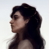
Hey Matt,
This drawing is pretty good, especially the face. There is a problem with proportion though, the head is too big for the body.
As far as the painting, color saturation is a personal style thing. I think though you could desaturate the skin a little to build contrast with the rest of the image, but, that's just my opinion. I think the bigger issue is the lighting. It doesn't look like there is a convincing light direction because of a lack of shadows. I did a sketch to show you what I mean. I hope it helps :)
Show 1 more replies
added a new topic
First attempt at colour work in a while2yr
Hey guys
I think im progressing quite well with this image but would like to get some of your feedback before going further. Is the lighting ok ? is the colour too saturated ? appreciate any comments


2yr
Hello matt :),
I've made some notes over your artwork.I put it there only for explanatory purpose and they might be off.
I've extrapolate a ray of light from your cast shadow made from her chin to the neck ( small portion in green ) then extended it and multiplied it in order to visually see where the light is coming from. Please note that this imply a far away light source like the sun as the rays are parallel. (even if in reality even sun rays are not totally parallel).
It shows you one way of how you can help yourself making this type of lighting calculations.
The dots are estimated points where form is turning away from the light and therefore going into shadow.
On the shoulder I made an example where it is going to cast a shadow. So you'll have to calculate where the light hits the turning point and where it is blocking the light on the form next to it.
Concerning blending I can advise you to make soft shadows on women's faces as they tend to have softer feature.
Making a lighting from memory is a very hard and taxing process, I can recommend you two books that will tremendously help with that [How to render - Scott Robertson] and [ How to Draw - Scott Robertson ]. The author recommend to start with the How to draw book as it tackle some of the core concept. I don't know if there is course here on the Proko platform.
I hope any of this will help you :)


2yr
Hi @matt barton, Nice!
I think it would be nice if you pushed the contrast between light and shadow. When inventing lighting, using the halfway to black method could help, to get realistic values. Check out this video for example https://www.youtube.com/watch?v=49VKDhngQQA
I agree with @Nicolas CATALDO Scott Robertson's books are great, but they are also pretty advanced. Dorian Iten has a course here on proko The Shading Course – Fundamentals of Realism, Light & Shadow. He breaks down the concept of shading in a digestible way, that suits all levels. So if you're new to shading I would recommend starting there
Cheers!
2yr
Hey @Jesper Axelsson thanks for the advice I really appreciate it and the video too was very useful. I have actually purchased the shading course and am currently working through it, So far very helpful
Show all replies (1)
Show 1 more replies