


@pollypopcorn
added comment inFantasy Illustration Feedback
3yr
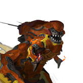
I would make less of the griffin itself blurry. One reason to make part of an artwork blurry is because it's not in focus. So grass in the front could be unfocused, but the griffin and child would probably be all in focus. Blur can also imply smoke or haze. I would be careful with the perspective. It feels like the griffin is sitting on one plane and the boy is standing on another. Like he's on a hill or we're looking more down on him. I like the gold colors on the griffin and road.

@m_rybo
3yr
I agree! I had really hard time with the angle and how to fit such a big creature in the frame. Maybe a completely different angle or camera position would have been better but I got very stuck on trying to make it work on that angle.
having blurry or not defined characters is still a struggle for me, somebody else suggested to add details here and there and to work more on the shapes first, before deciding what I want to just hint. It’s still hard but I will keep practicing.
thank you for taking the time to give me feedback! I appreciate it!
3yr
Update: some changes based on the feedback! I know I still have a lot to learn and lots of hours to practice, but I really appreciate the comments from everyone, it has been very helpful for me and saw lot of things I didn’t notice before.
Show all replies (1)


3yr
1) the gryphon is crammed into the corner, with his wings tucked like a chicken in a cage. It's okay to let stuff carry over the edge of the canvas.
2) it gets very airbrushed in the lights. Probably better to use real brushstrokes that force you to be more decisive. Airbrush is like a person singing under their breath, in that it makes a very non-commital, weak statement.
3) the gryphon melds with the grass to create a giant black blob. I wanna say in general that you've got really dark darks and really light lights. I think you need to work on getting more midtones in there
I think overall it's your values that need work
3yr
Hi Peter
thank you for the feedback! I agree the wings were too close to the edge and it looked indeed like a big black blob with the silhouette not very defined. I am still experimenting with different brushes so that is definitely something I continue to work to get better!

3yr
Hi m_rybo!
Hi, I like the concept, the wheat field and the child came out well, the problem is the lack of texture in the griffin.
One of my life drawing teachers used to repeat "Remember the material!".
Plaster looks different than wood or metal, feathers reflect light differently than leather or fur and have a different texture and grain.
Obviously you don't have to paint every hair or feather, just suggest where the planes change and the light reflects differently.
I suggest you start with flat colours and then define the shapes with shadows, don't use round brushes or you'll get the infamous plastic effect! (Use shadows to emphasise shapes and gestures)
Try some brushes with a bit of texture (like crayons or pencils, but also brushes for materials, see for yourself, do some tests).
When you have defined the volume of the body, you can suggest the texture of the fur and feathers (but also of the beak and the scales on the legs) by painting hints of detail here and there (some scales in the light areas of the legs, feathers that reflect the light in the transition zone between light and shadow, etc.).
Don't be afraid to look at references, using references to understand how materials behave and how light is reflected from them is not only ok but essential!
3yr
Hi Serena!
thank you for the feedback! Indeed one of my biggest struggles is painting.
In an effort to avoid the infamous soft airbrush effect, I have been working my paintings by adding first a flat color, then with a hard brush with faded edges add shadows and things like that and then using texture brushes like watercolor or oil or pencil to add texture.
For this one I felt like I wanted to use a watercolor brush, and not worry much about defining everything just placing some shapes to hint, but I’m doing so I think I end up with a lot of mess. I do work with references a lot but I think my biggest problem is to try to go “painterly” or very loose and I forget to add details here and there and just getting too confusing.
Definitely this is something I need to keep practicing !
thanks again for the feedback!
Show all replies (2)

3yr
Hey, m_rybo. I am by no means an expert, so please know that I just looked at this and do really admire the lighting and style. It seems like the leg with the claw holding the feather is much larger than the right foreleg. This could of course be the way this fantasy creature's body is shaped, but if it is not, then I would consider making the right foreleg larger to be more in proportion to the left leg. And, again, I am just an avg guy who looked at this. It's cool. For sure. Thanks for being brave enough to share it.
3yr
Hi Brandon!
thank you for your answer and indeed it always feels a little shy about posting a drawing for feedback, but everyone here has been so helpful that I think is totally worth getting past that first fear :) funny coincidence the story behind the illustration is about a boy who shows his bravery and strength.
indeed the 2 front legs should be the same size and shaped like eagle legs. I used some references but I think that the foreshortening perspective on the leg that is touching the ground might have messed up the sizing, as it is supposed to be just slightly bent inwards and not completely straight. I haven’t noticed that until you mentioned it so I appreciate your feedback !!
3yr
Update: I wanted to add the version of this illustration that has a text related to the background story. I didn’t add this one originally because I didn’t want it to be in the way for anyone who would want to give feedback :) and it seems like I can’t add new pictures to posts already submitted.
Just adding it now for anyone who is curious about it :)

3yr
My feedback is just that this looks super awesome and i love it! Especially the lighting and the storytelling.
I love the stern expression of the eagle while his gesture is so kind and wholesome. Is the feather meant to convey magical powers or something to the boy? I would love to hear your interpretation of the story (the og-one :D)
3yr
Hi! Thank you and I am glad you like it :) The concept story behind is this young child, goes on an adventure where he meets this Griffin. During this adventure he faces challenges and he pushes through his fears. When the adventure is over, the Griffin gives him one of his golden feathers as a token :) Added a post with the original image that had a short text hinting the story.

3yr
Hey @m_rybo ! I really enjoy the moment you're trying to depict.
I did a paintover with bigger changes than usual- but hopefully some of the notes will help you enhance your own composition.
First I made the canvas wider. I wanted the left wing to feel less cramped and the feather/kid to land on a third in the image.
I noticed the soft lighting quality and dynamic camera angle but I omitted these so I could solidify the perspective. (The tall grass in the foreground conflicts with the perspective of the camera angle)
Though lowering the camera angle misses some of the intimacy from the original- it allows us to design the surrounding environment. I made the kid smaller as well to make the griffin have an even more demanding presence.
I increased the contrast to stay true to the lighting scenario you established. It helps silhouette the griffin as well.
I realized how wholesome the story is here as I did the paintover- hope this helps and thank you for sharing!
3yr
Josh:
wow thank you for all the feedback!I am glad you like the story of my illustration.
You caught a lot of things that indeed were a trouble as I was painting.
I tried to force the Griffin head to be in one of the thirds, rather than focusing on the kid,which ultimately, is the primary focus.
That made whole Griffin felt cramped on the edge of the page, and this might sound silly, but I was afraid that by making the figures smaller in the canvas, I would end up with a lot of empt space and characters that were very small to see. I can see in your paint over that adding space it does improve the readability without compromising the concept and actually feels more relaxed. Now the feather/kid are becoming the center of attention.
I like way you increased the shadows and contrast created a more clear silhouette for the Griffin. That’s something I have been trying to improve in my paintings.
I really appreciate it!
Show all replies (1)
3yr
I had the same issue and had exactly the same thought. I hope this message gets seen by anybody in the proko team
3yr
Update: Following the recommendation I was given, I modified the shape of the left wing, moved the tail down a little and also I felt like the shadows on the Griffin could go a little darker.
Show all replies (1)

3yr
Hi @m_rybo
You are telling a nice story with your picture. I like the theme, the story and the colors. The grass in the foreground is too moody for my taste, but I am not sure how to change this. Concerning the composition you did a decent job I think. For my the anatomy of the griffin is flawed concerning the wings. I think it would be a good idea to study "griffin-anatomy". See my attached overpaint: I tried to indicate where the wing shoulg be for me. And there is a little tangent between tail and arm. Maybe you could change this too.
3yr
Thank you for the feedback Dominik!I see what you mean with the wings and you are right, it looks more accurate that way! Also thank you for pointing out the tangent, even with your paint over it took me a few minutes to notice it, so I really appreciate it!
added a new topic
Fantasy Illustration Feedback3yr
Hello! This is my first time posting a topic here.
I made this fantasy illustration, but there is something about it that doesń´t feel right and I can’t figure out what it is. Any feedback would be appreciated!
3yr
Hello!
I am a digital illustrator who has been dreaming about turning this passion into a career.
My dream work would be creating Magic the Gathering cards (you can imagine how excited I was when I saw this post). I remember when I bought my first deck, decades ago, having fun playing for hours with my brothers, but most of all, I admired the beautiful art, and even collected some exclusively for their illustrations.
However, I am also expanding my portfolio to try to work also on kidlit book illustrations, maintaining my style. I love fantasy and mythology.
I appreciate your time
Here is my entry for the prokochallenge movie poster. A fantasy story. “When a city girl moves to a little town in the country, she never imagined that transition would take her into a magical journey to discover herself”
I hope you like it!
Show all replies (2)